I practice Evidence-based Design.
My process is evidence-driven, tested by experience, and battle-hardened in some of the most challenging enterprise environments today. Have a look at some of the ways I work.
Click and choose an item to navigate to below.
The Basics
Talk to people
Actually talk to people who care.
Talking to the users or customers of a product or service is key to understanding what unmet needs exist. If something is getting in the way of talking to people who use your product, it’s likely you leaving something off the table. When you do talk to people, make sure you interview with a goal in mind, and making sure that your bias is checked at the door.
Defining a Better Business Need
Get agreement on what unmet needs and goals are worth researching.
You need to understand the primary thing about your business that you should improve right now. Whether you’re determining a business goal for your company, your entire product, or just for your own team, it’s important that everybody agrees what the goal is.
Ideas as a hypothesis
Always frame ideas as a hypothesis and not a fact.
In common usage in the 21st century, a hypothesis refers to a provisional idea whose merit requires evaluation. For proper evaluation, the framer of a hypothesis needs to define specifics in operational terms. A hypothesis requires more work by the researcher in order to either confirm or disprove it. Before rushing to build, understand whether your idea is worth building. Frame accordingly.
Learning how people solve problems today.
Learning how people solve problems today, by humbly listening and walking in their shoes.
Designers too often work from a place of privilege. One of the best ways to cut thru our bias, is to learn about your users’ goals and needs, especially as you visit people where they work. By watching people work, you can learn a lot about common challenges they face, and the context of use your products are found in.
Map out steps
Map out steps, tasks, and mental models.
Sometimes, all a project needs to get direction is a good map. I usually start the process with creating visual tools to communicate the lay of the land, first by mapping how users interact with a product or service, and then measuring whether they can achieve their desired outcomes.
Sketch and show
Sketch and show with pictures before describing with words.
UX sketching is a crucial, yet often overlooked, aspect of user experience design. Sketching is a very efficient way of communicating designs while allowing designers to try out a multitude of ideas and iterate them before settling on one. I take this principle to heart, always ready to think on paper when working with people.
In the Field
Test early, and test often with user testing.
There is no excuse for not performing usability studies. They’re fast and cheap, and very convincing. Ensuring that test occur with representative users, with realistic tasks, and with the right methodology. If we’re not learning during observations, I didn’t do it right.

Don’t get comfortable
Don’t get too comfortable with a direction.
Hidden and unexamined assumptions are dangerous, because they can completely derail a product at any point, even after investing a huge amount of time and money into them. Making sure ideas and designs are framed as falsifiable statements helps keep projects relevant when new information presents itself. I believe that it’s better to throw out a design than to solve the wrong problem.
Feedback and Qualitative Data
Shape research, by getting feedback and qualitative data from as many places as possible.
Rather than just using surveys to generate ideas, I use them for baselining. Reaching out to folks from all walks of life when you are screening for participants to conduct user research, can help shape the best possible audience to talk with. Then, by creating surveys to help refine a list of relevant participants, you can ensure that the people you interview are the most accurate representation for your research to be valid and useful.
Gut check often
Gut check often and use goals to drive design.
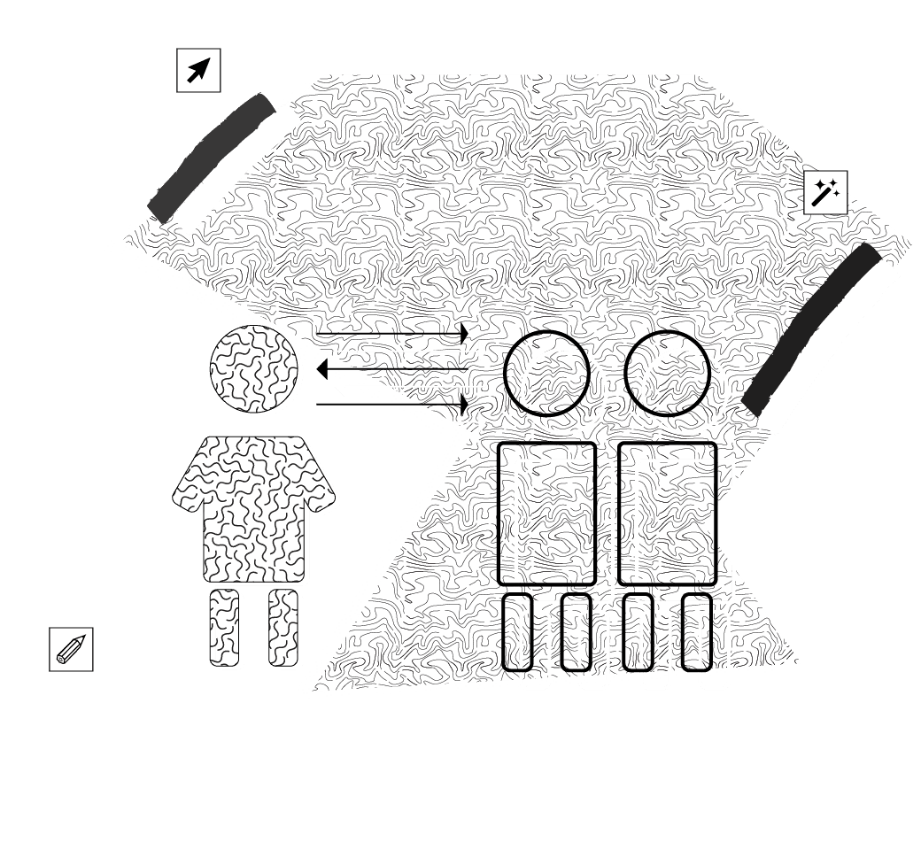
When you’re building products, websites, web applications, or just about any experience out there, the thing you build will serve two masters: Your End Users and The Stakeholders. These are found in the form of the “business owners” behind the project, or the customers that will live with this thing. By determining the goals of both users and the business, and getting buy-in from all aforementioned parties involved, you ensure you don’t miss anything. I practice this to make sure all the goals are considered in solving a design problem.
Smart Analytics over raw numbers
Smart Analytics over raw numbers.
By thinking about metrics early, success or failure can be better quantified overtime, and the results of design direction can be quickly tested. Thinking about business metrics, UX quality metrics, and engineering performance metrics can help inform every decision, while tracking against whether a products goals are really being met.
Adapting to Change
Think outside the UI
Think outside the UI.
Sometimes you have to consider the relationships between different systems and services, (such as people or processes) at various touch points, (like physical places or systems) to solve problems. By thinking on what your users road to success requires, you can organize different services and all the intricate connections between them to make things easier. Thinking “outside” the user interface is a key part of solving problems for me. Focusing on the user (and taking the user’s viewpoint), you can create blueprints for success that are focused on both the user and the business responds to the user.
Tools for work
Tools for work, play, and communication
The products I work on vary greatly in scope and intent, but I focus on the common components that make things work. The forms, layouts, buttons, animations, scale, and controls I design and assemble are parts of the core user interface that every great product demands good usability from.
Getting Things Done
Speed over perfection when rapidly prototyping.
Speed over perfection when rapidly prototyping.
My design process has evolved over the years, but being the right amount of quick still matters. Being able to quickly produce concepts to communicate ideas and potential value, helps more than being “pixel perfect”. And because I can design in the browser with HTML/CSS and JavaScript, I can create testable designs that leverage what the browser provides for fast idea validation.
Use metaphor
Use metaphor to communicate.
Using reframing tools helps produce clear, well written statements of what a design is attempting to solve. Framing things with epic, KPI’s, jobs to be done, outcome statements, user stories, or 5 why phrasing can help teams align without having to parse ill-defined language around a problem.
Use your words
Use your words to communicate problems.
Being transparent when designing is important. A useful tool for being transparent is to create actionable problem statements, that if shared, are used to summarize who a particular user is, that user’s need, and why that need is important to that user. It helps get a team on the same page, ensuring that the right problem is being focused on.

Create clarity and presence
Create for clarity, then presence.
I design products that leverage good typography to make it easier to read and work within. Typography that invites a reader into text, reveal its meaning, clarifies its structure and connects it with other surrounding elements. A good design must accomplish basic legibility before all else.
Functionally interesting
Create functionally interesting products, without complication, and without forgetting that people actually want to use these things.
I believe that interfaces and products need clear designs, but not overly simplified features sets. Every feature crafted should have the right amount of visual fidelity, utility, and also match what the user expects. Sometimes the line between complexity and simplicity is hard to straddle, that’s why focusing on functional design can help.
Get organized
Get organized before designing screens.
Knowing where your data, content, services, or ideas sit is essential to understand what products and brands do. Organizing and auditing how information is perceived, created, and consumed requires detailed capturing, mapping, and shaping. This principle is a must, and is something I have focused on for a while.
Never static
Never think in static terms.
Products grow, shrink, and change overtime. I believe that building flexibility into a design at the start is critical to adapting to change. The web is a flexible container of things. The whole software paradigm of the web is create tools that work everywhere. My designs are not just stuck in the design tool. I build in the browser to make sure things work on mobile formats and desktop.
