What is visual communication to me?
Visual communication is the art and science of helping people understand.
It’s the creation of understanding. If “the web is 95% typography,” being made up of text and images, then the web at its core is a visual communication medium.
A digital agnostic take on this is that the web is just the medium pushing visual communication. Like the printed word, or the spoken and illustrated word, how people receive information is critical to how our world works. Digital and Physical continue to blend. The new oil is knowledge. This has created a few problems.


Building anything in this world takes someone who has experience working with all the distinct forms of communication. Email, video, audio, writing, drawing, speaking, the list goes on. The question is, what business can get by with just one of these? What practice can ignore all these mediums of knowledge exchange? When choosing a platform to communicate with, which do you put your resources into?
Knowing how to communicate, and actually doing so, has become the key skill. Both for the individual and teams.
When I first started down this road of becoming a visual communicator, I was trained in formalist, classical arts like drafting, organizing, and layout. First, as an Architect draftsmen, then as a graphic designer. Even in the late 2000’s my education ignored digital. This was a strength— until it wasn’t.

The promise of Web 2.0 and the rich media of Flash, was enchanting. But it conflicted with the training I was receiving. I was being trained to both design physical structures, and later to design printed media. But even while being told to ignore digital experiences for so long, these fundamentals gave me a strong foundation that helped in my transition too designing for digital settings.
But this transition was a big change for me, my day job of solving spatial problems became one of solving communication problems. I had to show and tell. As the market kept pushing me into digital work, and technology finally started to allow for visual parity with printed media, I soon found myself with the in between-er generation of visual designers that became UI and UX professionals. Missing the academic library science and HCI early days of user experience work, and missing the rise and fall of the web master/web designer role, but before the proliferation of the UX craft as a well known avenue for up and coming design professionals.


For a short time, classically trained designers like me were thrown for a loop. What eventually gave me a competitive edge, was a process shaped by experience that wasn’t tied to any specific design craft. My skill as a visual communicator allowed me to push my professional work farther.
What have I done to solve certain communication challenges?
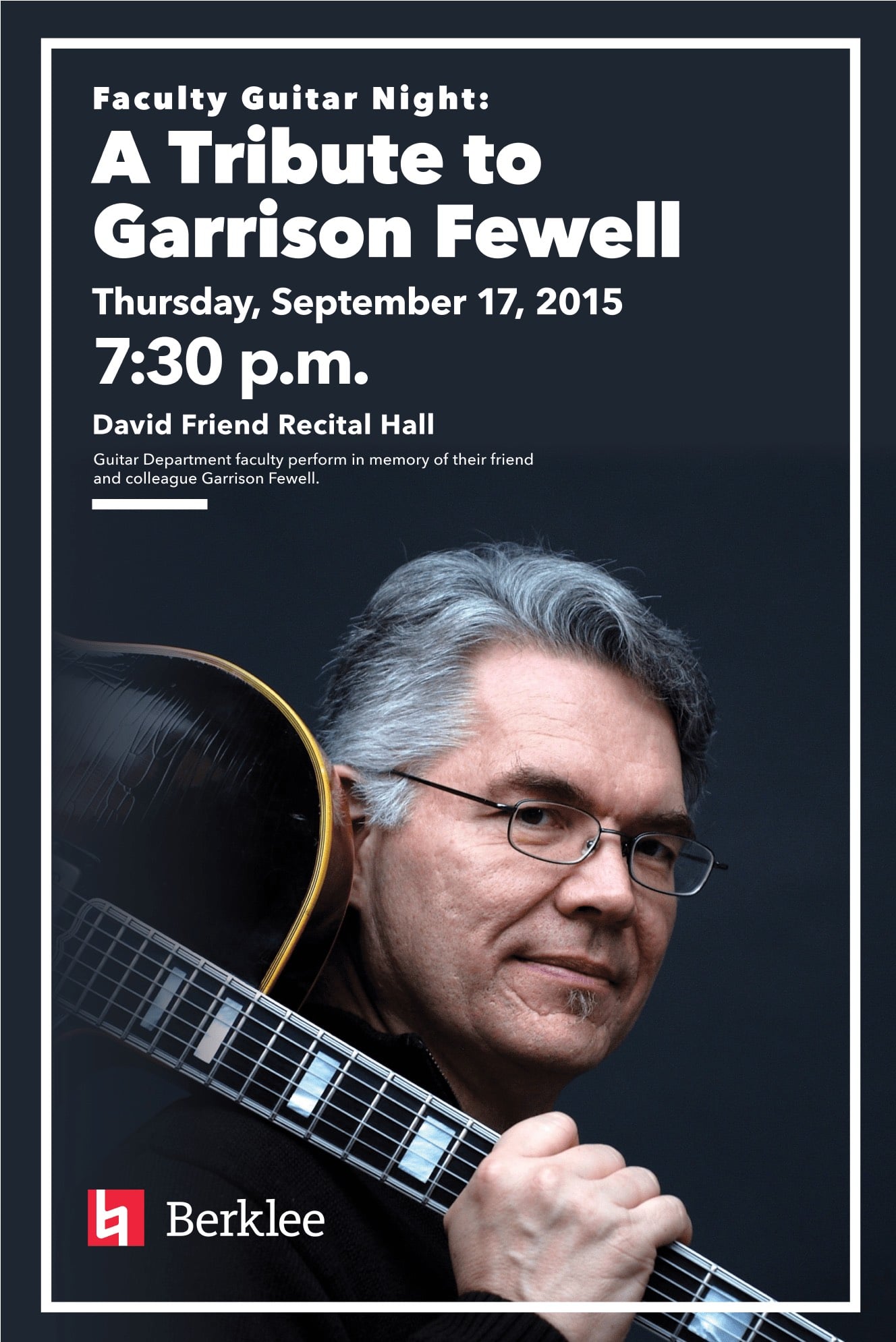
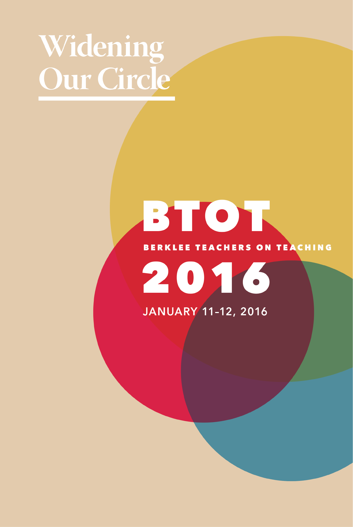
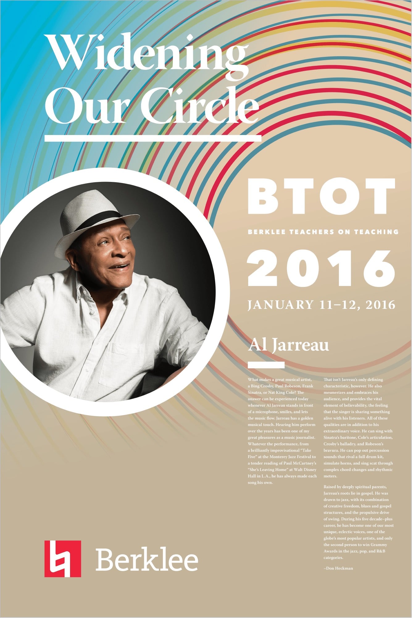
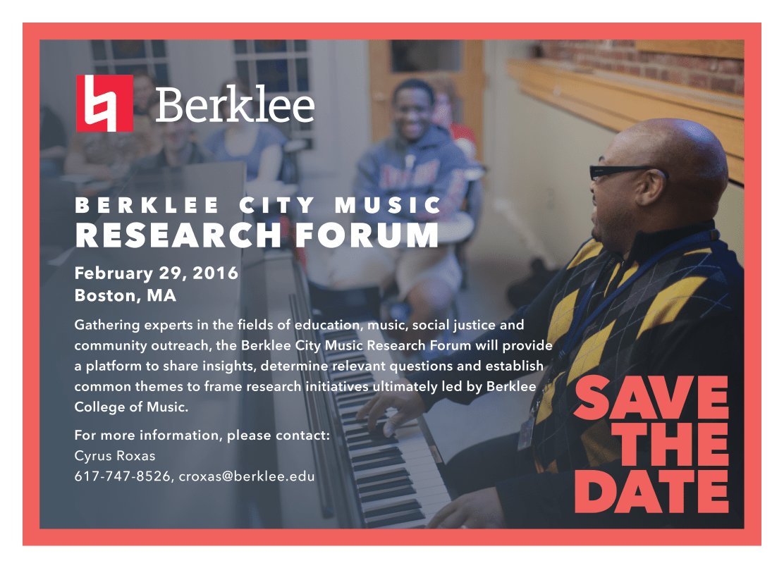
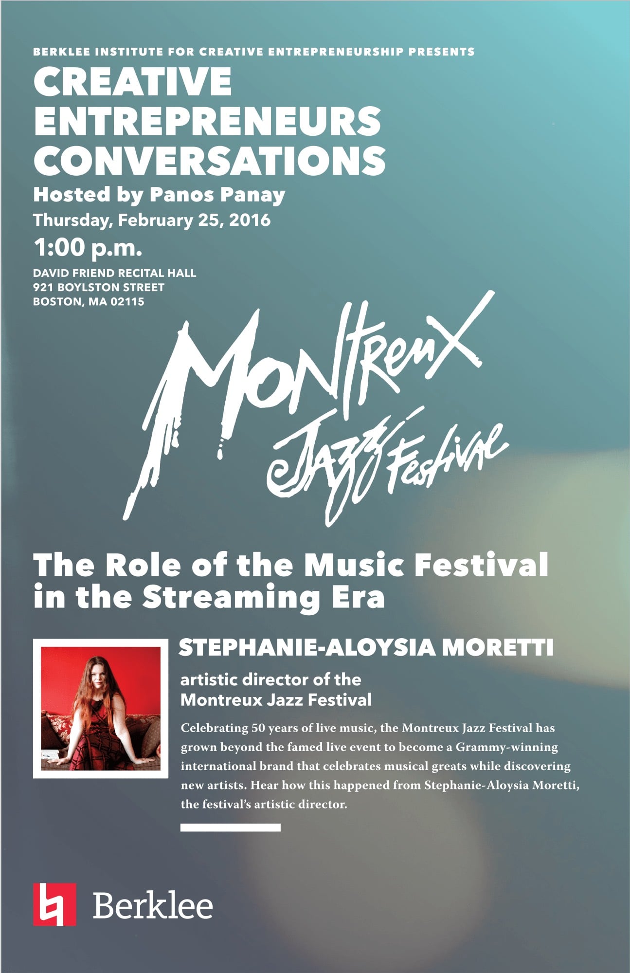
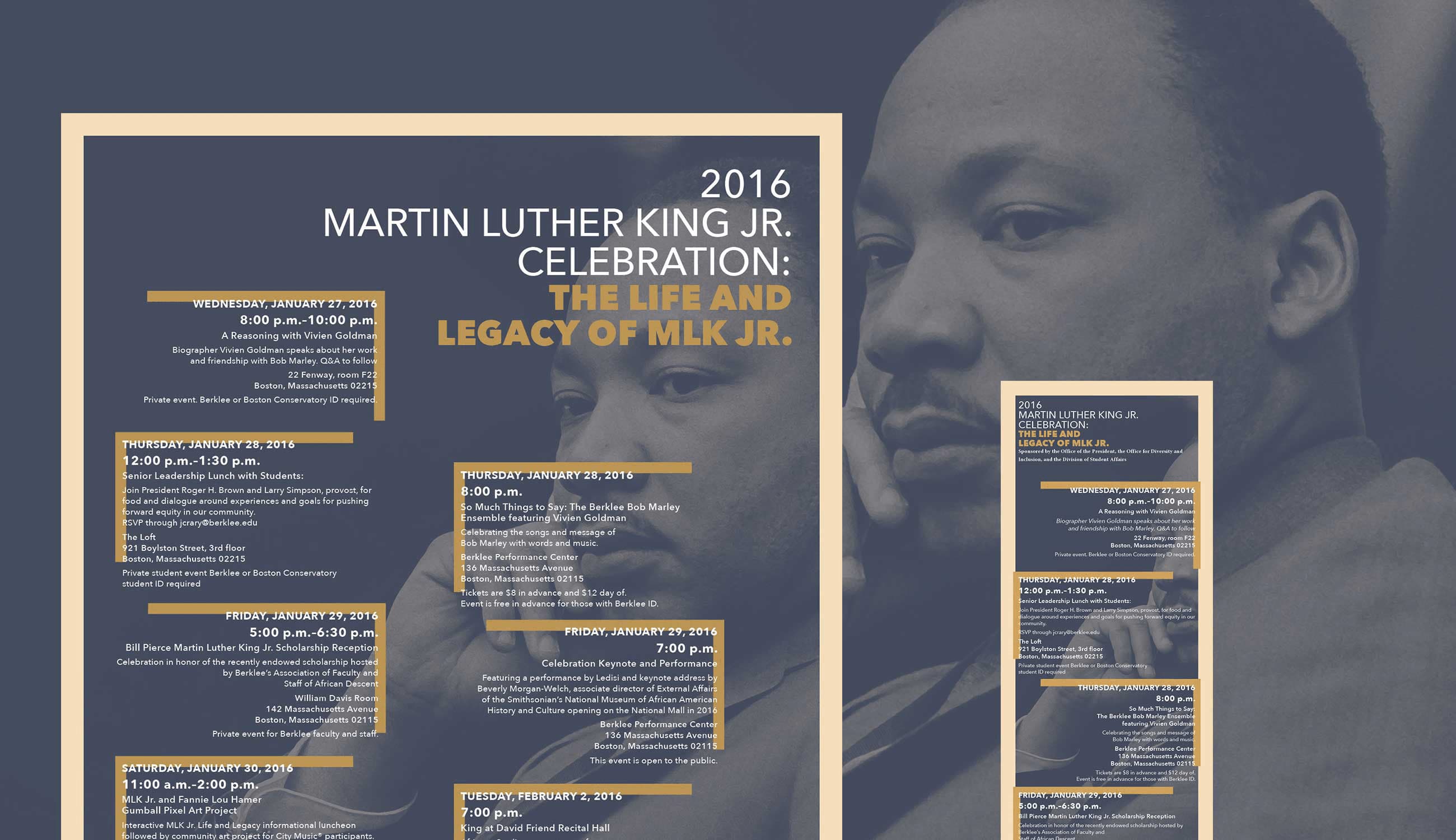
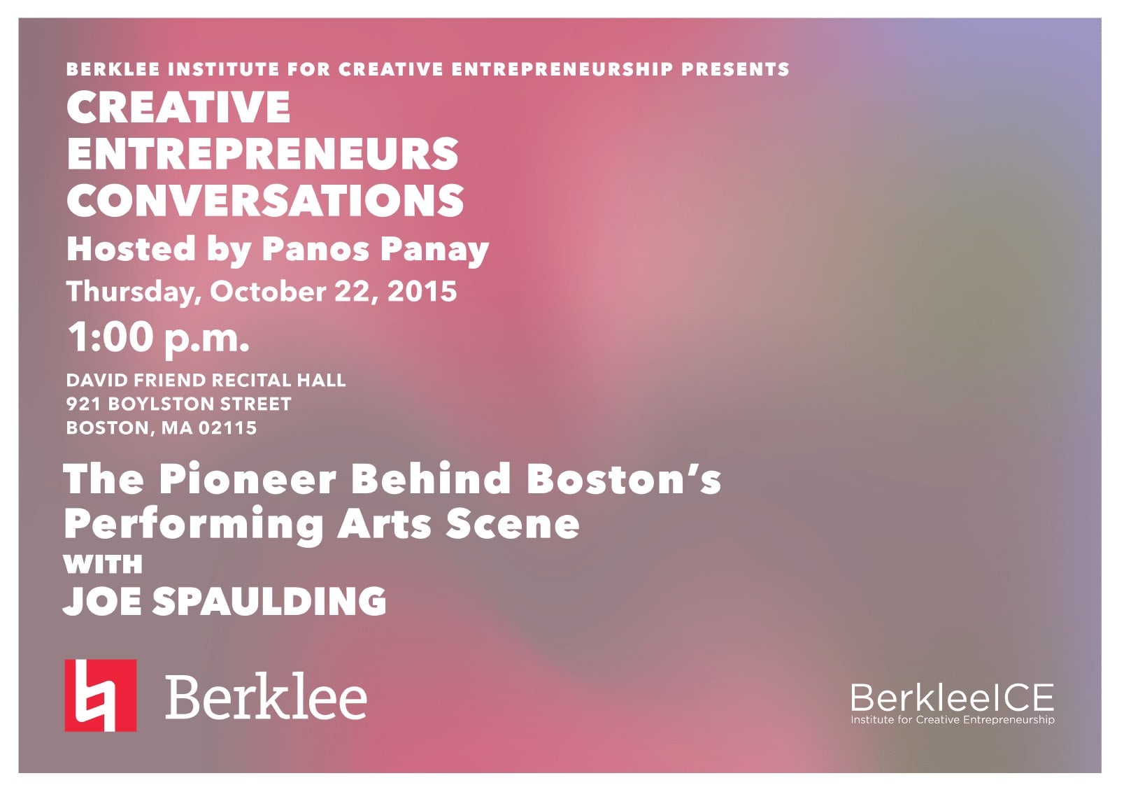
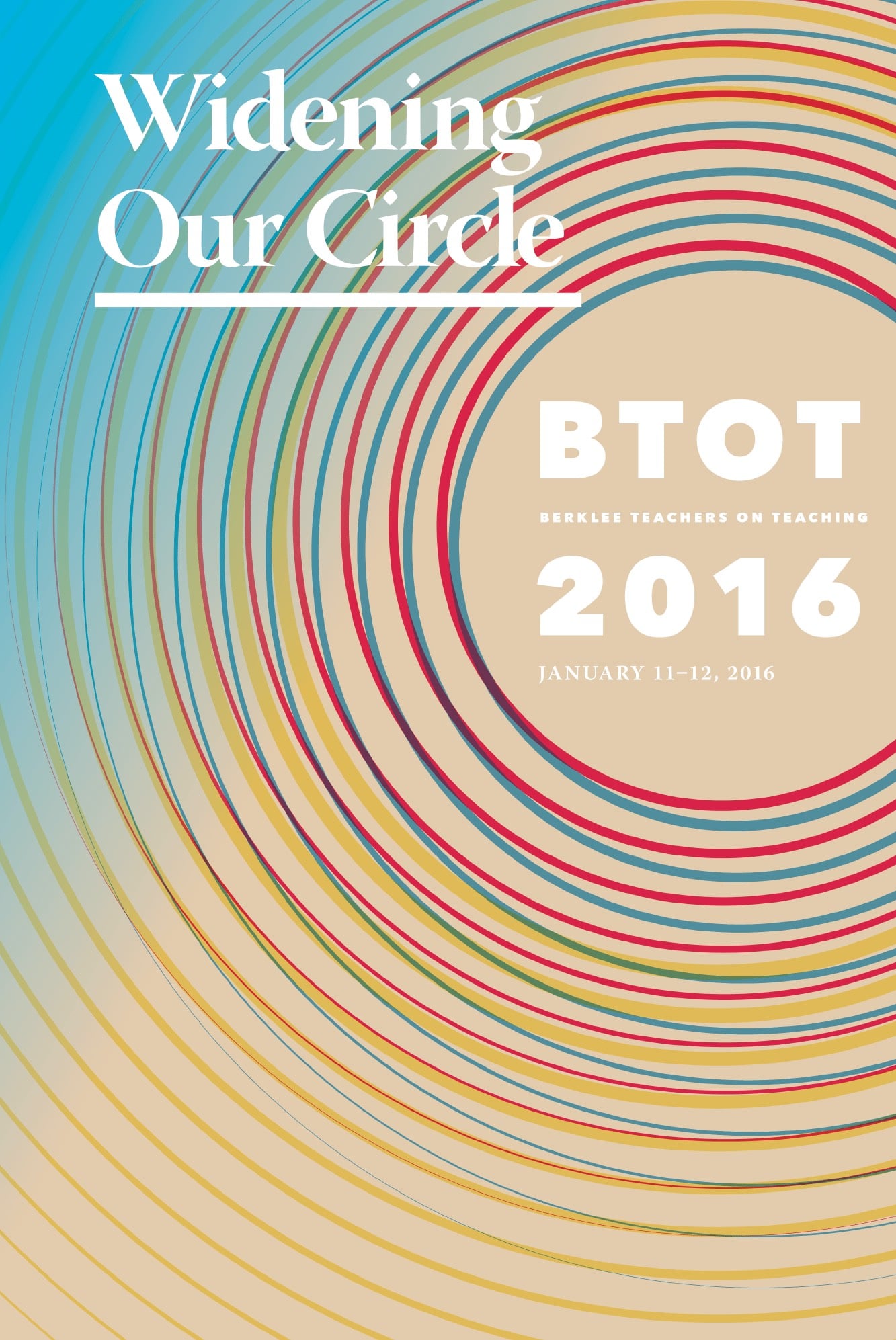
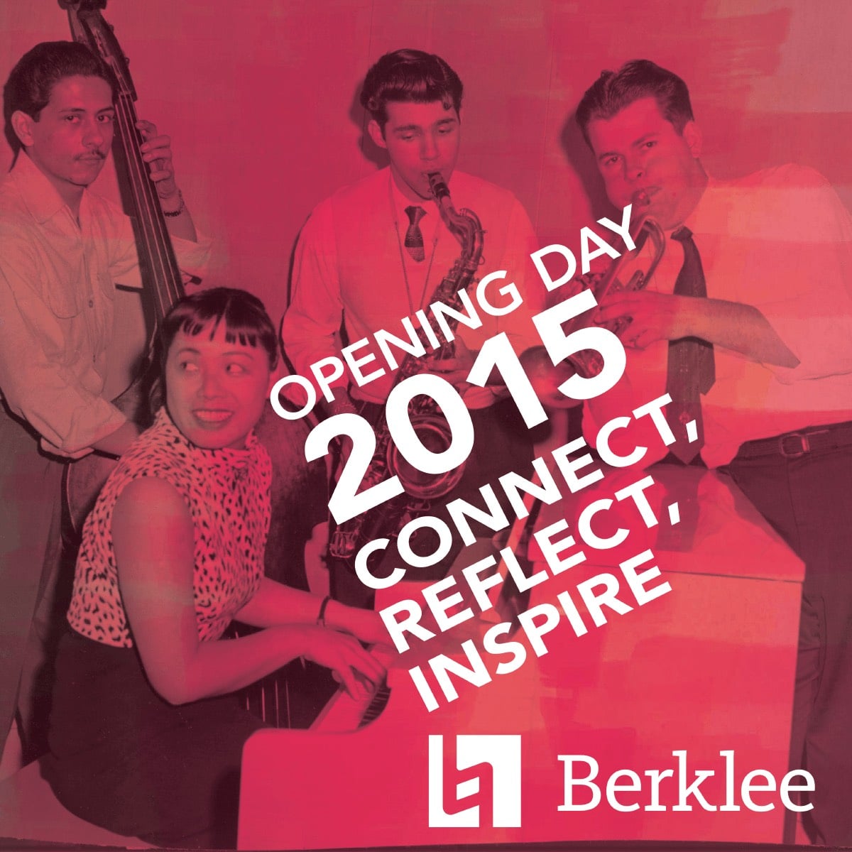
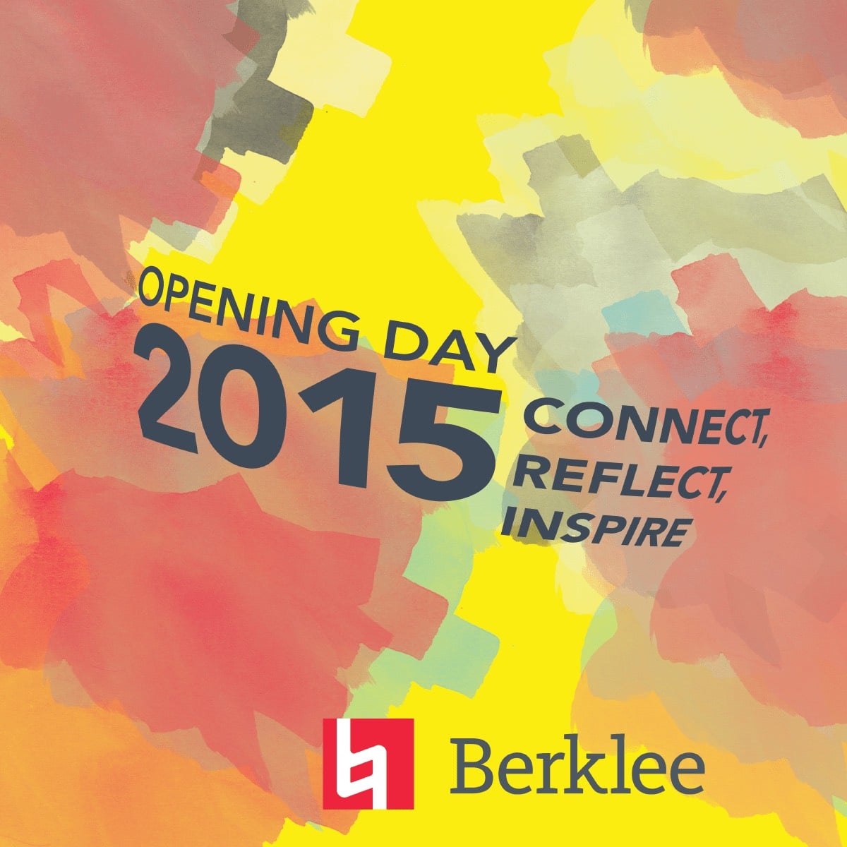
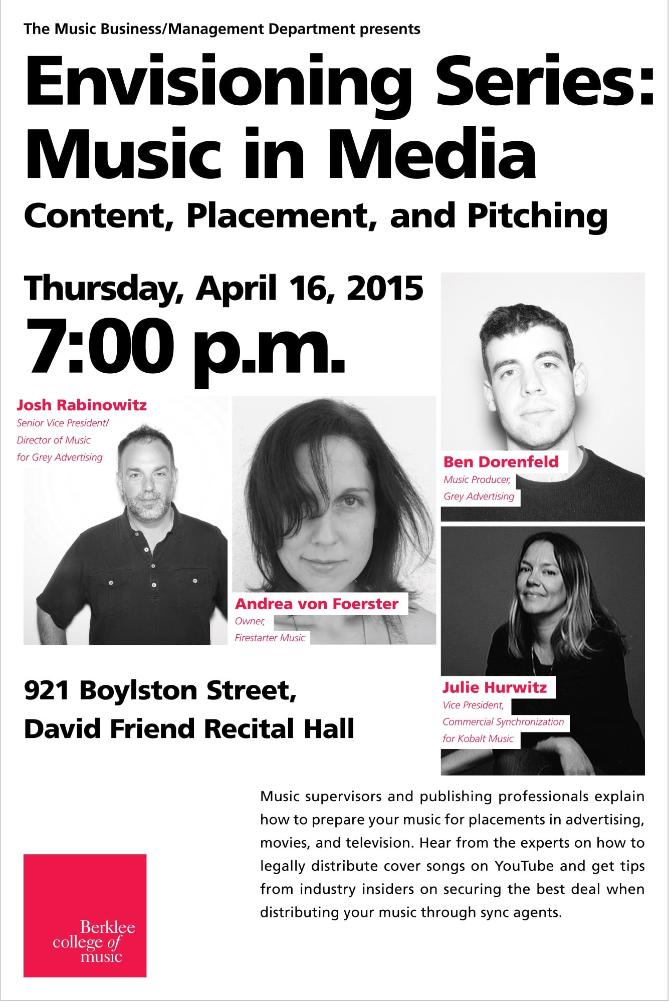
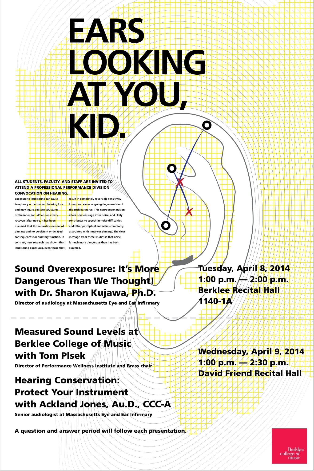
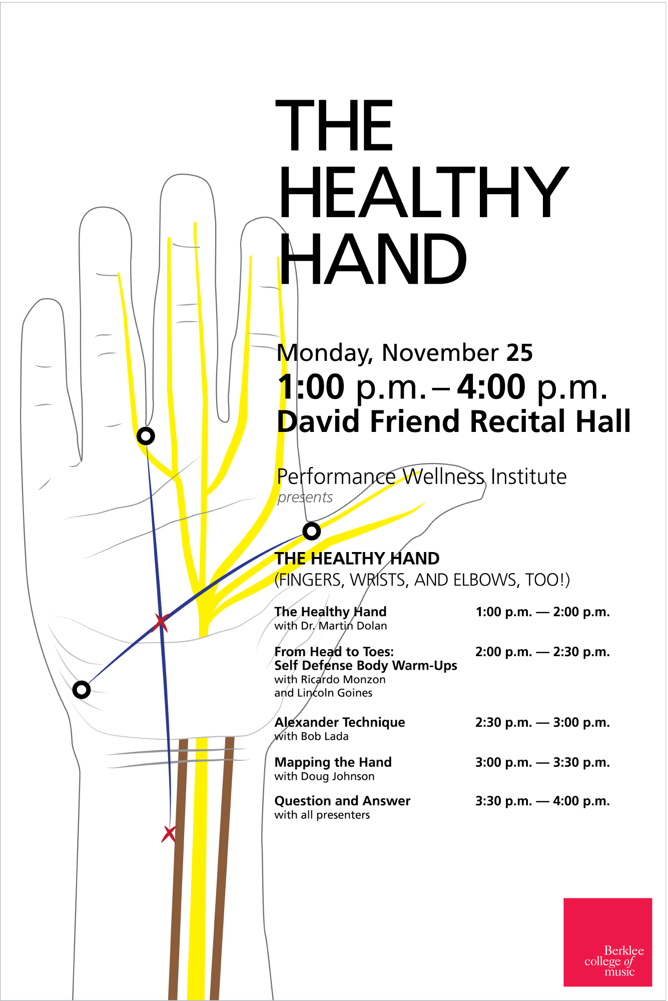
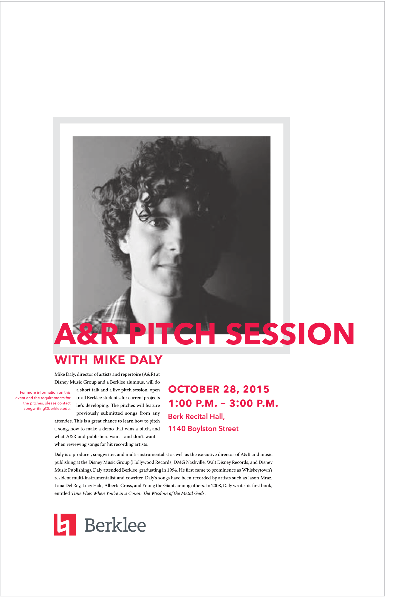
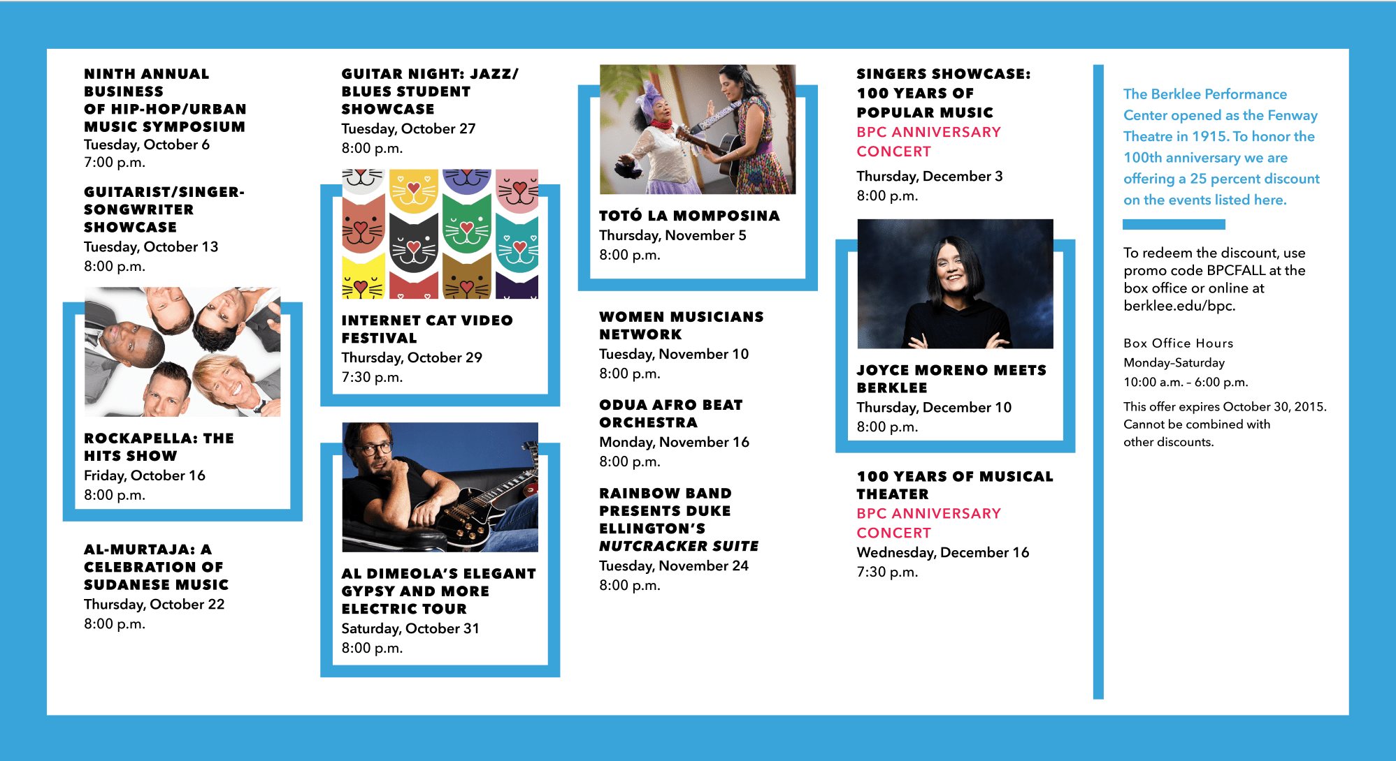
I’ve done a lot of work for large companies and big institutions. My work for universities is where most of my graphic design work was done. Berklee College of Music being my biggest and longest run for poster work. It was a particularly fun gig.
Sometimes you’re creating concert posters, other times you’re crafting mailers. From print to email, managing the .edu site, creating art for some marketing campaign, and a-lot of maps.


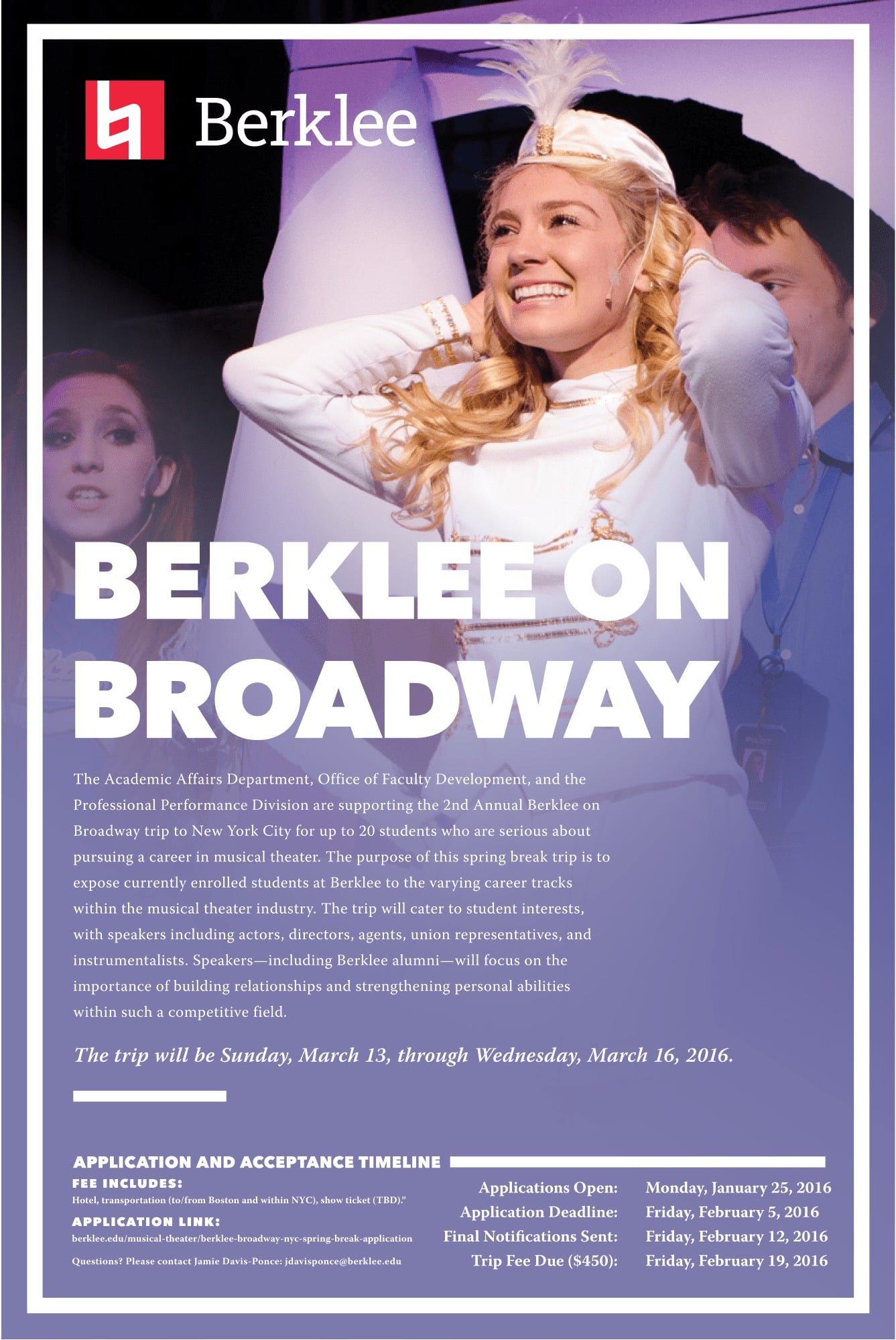
But this kind of work has obvious outputs from clear inputs. Sometime it’s less straightforward. Take the design work for the Performance Hall at Berklee.
As with many universities and colleges, their different departments usually like to stand out and spend some cash on drawing attention to themselves, outside of their master brand, (MIT was notorious for this but has gotten better in the last couple of years). The Performance Hall at Berklee wanted a better poster and mailer design system so they could promote their concerts.
From discussions with the concert hall team, I created a pattern, one I could build a visual language with. There are big concerts, and minor shows. Different types of concerts throughout the year.

Creating a strong container for each event, some with images and some without, and overlaying the event title within each container, allows for a calendar reading for outdoor installations, single squares for social sharing, and packaging that fits mailers and email blasts.
Strong type scaling down, with each event placed on a grid, a grid that allows for scaling each container larger or smaller depending on importance. It works from 12ft, down to 300 pixels.

How I approach visual work.
Anything I design has to scale. I learned this principle while working at an architecture firm, that all the parts of the whole have to be considered. That these parts be a cornice, a typeface, an image, or animation, each part needs to support the whole as the design scales with use.
Those of you that remember the ”before” times— when responsive design wasn’t a thing, that a lot of the design profession was trained to think in terms of static, never changing forms. This is where my background differed.
My architecture education was very different to most of my peers in the design profession, it focused on a deep research cycle. Considering an entire community first, before considering the building. Even in 2006 this was still unpopular in the training. I studied the work of Christopher Alexander whose book “The Timeless Way of Building” described his idea of a Pattern Language. These patterns in architecture seem to almost anticipate the popular idea today that humans interact with any design in dynamic ways. Static architecture doesn’t work overtime. Static designs don’t satisfy the demands of what visual communication requires. Static design does not scale, cannot be reused, cannot be adapted, and cannot grow with changing needs.

A poster with a grid system printed once, can also be printed again at a smaller size, if the scale is considered in the design. Like a website that constantly evolves and grows, buildings usually change and morph whether the designer thought of it intentionally or not. The essence of a pattern languages is the growth and adaptation to meet the needs of people.
This thinking is missing from most of the modernist approaches to Graphic Design, and was missing in the slice and dice era of web design. Now the profession is relearning what has been forgotten.
Design that scales, adapts, and morphs to the needs of the people that use it.
Find the patterns in how people have been communicating before, structure around these patterns, simplify, and execute.
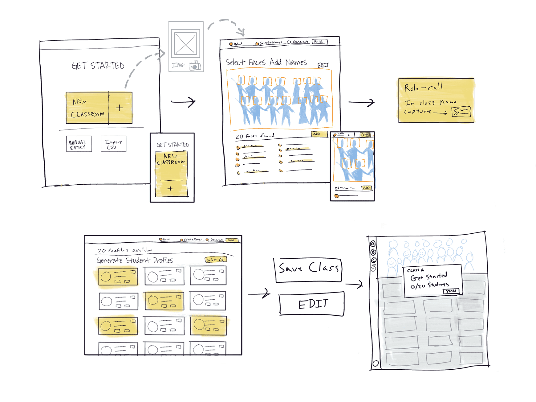
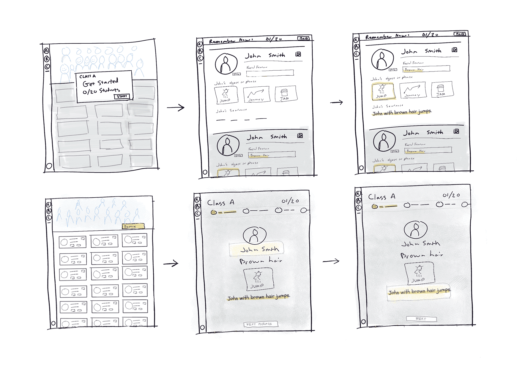
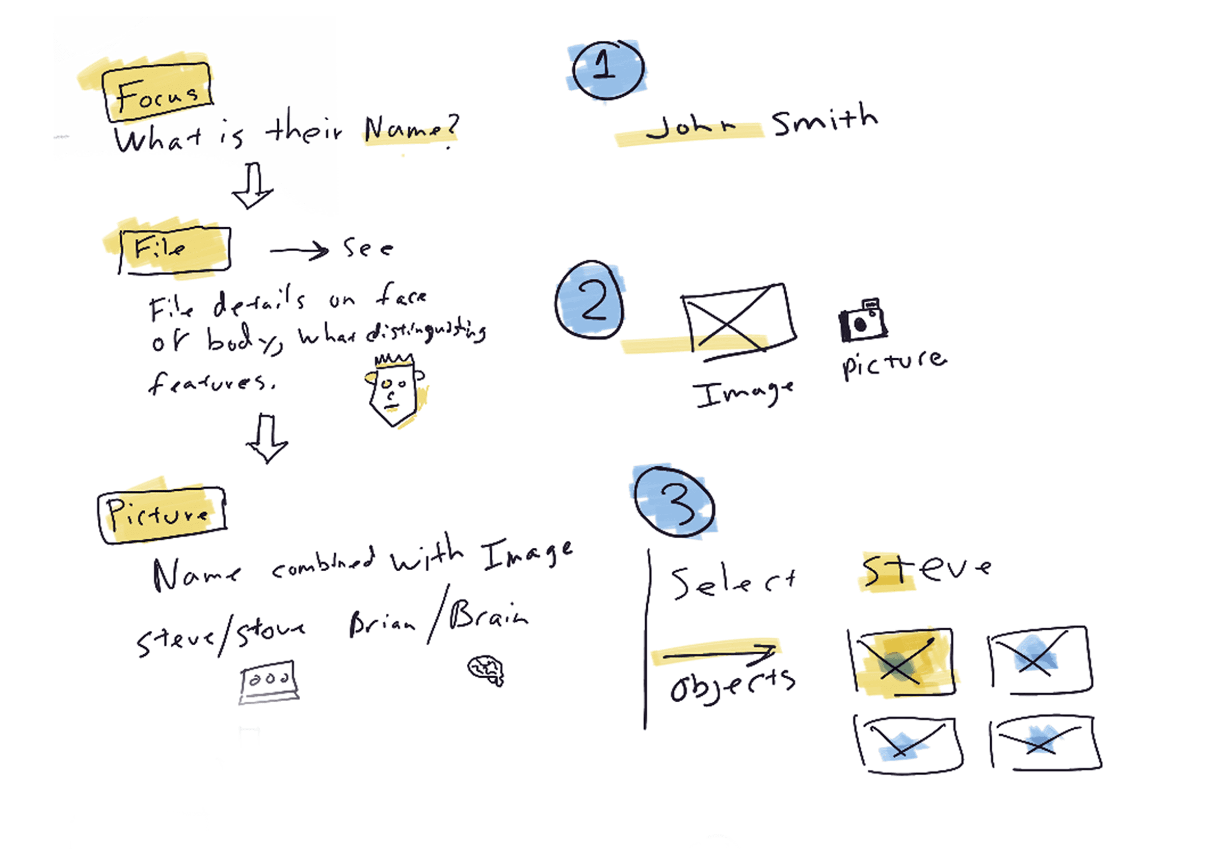
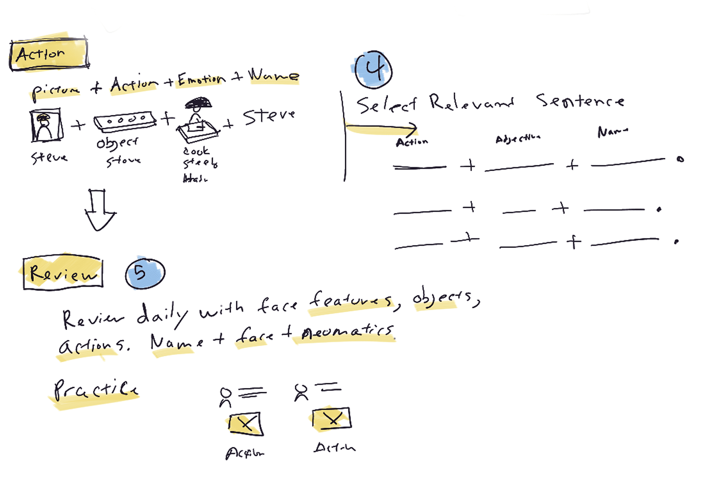
If you need further examples of my work, please check out some of these case studies.
...would be here if I added them.