MIT police.mit.edu Website UX Audit
Helping the police reach out to the whole MIT community.
-
On Behalf Of
- MIT
- Information, Security, and Technology
- MIT Police Department
-
Service Provided
Research -
Project Date
January 3rd, 2017 — March 13th, 2017 -
Deliverables
- Site Audit
- User Research
- UX Recommendations

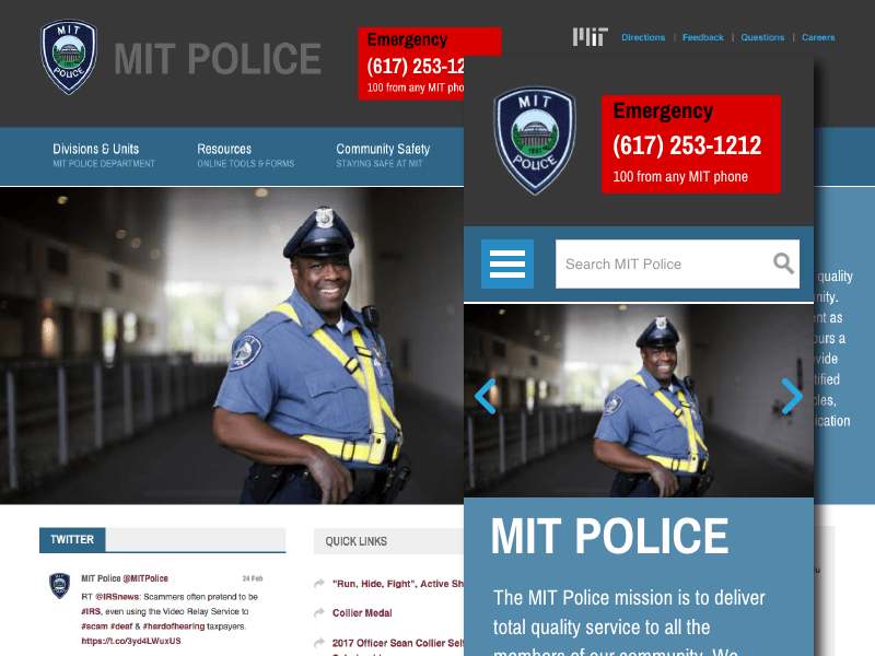
Running a series of audits, looking at critical areas such as user flow, content and site structure, way-finding and navigation, accessibility, discoverability, and UI design concerns.
Taking a Look at the MIT Police Website
As part of the UX team at MIT, I audited the MIT Police website to present my findings to the police’s communication team. Working with other team members, we ran a series of UX/UI audits looking at user flow, content, site structure, way-finding, navigation patterns, accessibility, discoverability, and other UI design concerns. We added to our findings some recommendations that would improve the overall experience for the MIT community and police.
Working with the team, we divided and began pouring over the entire police.mit.edu website. After our team had looked over the site, and shared all of its findings, I took the lead and began digging deeper, uncovering some problem areas.
Introduction
Talking with stakeholder
Talking with the stakeholders revealed that the primary reason the site was to be refreshed was frequent user confusion in finding specific rules, regulations, and safety forms. Getting a sense of what users were looking for proved invaluable.
A hunch
Validation of our hypothesis.
After several discussions with users on campus, a pattern of behavior on the site was emerging. Key areas were always searched for, often not found.
Observation
Look at content
I went through the many pages of the site and cataloged the sitemap and ways the content was read.
Auditing
Visual Audit
Site design was on the table, but making sure that there was value in a site redesign was important. Looking at the visual design and how it affected usability.
Testing
Testing Usability
Informal usability tests where run. The goal of getting a little more concrete data on what precisely the users where being blocked by to get to the content.
Accessibility
Testing Accessibility
Perhaps the most critical test we conducted was the audit for accessibility. We tested the site for ease of use with screen readers and basic inclusive techniques.
The findings were reviewed and discussed with the larger MIT UX team; we refined and created a brief for the MIT Police to review. I then was tasked with presenting the findings to the stakeholders. I created this document to help: MIT Police Site Audit PDF.

The Results
Part of the key deliverable was a written deck with a breakdown of the site's problems and strengths. Most of the information we uncovered needed to be refined, condensed, and toned down for the right delivery. I was making sure not to browbeat our stakeholders but instead take a neutral stance. Graphics and charts were created, and lists of actionable items presented in the formal briefing.

What was observed to not be working:
Flow: Content discovery is confusing. Link duplication doesn’t fix the confusion and only adds to the “choice overload.”
Structure: Page content structure is not well defined. Placement of copy, images, and links are confusing. The discoverability of critical items is obscured.
Navigation: A heavy reliance on linking between pages has the user bouncing around to find the desired content. Navigation is clunky.
Style: Page style elements are inconsistent, making it hard to differentiate some elements from each other. The screen is full, but useful content isn’t present.
Discoverability: Confusing segmentation of content makes it hard to find out exactly which content the MIT Police think is a priority.
Accessibility: We tested the site for ease of use with screen readers and basic inclusive techniques. There are vital issues that need to be addressed.
Recommendations
Clean up the header section of the site: Refine top header to take up less vertical space and transition smoothly. At the same time address accessibility concerns.
Refactor Navigation Patterns: Make your page content easier to discover. Refine existing navigation to be more easy to use and address accessibility concerns.
Make images matter on the page: Make sure the right image is used for the story told on a page. Reduce amount of visual space images use while increasing their utility and delight.
Make page structure more natural to read: Structure pages with clear calls to action and purpose. The layout needs to drive users to their goals with the least amount of distraction possible.
Refine the design: Refine the design to reflect a more consistent aesthetic that represents MIT’s finest in uniform to the community.
Outcome
How was this information was used/received?
The MIT Police Department where thankful to have this information on hand.
The department decided that a refactor was wiser than a full a redesign.
Accessibility became a priority for the department.
Other departments where able to see the value in running a UI and UX audit.