MIT Graduate Appointment Portal UX and UI Enhancement
Making the Graduate Appointment Portal a more useful tool by enhancing copy and creation of appointments, making data entry and appointment creation faster, easier, and more intuitive.
-
On Behalf Of
- MIT
- MIT Information, Security, and Technology
-
Service Provided
Problem Solving Research -
Year Active
January 1st, 2017 — June 13th, 2017 -
Deliverables
- Research
- Artifacts
- Wireframe
- Emails
- CSS/HTML

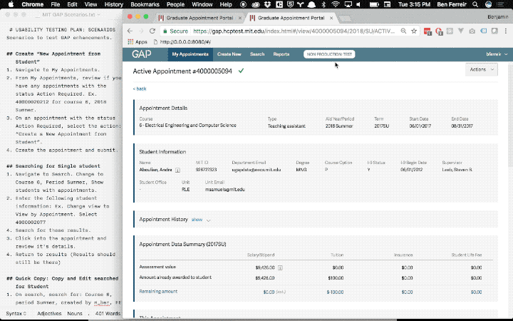
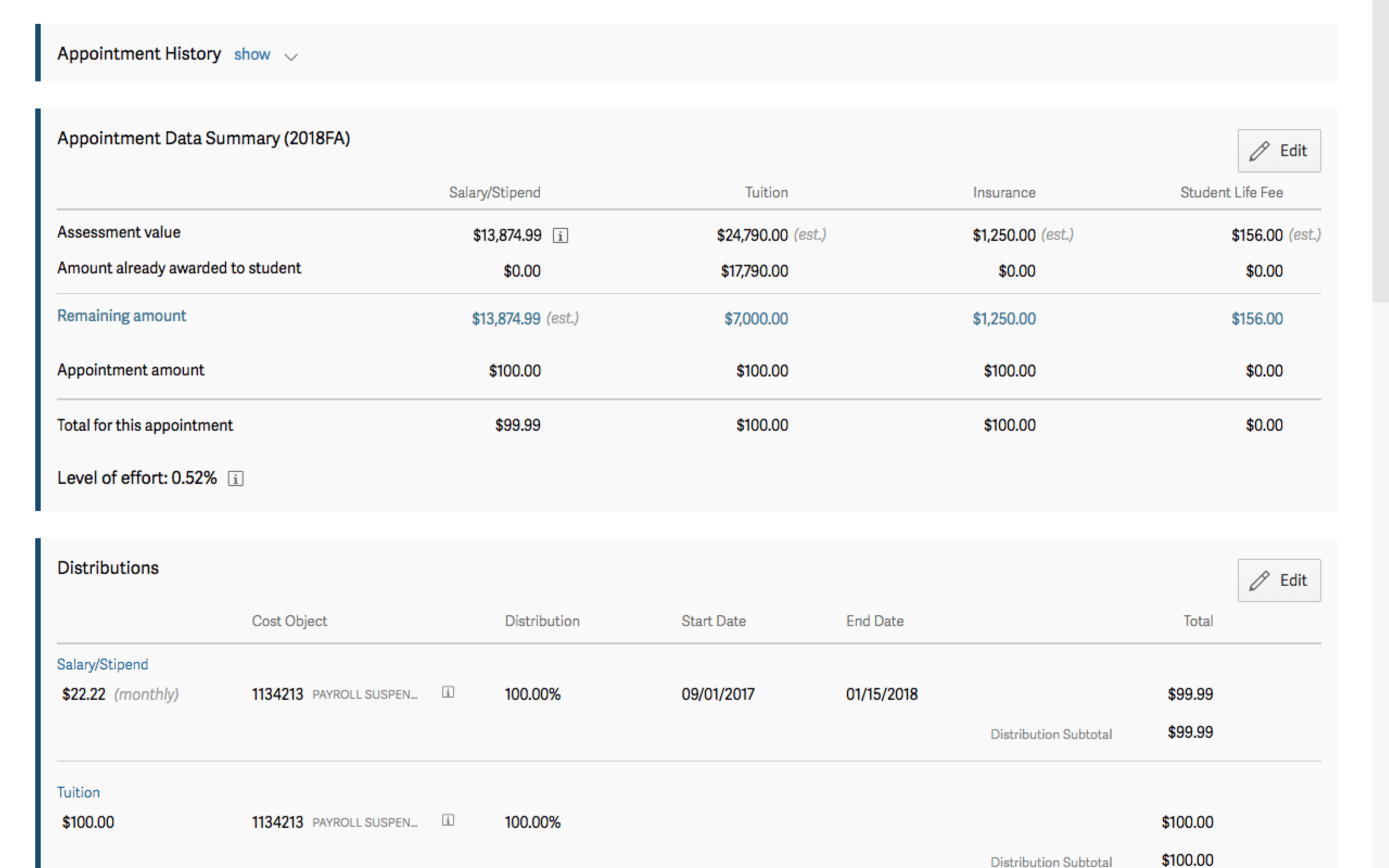
TLDR: Users faced too many steps to accomplish basic tasks in their appointment creation. It became obvious in interviews that simply allowing group copying of appointments, improving readability of the detail pages, and increasing the usefulness of specific table views of their data would reduce their time in the tool, and after my designs where implemented we saw a 4x reduction in time spent on workloads.
Graduate Appointment Portal, and a summer update for 2017.
While on contract at MIT, I worked on an internal SAAS web app called the Graduate Appointment Portal, to make it a more useful tool. While testing with the users of the app, I was able to reveal that by refining the copy and creation features of the app and making data entry faster, easier, and more intuitive, it led to better usability across the experience. For admin, staff, and students on campus, my designs were proven to help, post-project.
MIT’s information security and technology UX team focused on discovering, researching, and designing solutions for a series of problems that users had experienced with the Graduate Appointment Portal. Leading the UX audit, I ran a rapid discovery strategy. Within a month, I was able to interview seven administrative users, gather and prioritize their pain points, discuss, and iterate through their problems with the product team. After the issues were defined, I helped guide the scope of the design sprint with the project manager and developers, ensuring a focused deliverable that solved the right problems.
What is GAP?
Graduate Appointment Portal (GAP) is an application used to create graduate awards such as Fellowships, Research Assistantships, Teaching Assistantships, and Instructor/Graduate appointments. In spring 2017, GAP replaced the Web Grad Aid (WGA) application. All appointments from June 2009 (the aid year 2010) were migrated into GAP, and appointments before that date were archived for viewing in a legacy tool called the Web Grad Aid application.

Why did I get involved?
With a hard launch of the GAP application in early 2017, two years' worth of design and development effort came to a close with the hopes that the newly released GAP would be a steady improvement from the old paper process it replaced. From an administrative and data integrity perspective GAP solved many of the previous systems problems, but data entry users, the principal owners of the graduate appointments, became vocal about pain points they were encountering.
I became involved in summer 2017 to smooth over some the post launch issues, research the problems encountered, make recommendation on solutions, then test and validate with GAP users across MIT's campus.
Process
I began capturing the existing UI and workflows described by users, compared with my own observations, in preparation for user testing the GAP tool. I interviewed a diverse group of department administrators across MIT, some with large and small workflows to accomplish with GAP. Looking for patterns and a common ground to work with, I created a interview guide in prep for this. After interviews came ideation.
After a series of low-fi sketching sessions, I used Sketch and Invision to create prototypes of possible solutions to observed problems. First focusing on layout and typographic refinements, and later building out new functionality like "Quick Copy." By the end, this rapid prototyping method allowed for quick turnaround, developer engagement, and high fidelity prototypes for stakeholder and user delight.
One of the tools I use are Job Stories:
When I am creating a lot of appointments, and have a deadline, I want to be able to quickly fill out an appointment, so I can move to the next one. Often it is a struggle to create a lot of appointments quickly and it is frustrating when many are just copies with small changes here and there.
Job Story: the situation, context, and job to be done a user faces.
How we got to success.
Seeking validation on the proposed design changes and enhancements, I ran a user testing and usability session with those I interviewed and new users alike. Getting quick validation helped give the team confidence to build out features early, pleasing the apps stakeholders enough for the enhancements to be pushed to production quicker than usual.
When we did our own QA testing and UX testing, the developer and I worked hand and hand to deliver and refine the solution as technology challenges arose. Many of the recommendations were difficult to implement within the GAP front end framework (A SAP Fiori Frontend with custom components), but despite these challenges, the final product balanced the compromise between performance interface and user needs. We collected data to backup our thinking, measuring improvements over the GAP tools launch baseline.
Wrapping up, individual testing sessions helped determine whether or not my solutions solved user problems. After 5 user observation sessions, it was being observed that the new GAP features had achieved the goal of making data entry and appointment creation faster, easier, and more intuitive.

Process
Project Manager kicked off the discovery phase.
Designer and team members interview stakeholders.
Designer and team members interview/observe users.
Team writes [Job statements/story].
Team and some stakeholders ideate through possible solutions.
Designer creates [product brief]
Team creates a [system map]
Designer creates a [prototype]
Team creates the [release roadmap].
Out of scope items put on backlog
Designer and team pitches the product design to the stakeholders.
Team revises prototype and release roadmap.
The team began the discovery sprint with interviewing several key users of GAP. We were looking insights on the real problems users faced. The right information. We listened in and observed things like; users accomplishing tasks, looked for previously unmentioned pain points, and any successes or failures the users encountered. We asked questions to gain a deep understanding of the problems. We followed up on these answers looking for root causes.
It was critical that the team did not lead the users and that the observed experience was unfiltered. We did o run help sessions. It was an interview session, not a session. We listened only and responded neutrally.

Results + Exit
The design sprint was a success. Giving copy actions to users at the right time, improving table views, preserving search results when working with a set of appointments, reducing clicks to submit appointments, and many additional design tweaks were tested to show improvements in usability.