Making Next-Gen Research Tools
Cutting Edge science meets modern UI. Contract work with Foundation Medicine was focusing on designing around existing EHR and Healthcare research and reporting web applications.
-
On Behalf Of
- Foundation Medicine INC.
-
Service Provided
Prototyping Development Design & Craft -
Year Active
January 1st, 2016 — December 1st, 2016 -
Deliverables
- Research
- Artifacts
- Wireframe
- Emails
- CSS/HTML
Foundation Medicine UX and UI Work
Designing for Healthcare
Foundation Medicine is the premier cancer genomics testing and research company. This company specializes in advanced DNA/RNA cancer screening and testing, helping physicians, oncologists, and hospital support staff across the world better treat their patients. Cancer research tools are evolving, and Foundation Medicine was uniquely positioned to deliver the next generation in genomic information tools.
FMI’s Foundation One test is linked to an online portal, containing test results and targeted research, relevant to each patient's unique cancer case. This unique company merges medicine, science, and technology to help increase awareness, accuracy, and guide patients towards cutting-edge cancer treatments.
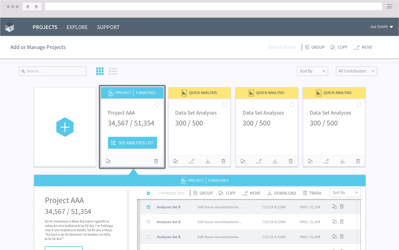
My role during this contract was to embed within the User Experience team and contribute to existing and new digital products — refining, designing, and crafting better experiences for FMI’s customers in pharmaceuticals and patient-related services.
Foundation Medicine Interactive Cancer Explorer
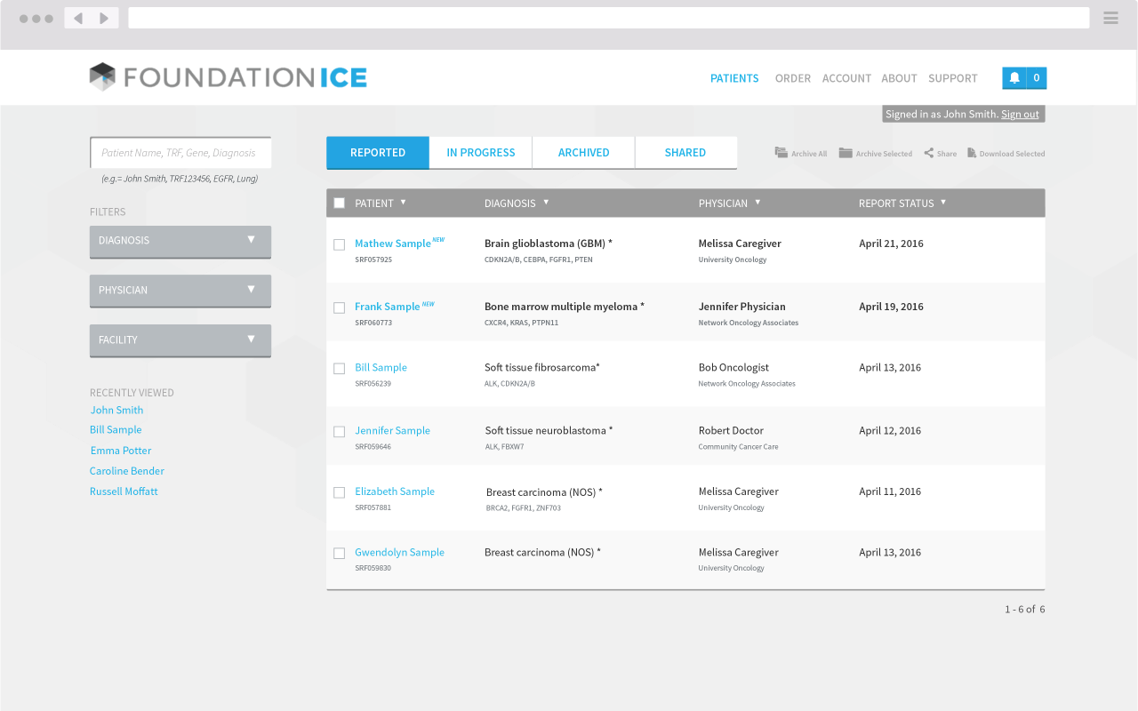
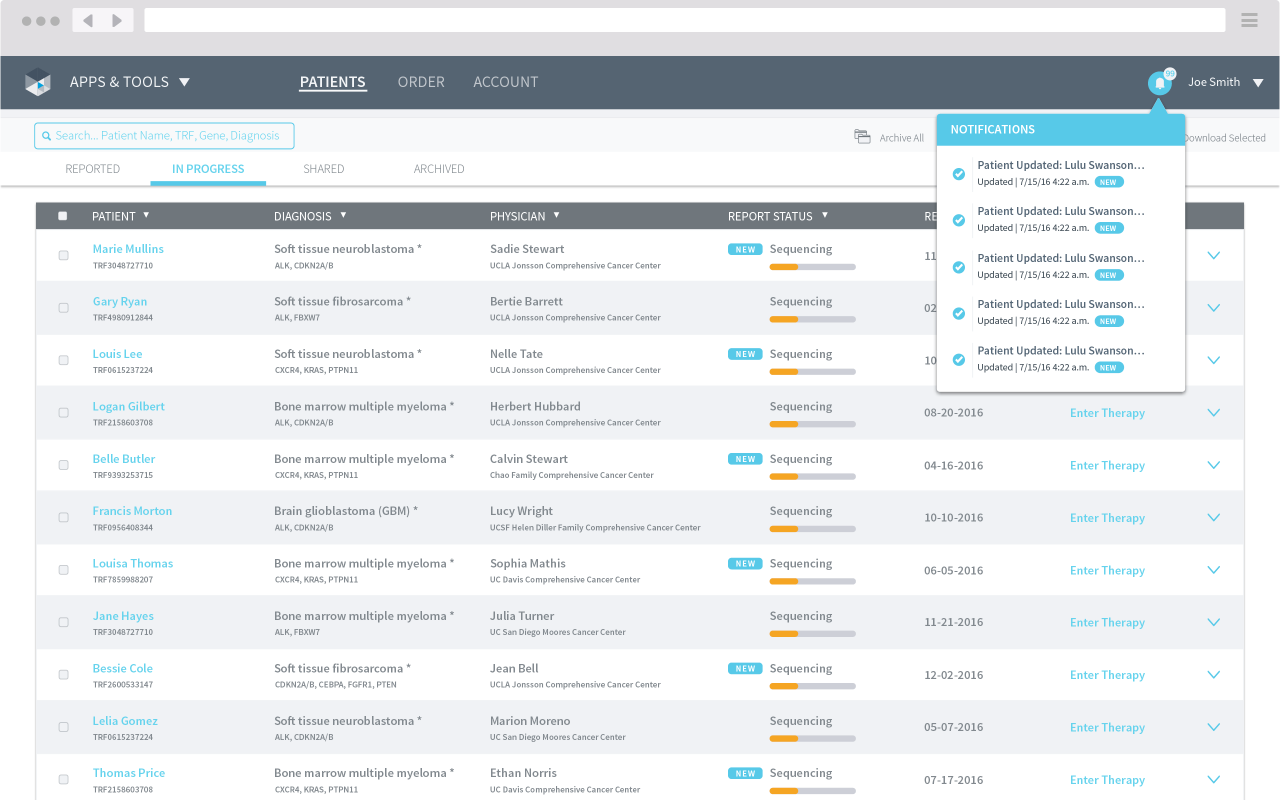
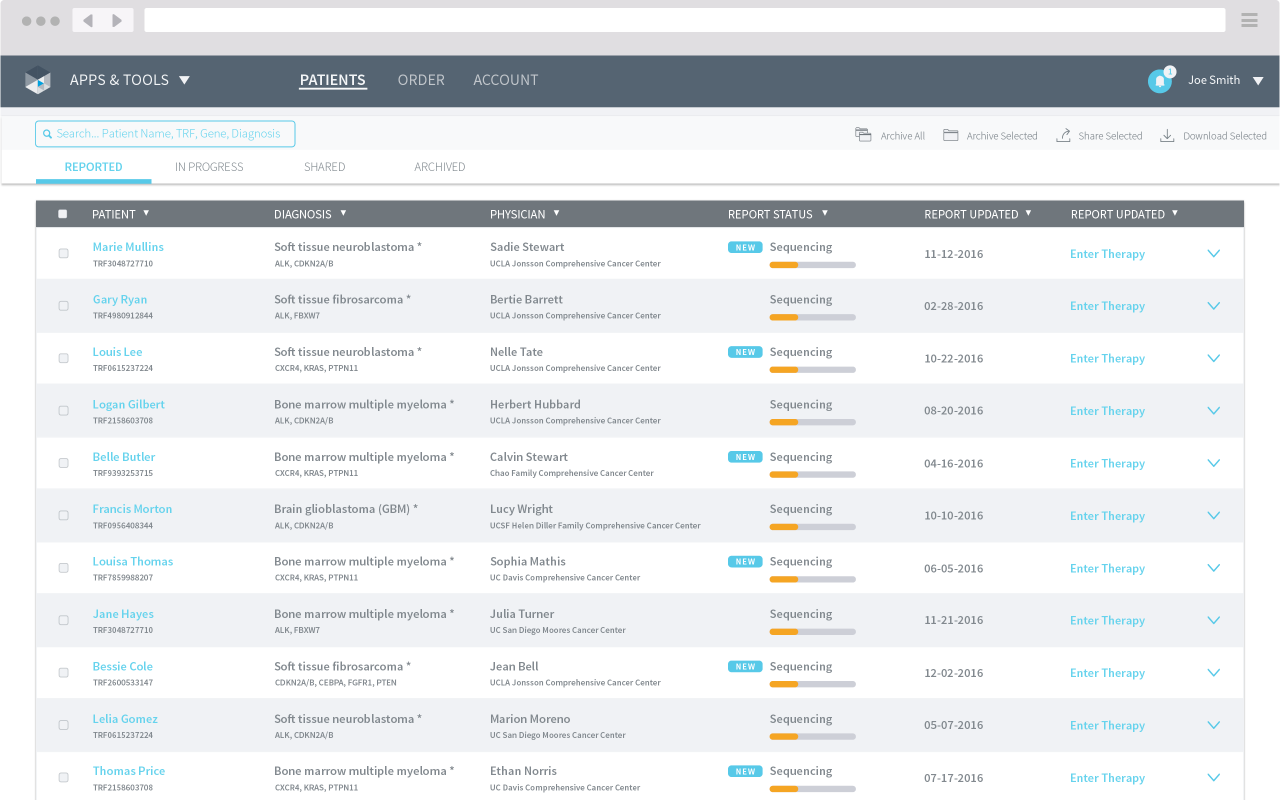
FoundationICE is Foundation Medicines premier web product focusing on delivering complete cancer genomics data to its customers & patients. I worked on additional features and a targeted redesign/refresh of the overall user experience and user interface. Extensive user research drove our efforts to understood how existing users interacted with the product.
While working there, we measured success by keeping tabs on how medical research teams usage improved in accuracy, ease-of-use, and reduction of time to complete tasks. We validated that we reduced the time to accomplish tasks by looking at our analytics and conducting user interviews.
Before ↓
After ↓
Traditional Design Problems

Design studies for Foundation Medicine Insights
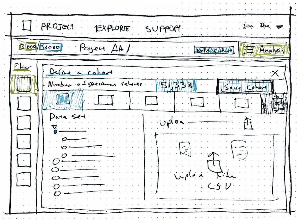
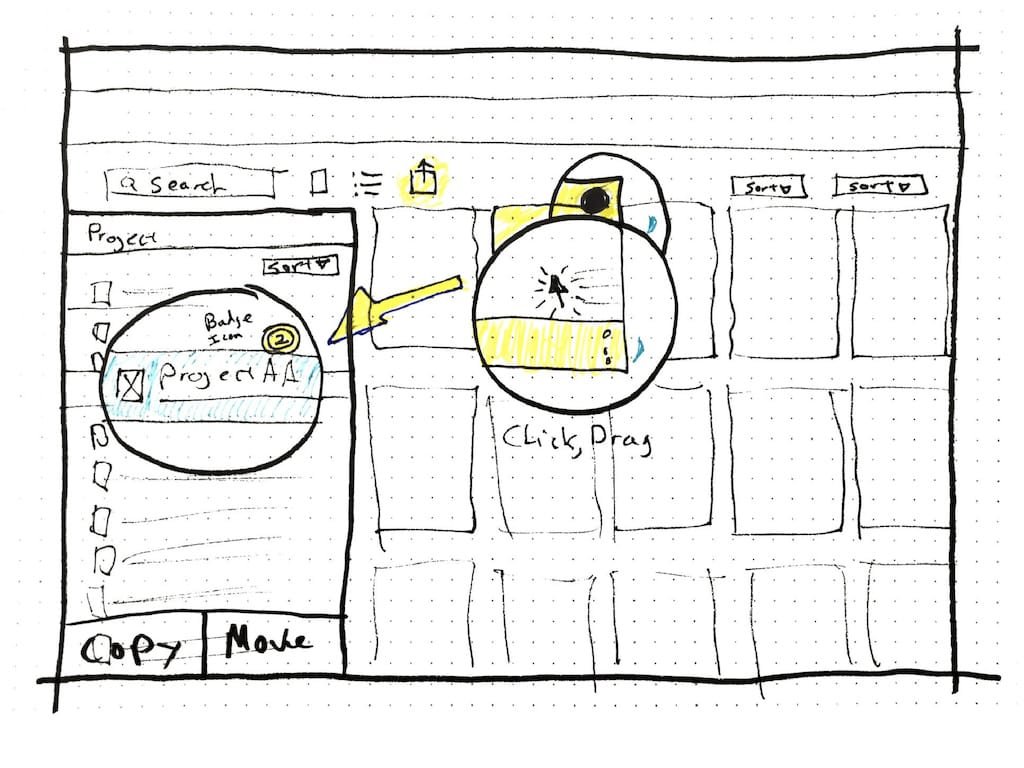
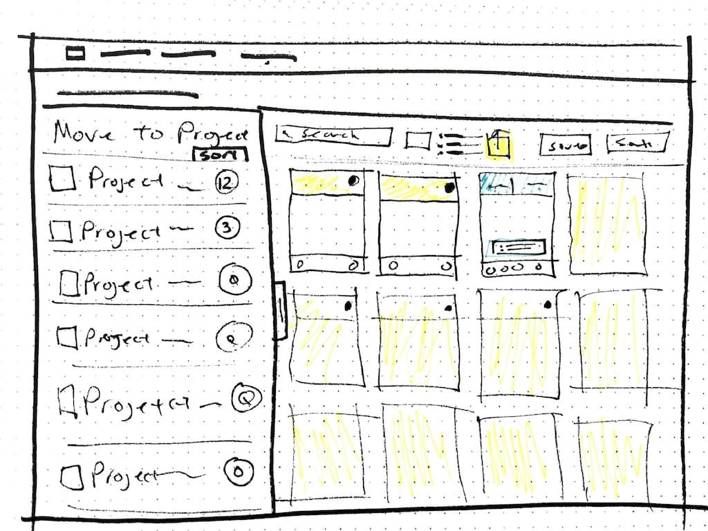
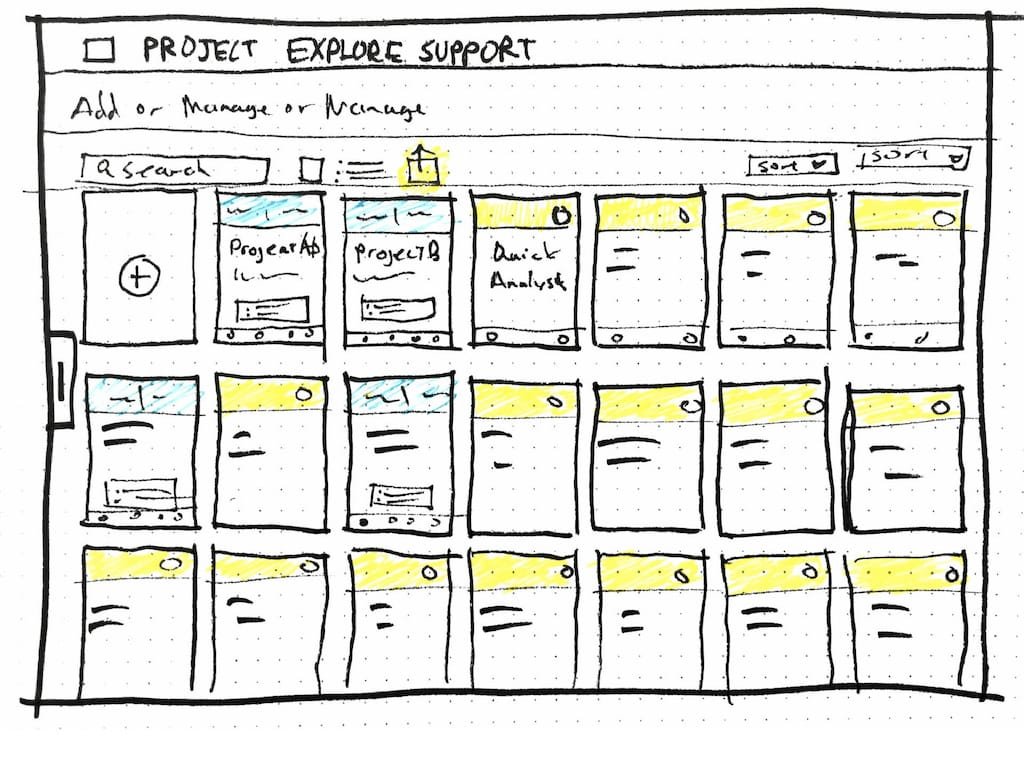
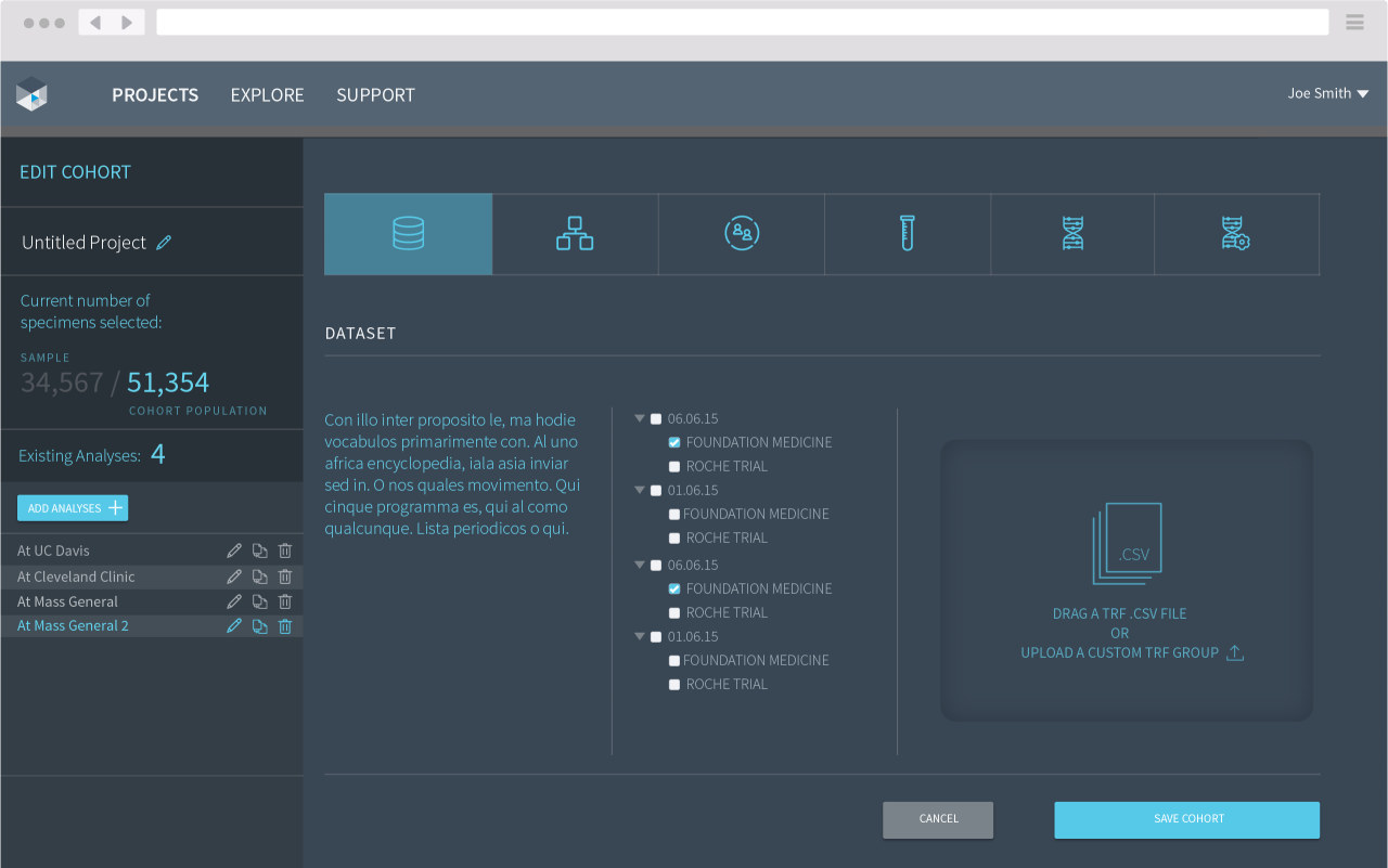
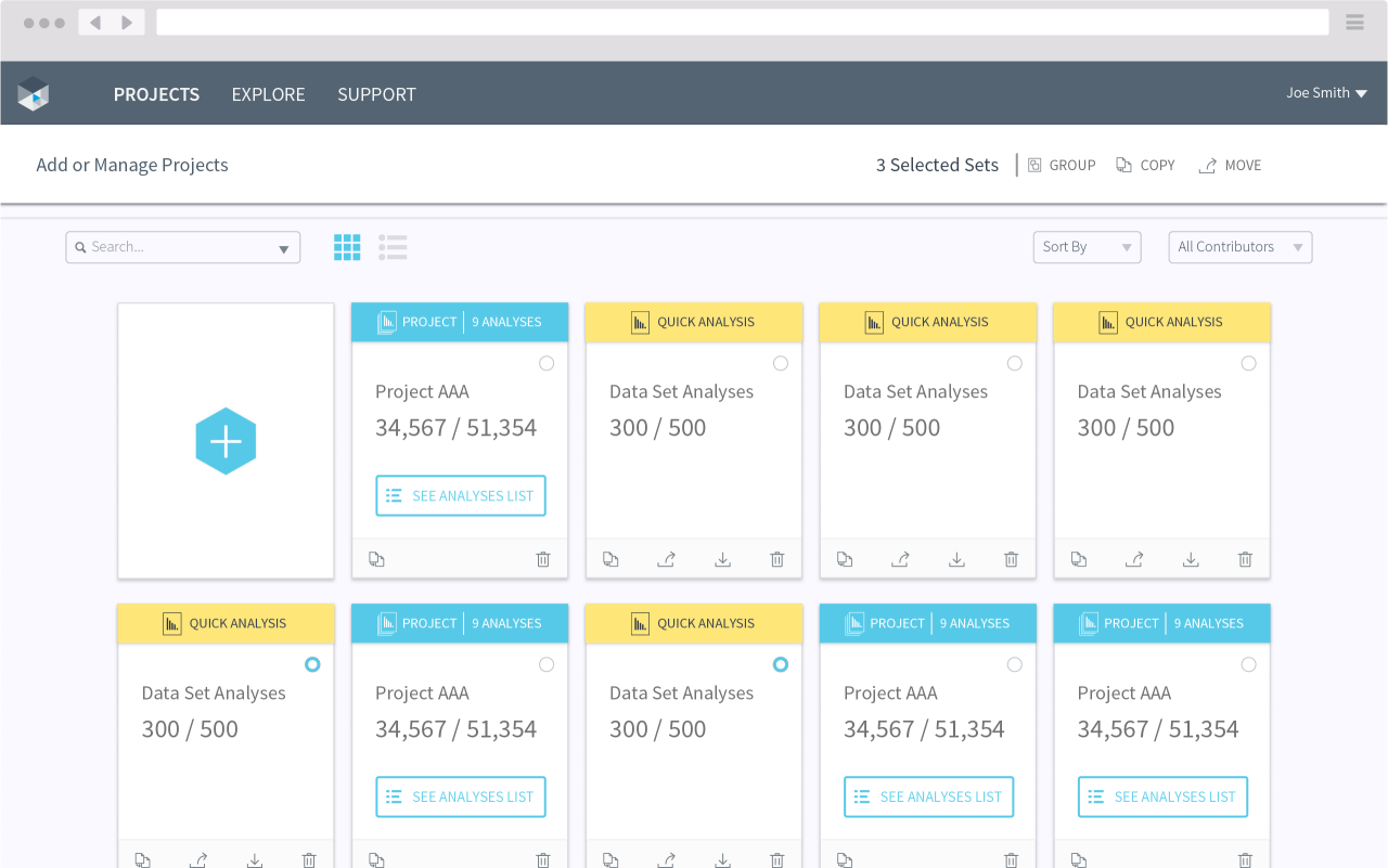
Foundation Insights is a web app powered by pathologist lab-certified cancer research databases that connect real patient data with researchers across the world. The research tool allows customers to view, download, and visualize data to better compare data between cohorts of patients securely from their organization datasets. Patient data is protected, de-identified, and normalized across 100,000+ FMI’s verified patient cancer reports.
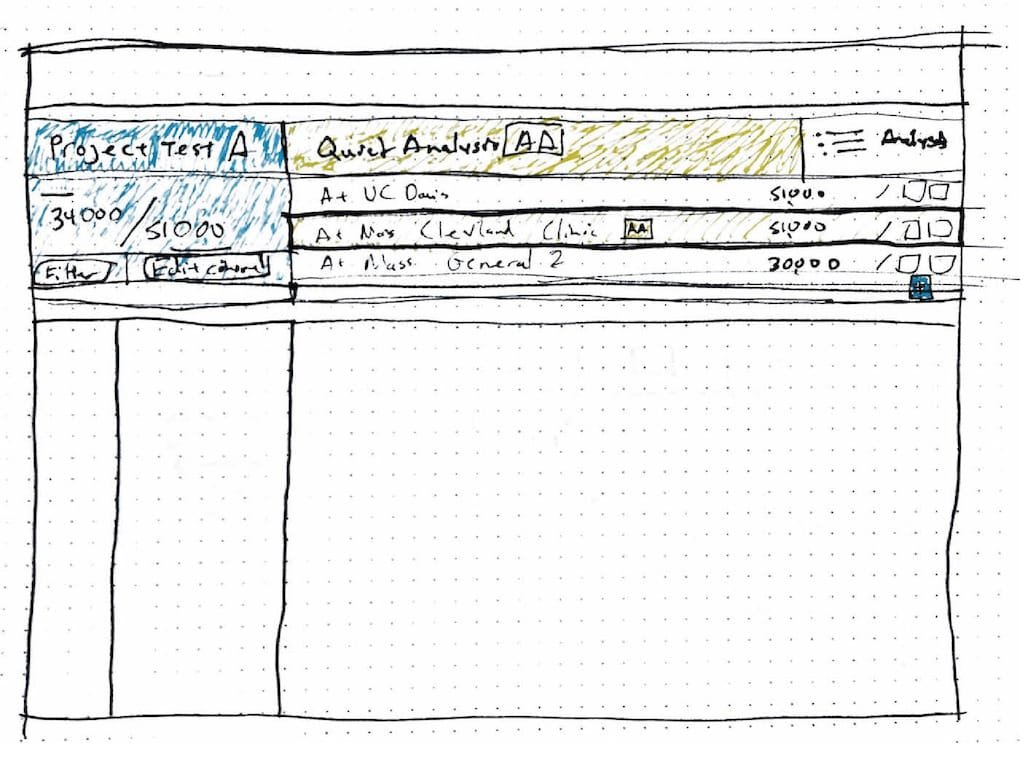
The unique design of the app allowed for powerful filtering and cohort creation while maintaining complete control over the complex data. Visualization updated in real-time and was rendered in the browser using responsive mobile-friendly methods.
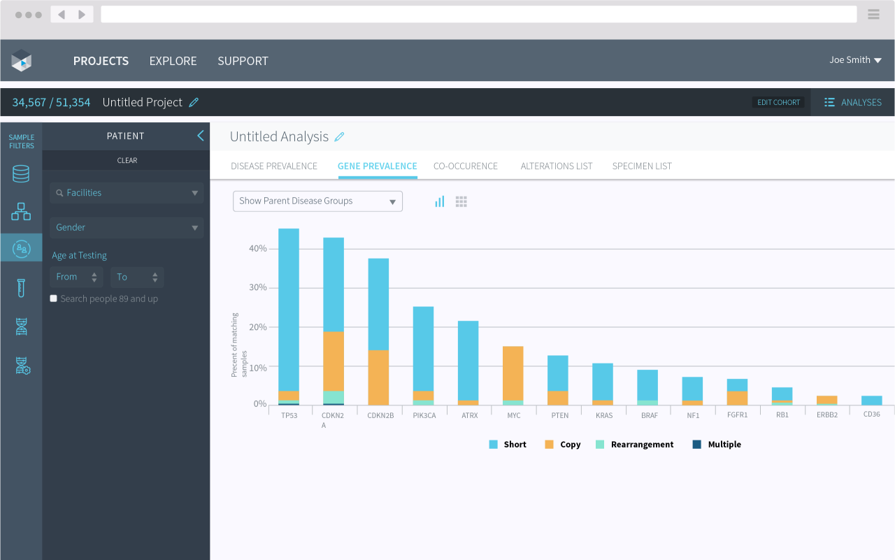
My task was to validate the existing digital prototypes experience and make recommendations on possible improvements. I was working directly with developers, designers, and oncologist researchers in an agile development workflow, allowing for my design recommendations to be implemented rapidly for validation. I audited navigation patterns, filtering methods, and other user affordances, while the team continued to build out the MVP and future releases.
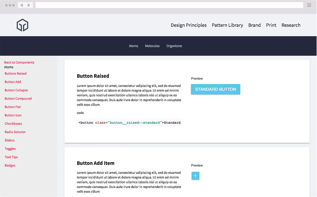
Prototyping a Styleguide with React components and live code previews.
At FMI, building healthcare-related apps required agile practices, modern tooling, and system-based thinking to maintain reliable, consistent, and validated user experiences across the company’s many products. While working with the experienced design team, I was tasked with taking the UX teams research and thinking, and producing a logical system that both respected existing UX patterns and progressive development practices. The result was a series of prototype Atomic Style Guides, built with a design component-based organization and a developer-centric modular system using our developer’s real production CSS/SCSS styles and React.js component systems.
Building a system and talking to the developers.
As a UX/UI specialist thru-out my tenure at FMI, I was continually working alongside developers on producing design and development systems that complement each other. The approach I followed allowed me to understand how FMI built their apps and designed them better.
Discovery
Discovery and Unifying a Product Experience
Foundation Medicine's design team was exploring methods of building a unified product system. I was part of the core team that helped kick off this project.
Research
Research of Diverse Systems
Foundation Medicine's many internal and external products had begun to diverge in branding and user interface design. Gathering these many different component systems and auditing them was crucial to understanding the UX health of FMI's product suites.
Exploration
Sketch and Organize
After a successful audit, I created a system of organization and categorization for the many existing and planned product UI components. The system decided on was the Atomic Design classification system. Simple components were called Atoms, groups of atoms called molecules, and systems and layouts of molecules and atoms group as organisms.
Build
Designing and Developing
As the primary UX designer, I created a living breathing prototype of the style guide system. Built with the same tech stack as FMI's production applications, I began creating a modular component-based website that could house FMI's growing system.
Key Lessons and Results
Key recommendations given to Foundation Medicine
A useful Style Guide should be developed and deployed using FMI preferred environment and DevOps method.
Don’t reinvent the wheel, use existing patterns that work at FMI and the industry.
Make it useful, usable, and delightful
The UI of the Style Guide should loosely match the prototype from design.
The Style Guide should be responsive.
The Style Guide should contain components built like production codebase examples.
Style Guide Components should contain code examples.
The Style Guide should contain static layout images and Brand graphics.
Think with components and share it.
The Style Guide should have a component based system in place.
The Style Guide should sync with production components from production codebases to make sure UI is always up to date.
Style Guide should represent new components that may not exist in FMI app suite.
Style Guide should be easily sharable and contain reusable code snippets.
