Giving music a brand voice.
Building up and working with a world class music brand from the foundation up.
-
On Behalf Of
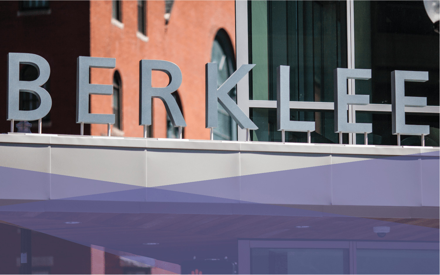
- Berklee College of Music
-
Service Provided
Design & Craft -
Project Date
March 13th, 2013 — March 13th, 2016 -
Deliverables
- Posters
- Cards
- Letters
- Brand Collateral
- Web Images
- Web Designs

Building a Brand
Building brands, when you’ve already been handed all the ingredients, has a bad rap. Frequently you hear from in-house designers that there isn’t room to stretch your feet, not enough “creative freedom,” they say. Sometimes you’ll listen to the same sophomoric voice mention that working in house is easy. Hardly.

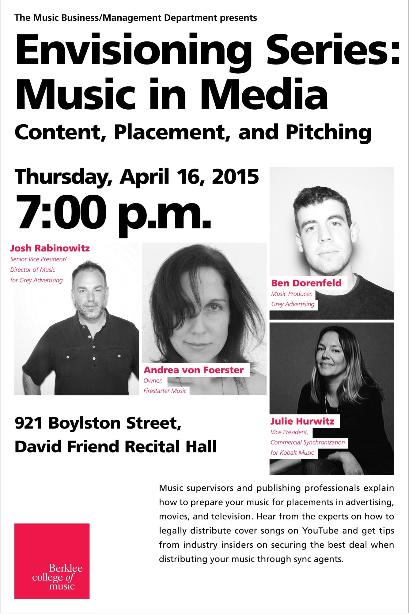
Working in-house at Berklee was a fun adventure. One thing I can say that I have never had my “creative freedom” stifled, and likewise, it has been rare that I can say working in-house was easy. I found working with an existing brand system had challenges and rewards. A brand lives or dies by how it’s implemented well beyond the final approval of the logo, color scheme, and letterhead. At Berklee, creating posters, books, postcards, handouts, keynotes, exhibits, and other print materials gave me hands-on experience in how people interacted with the college and its global brand.


Context and Challenge
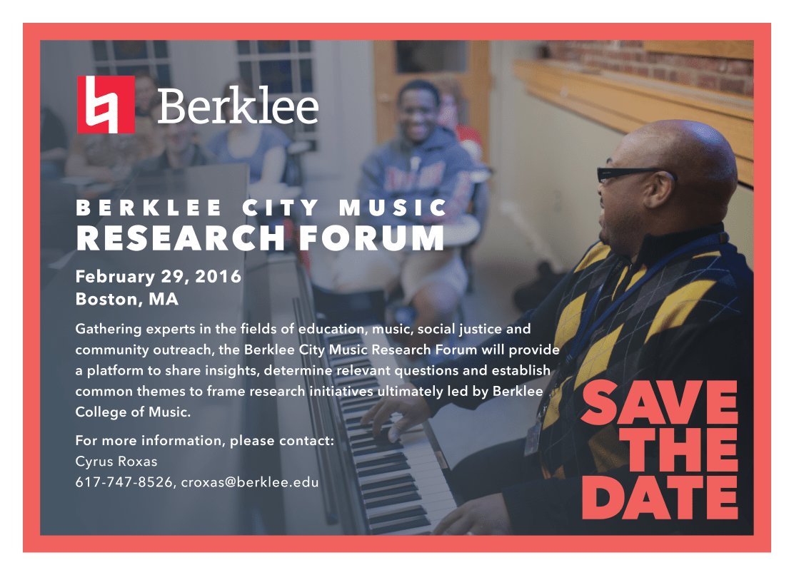
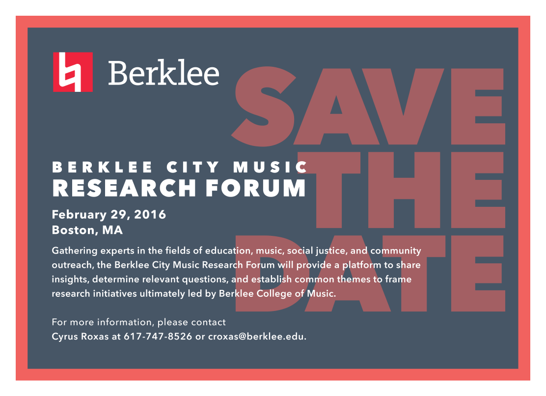
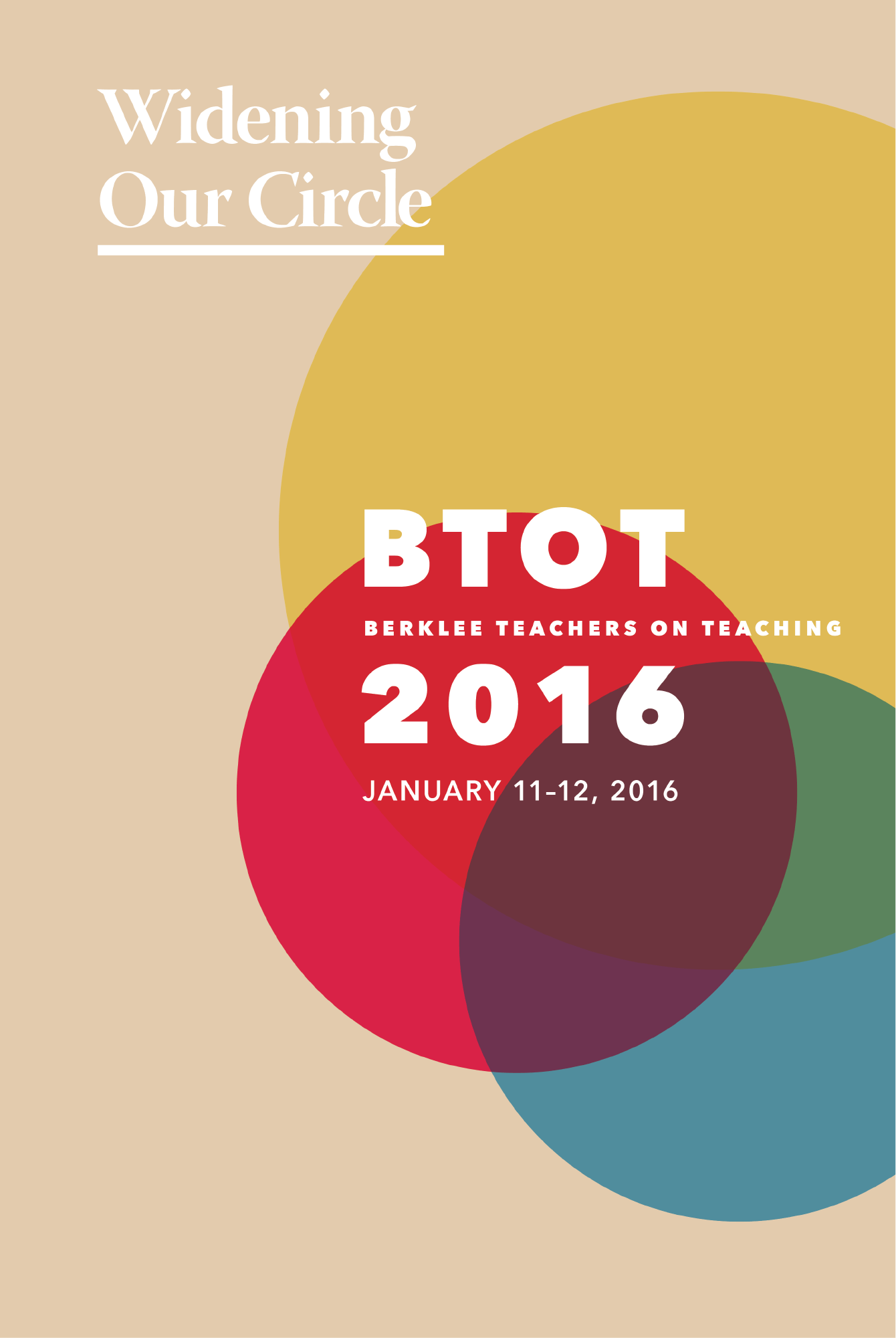
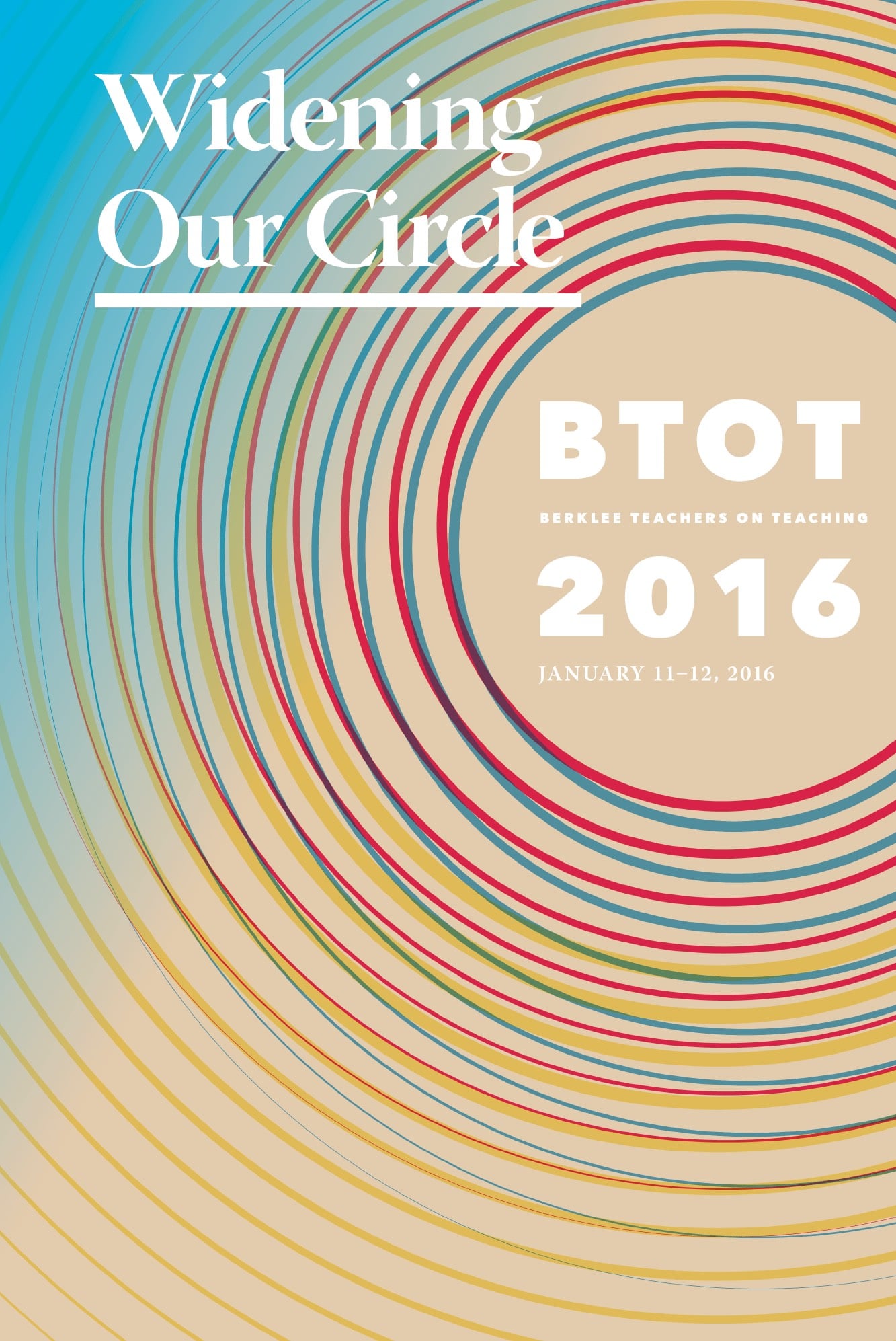
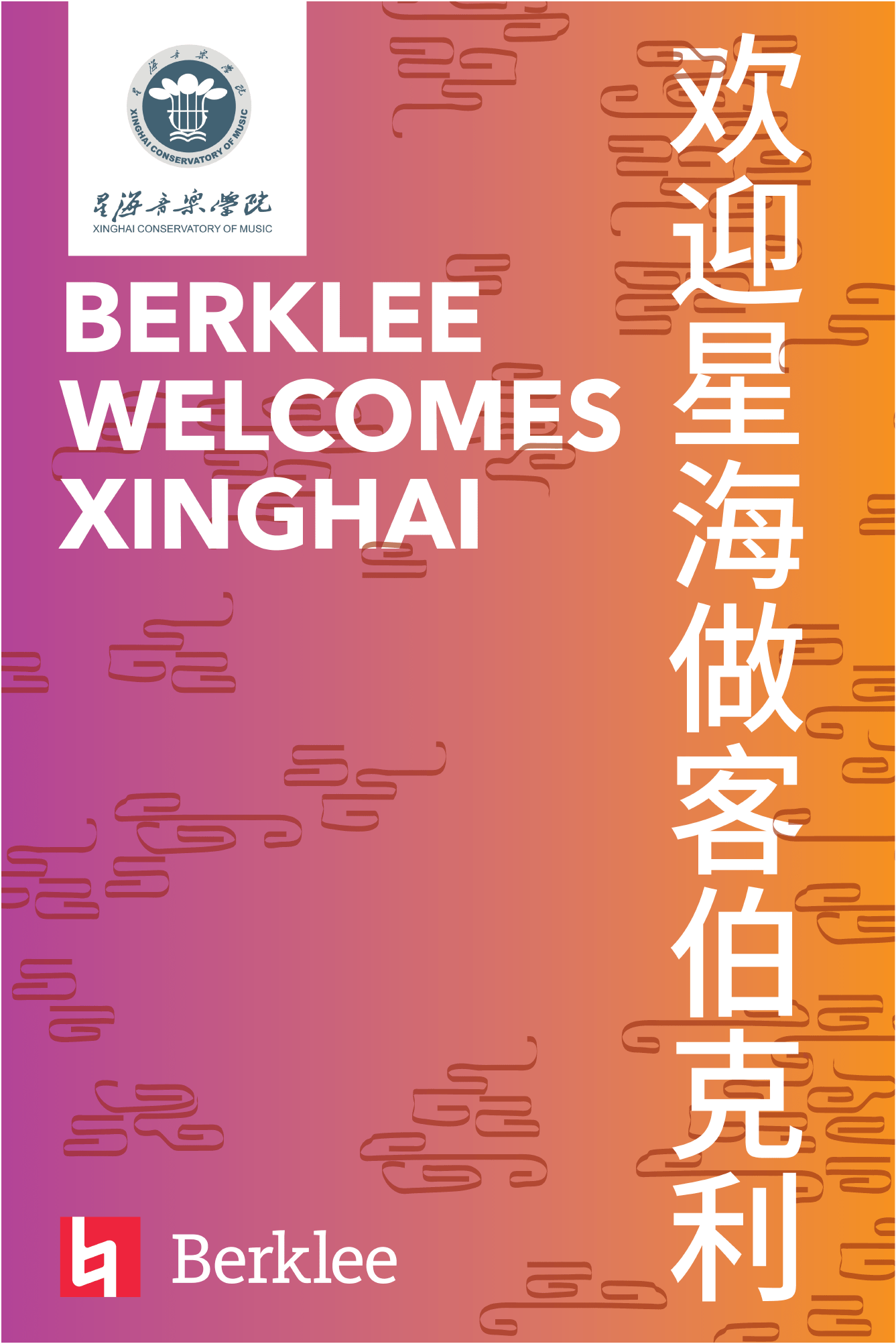
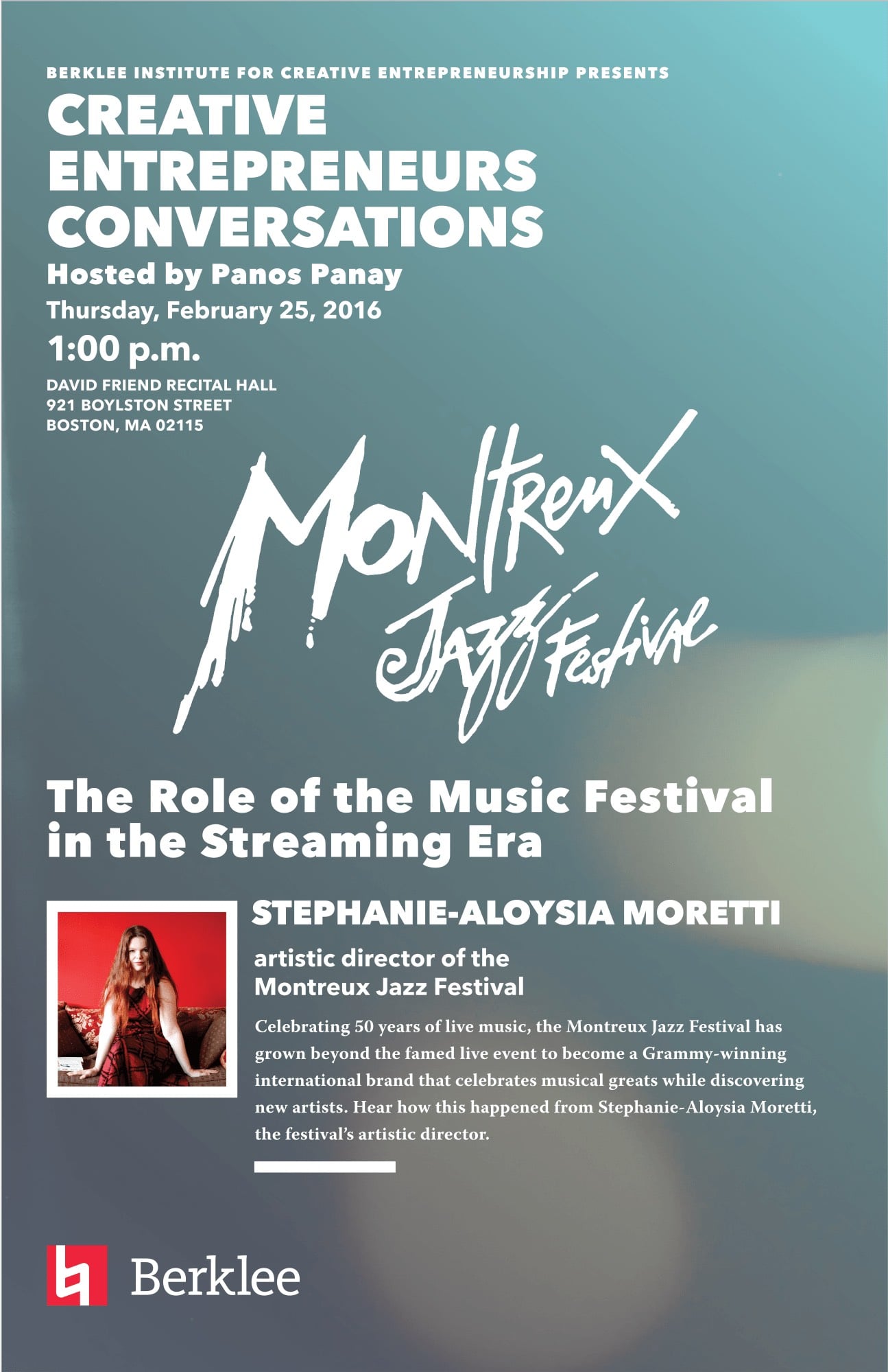
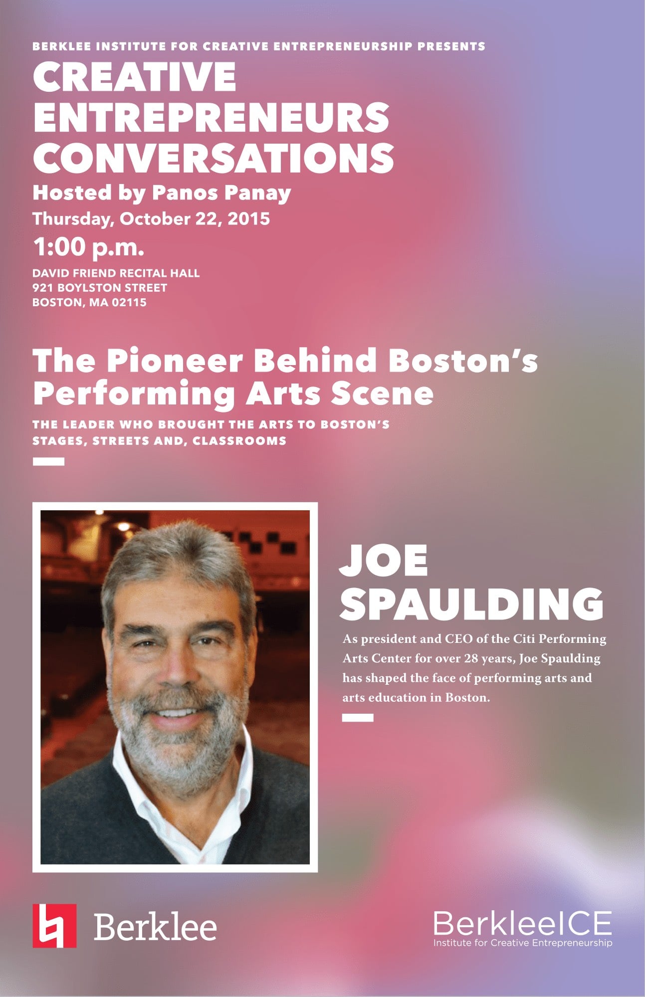
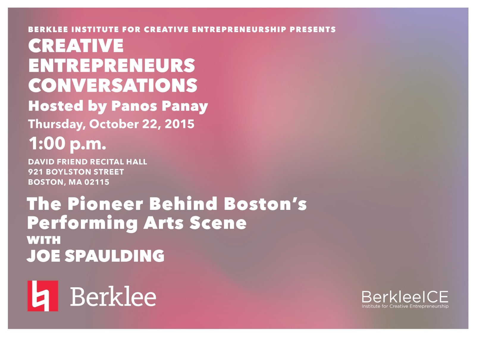
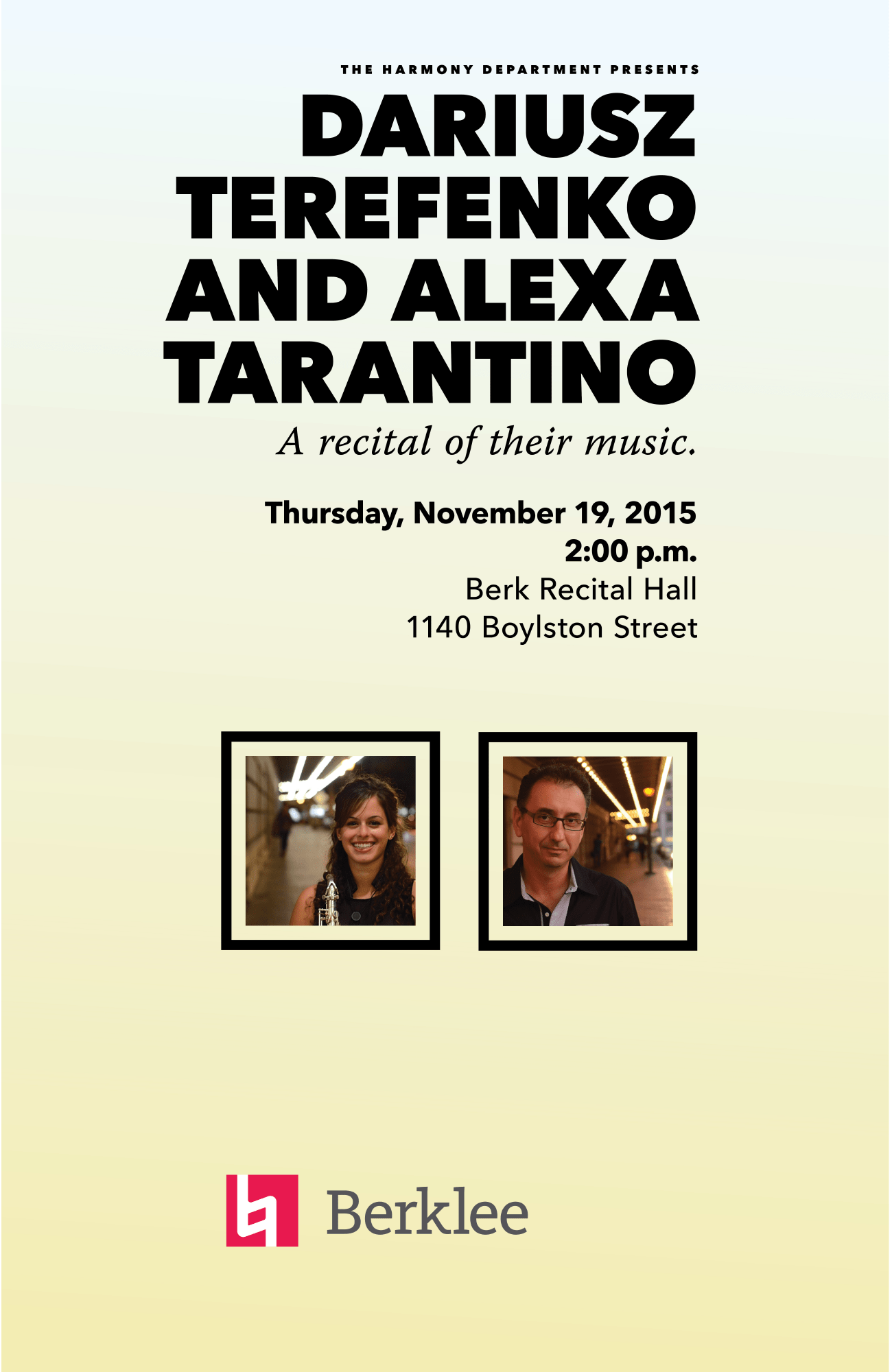
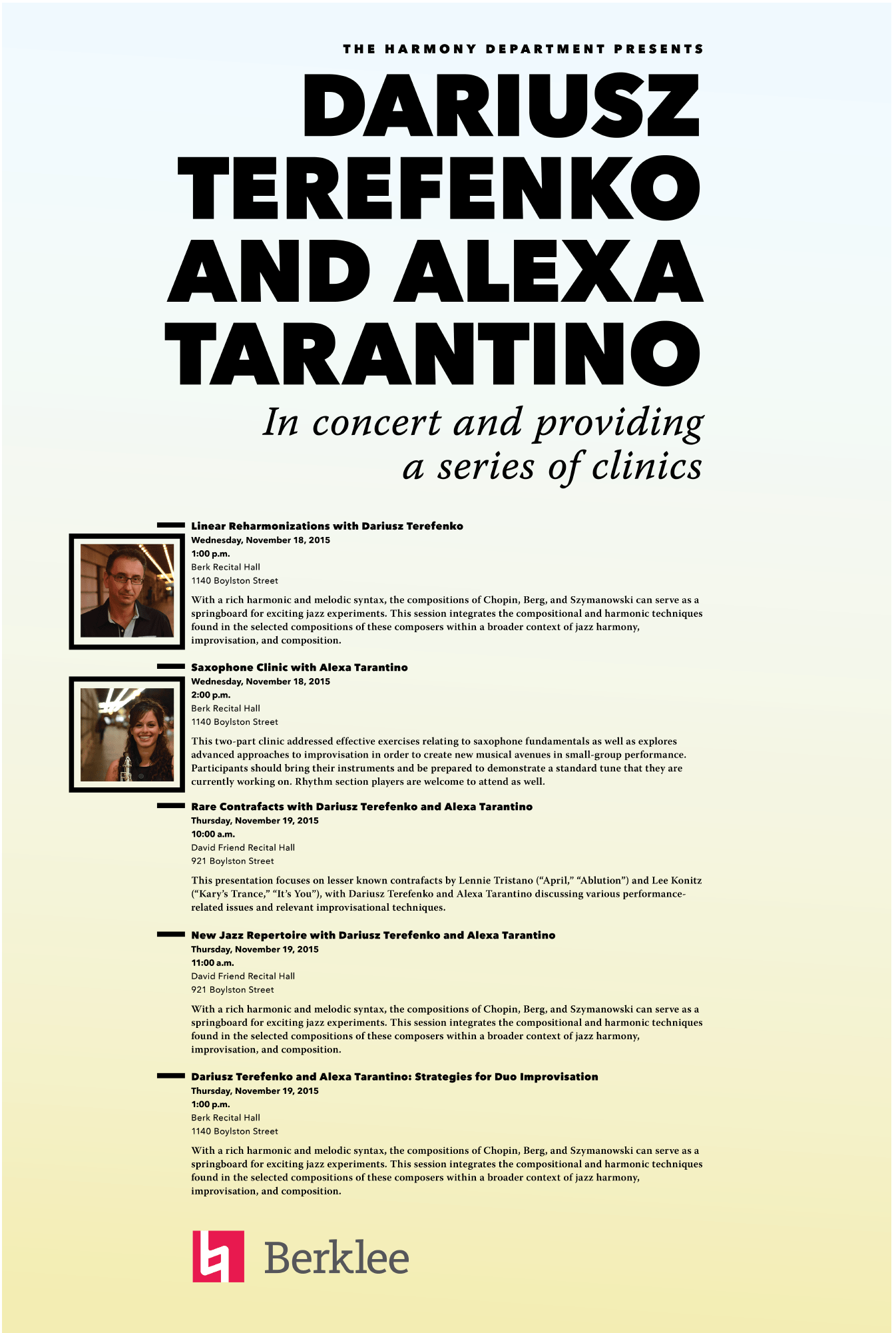
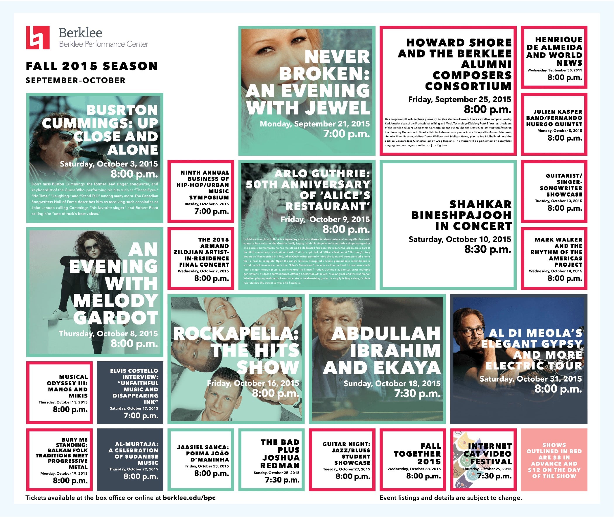
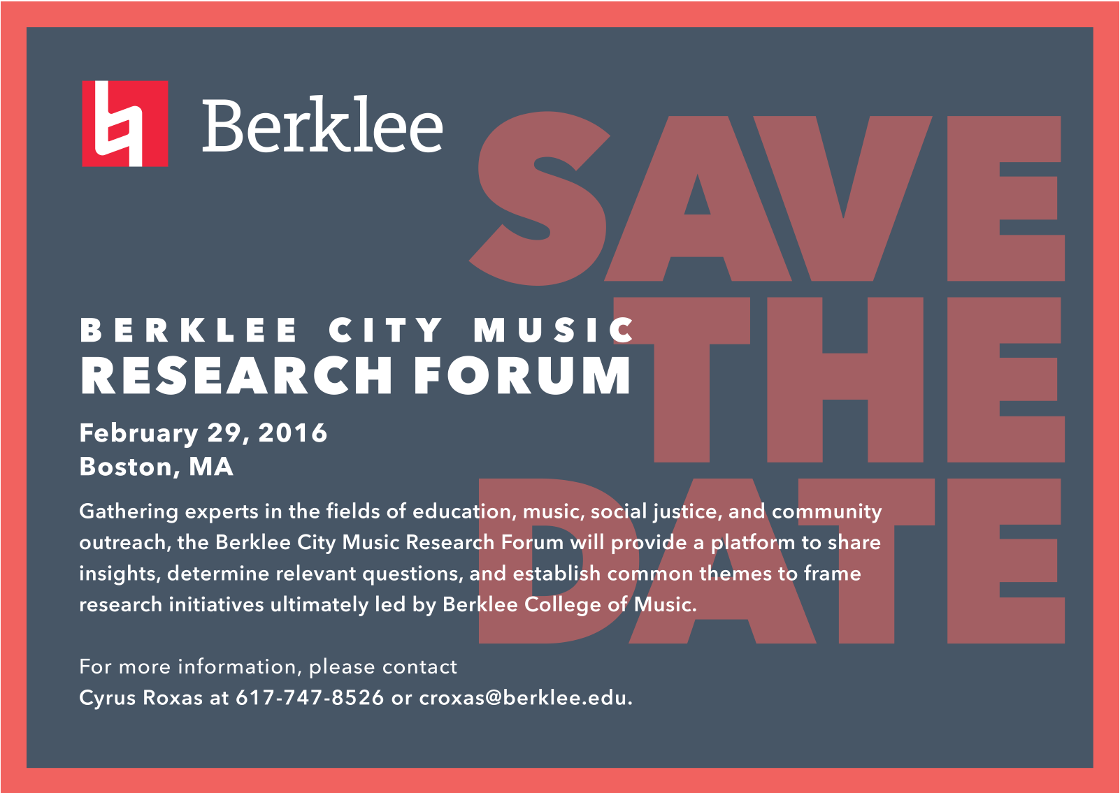
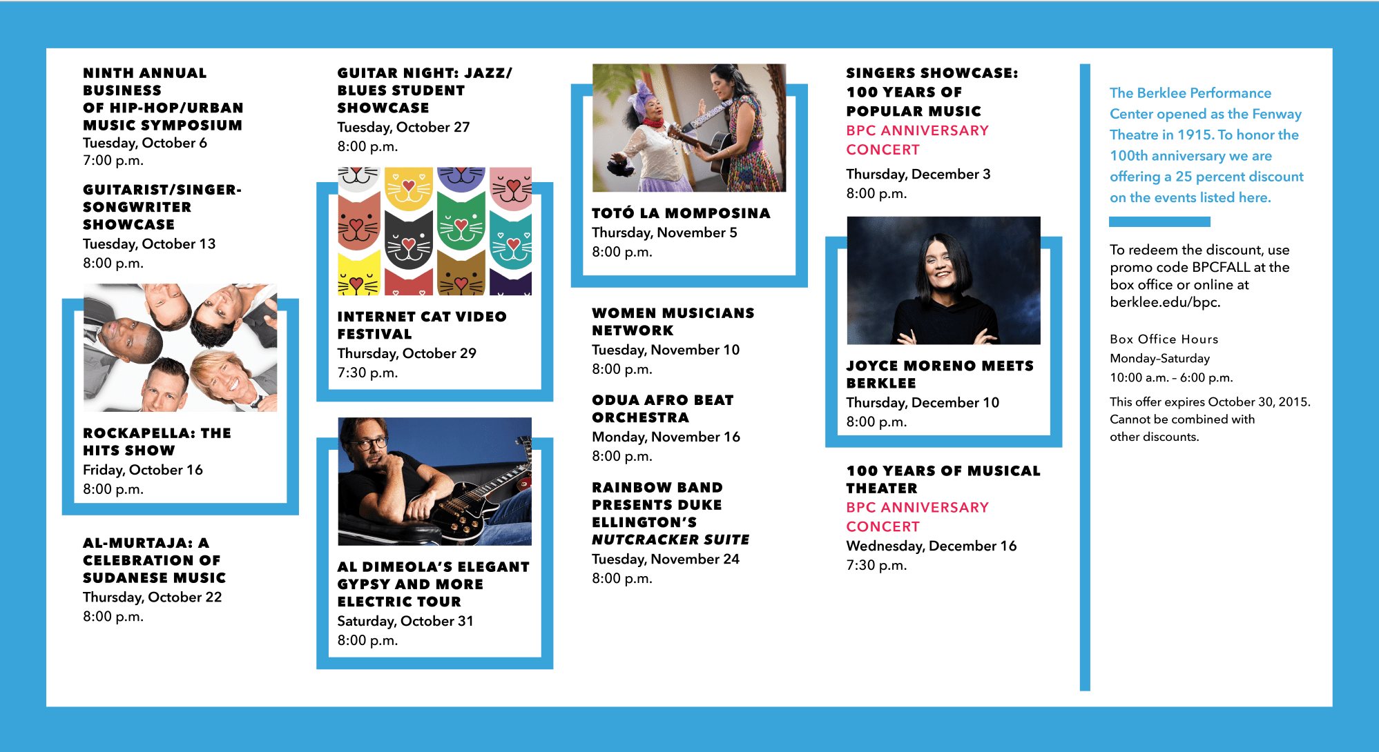
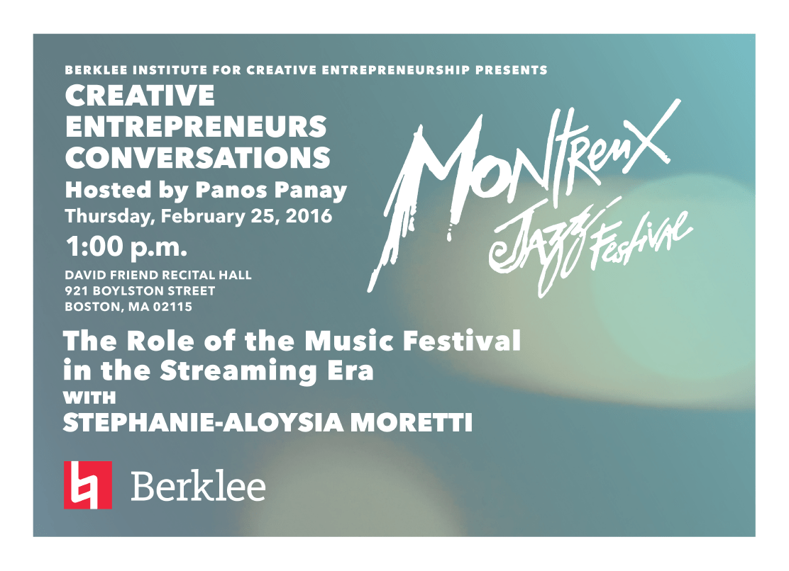
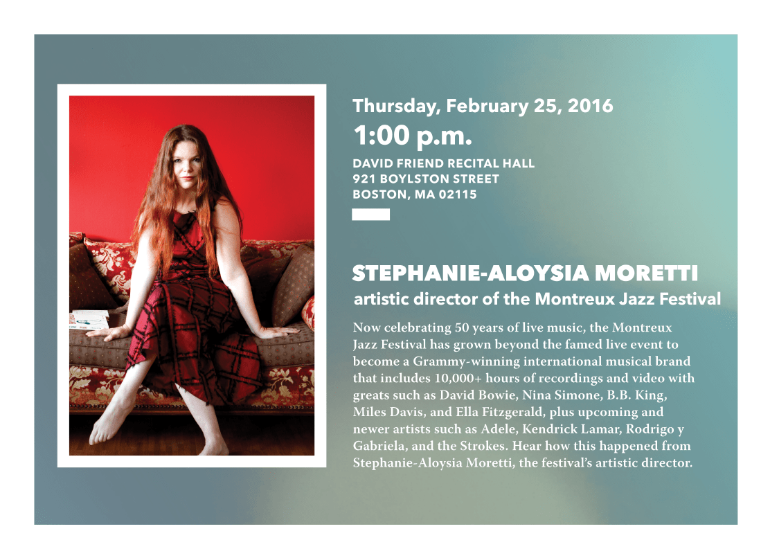
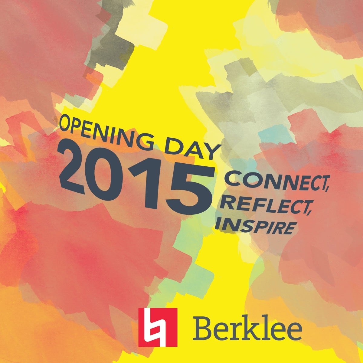
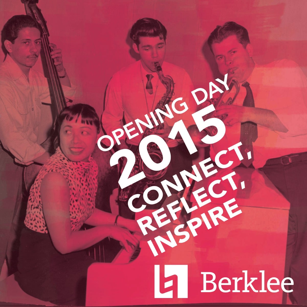
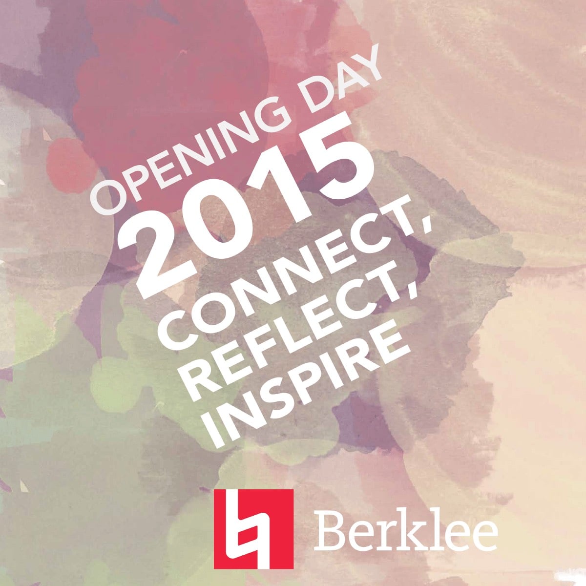
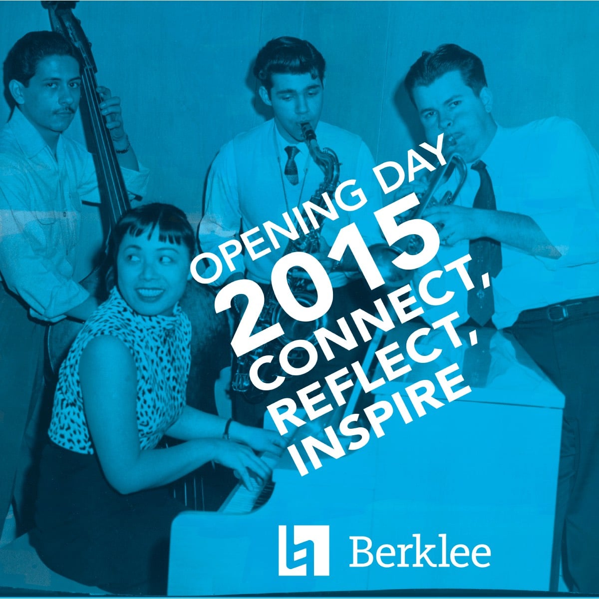
Berklee used a bold color scheme that evolved to be more and more saturated. Illustration and graphics changed to suit the unique needs of departments and events.

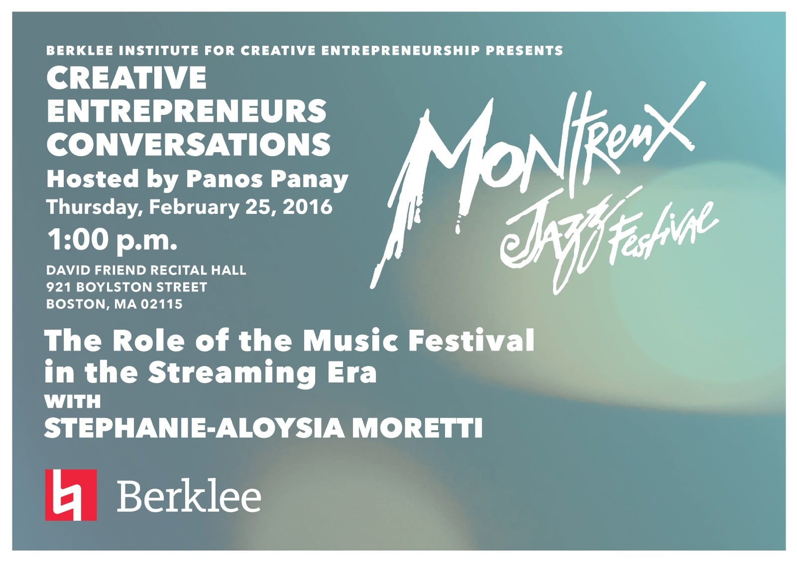
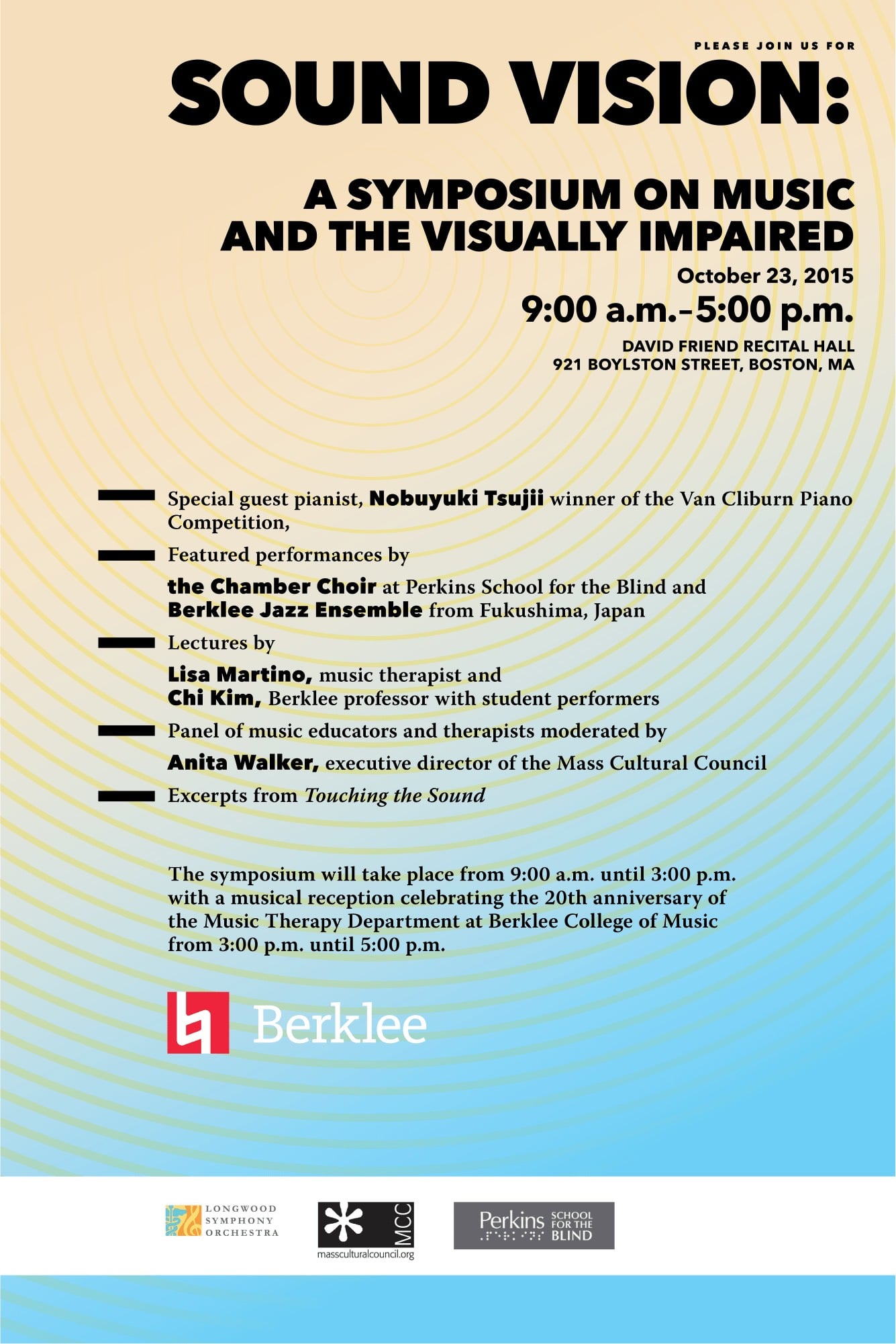
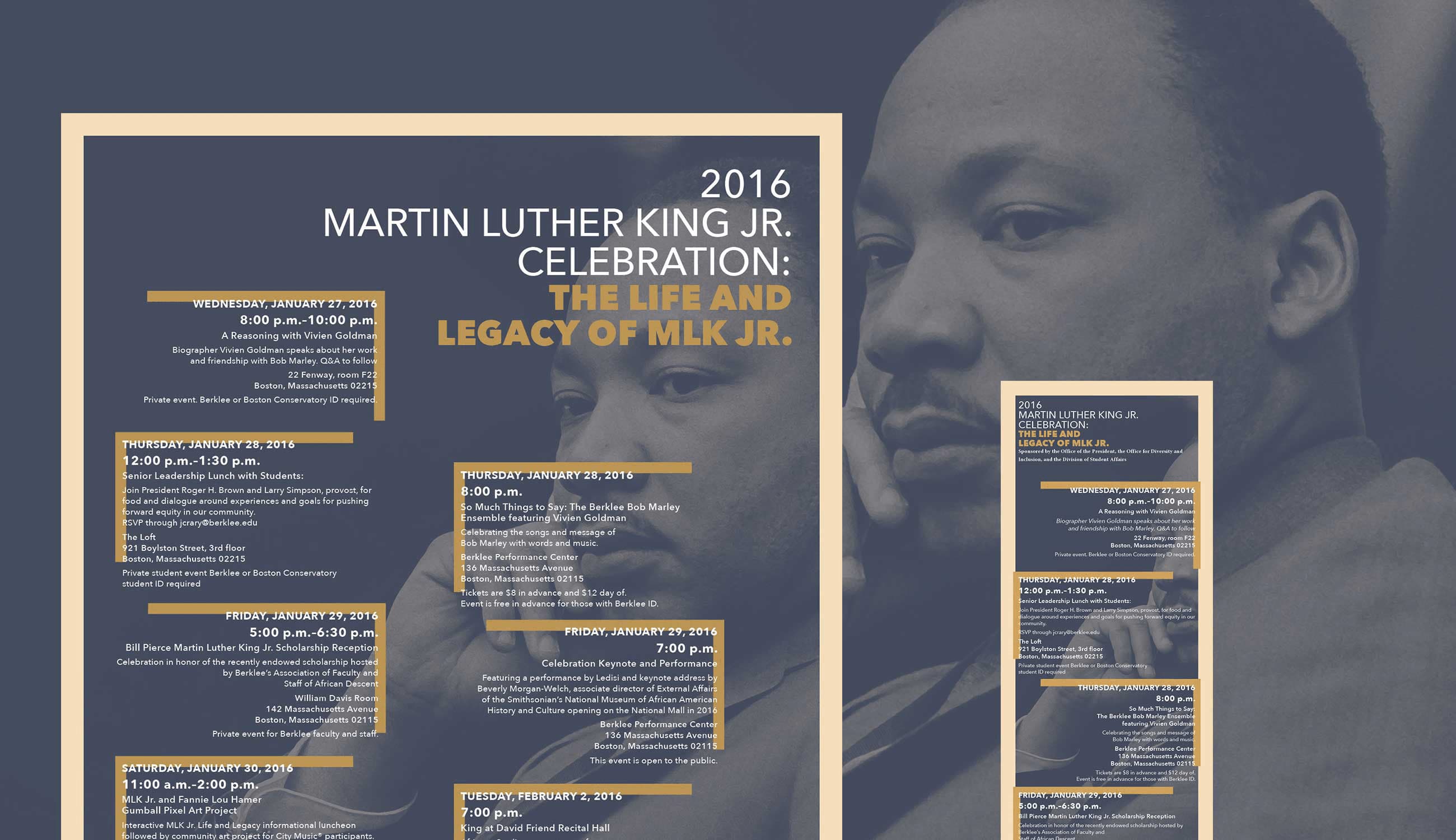
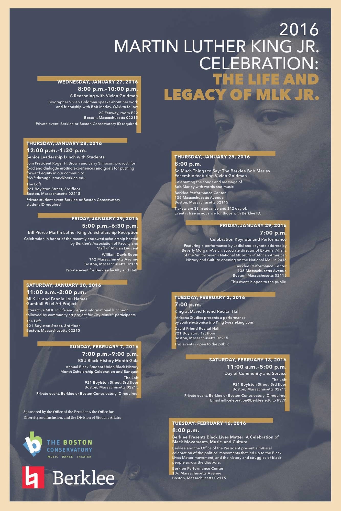
Bold typography using Frutiger and then Avenir gave heavyweight to a lot of the headlines the editorial team crafted. 1000's of posters a year were churned out, and each had to have its unique flair for the stakeholder's delight.
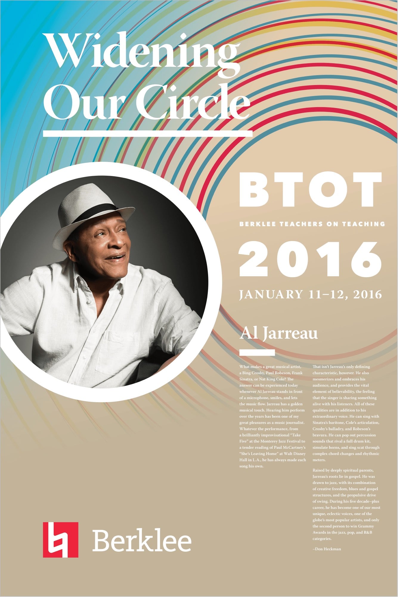
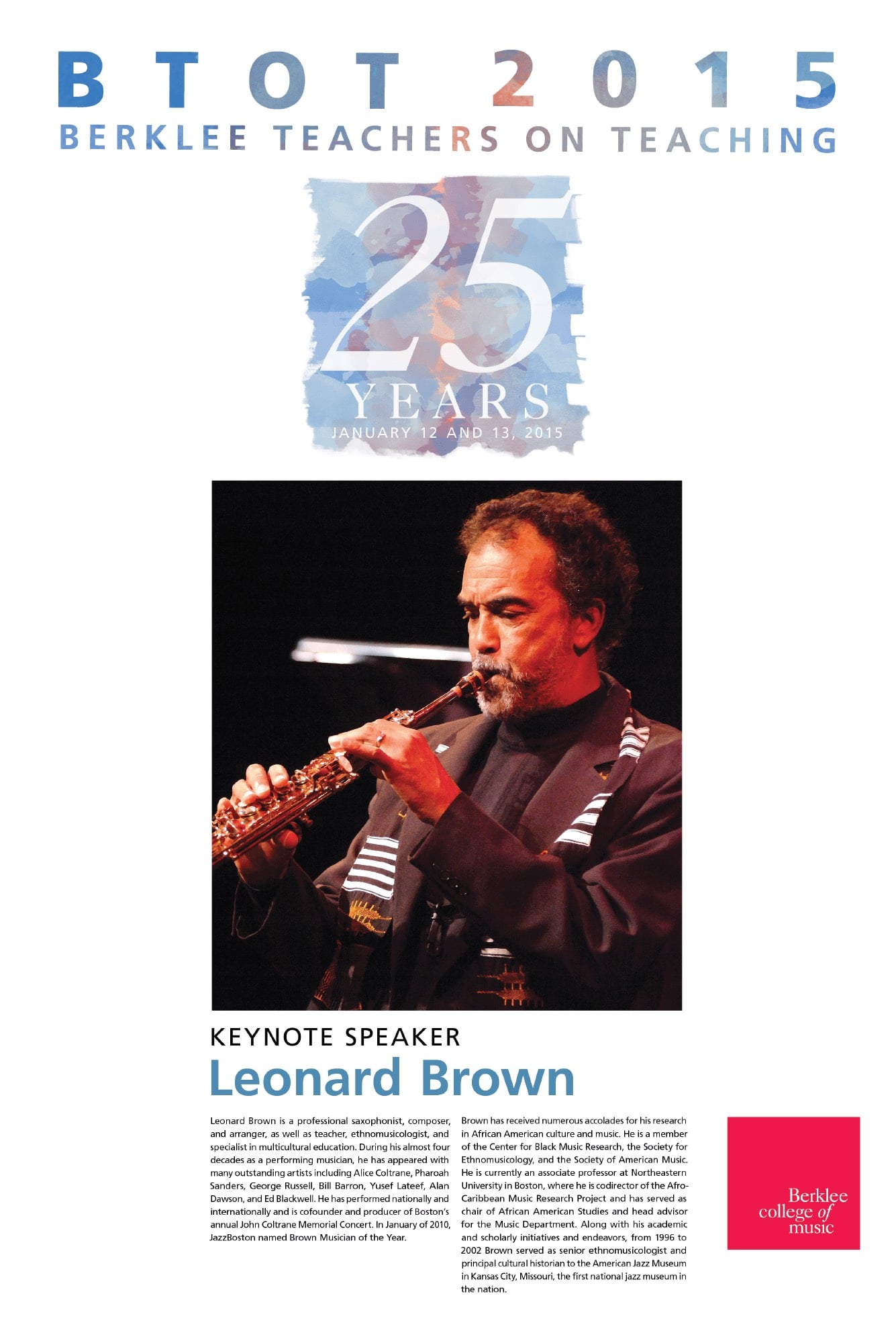
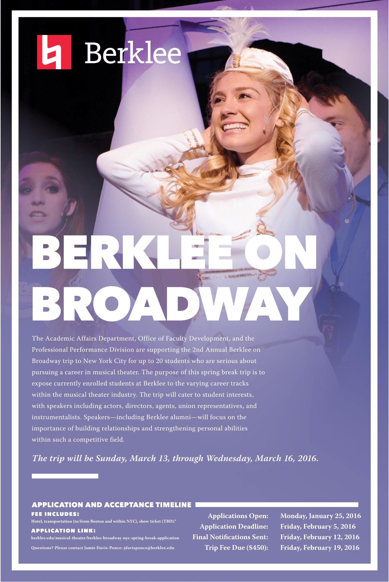
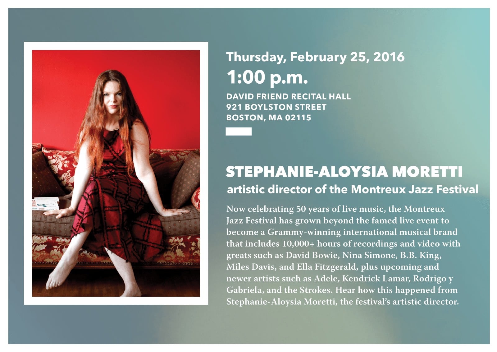
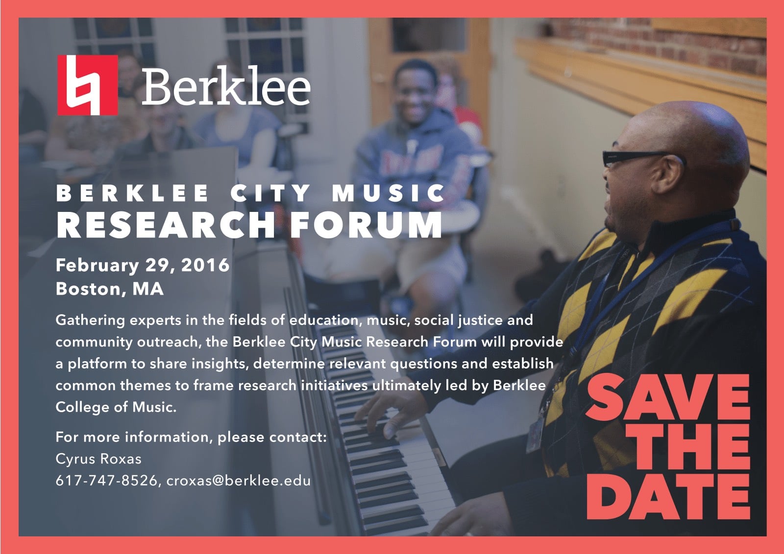
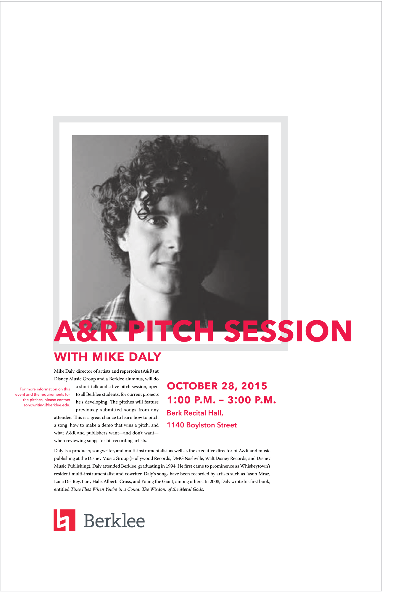
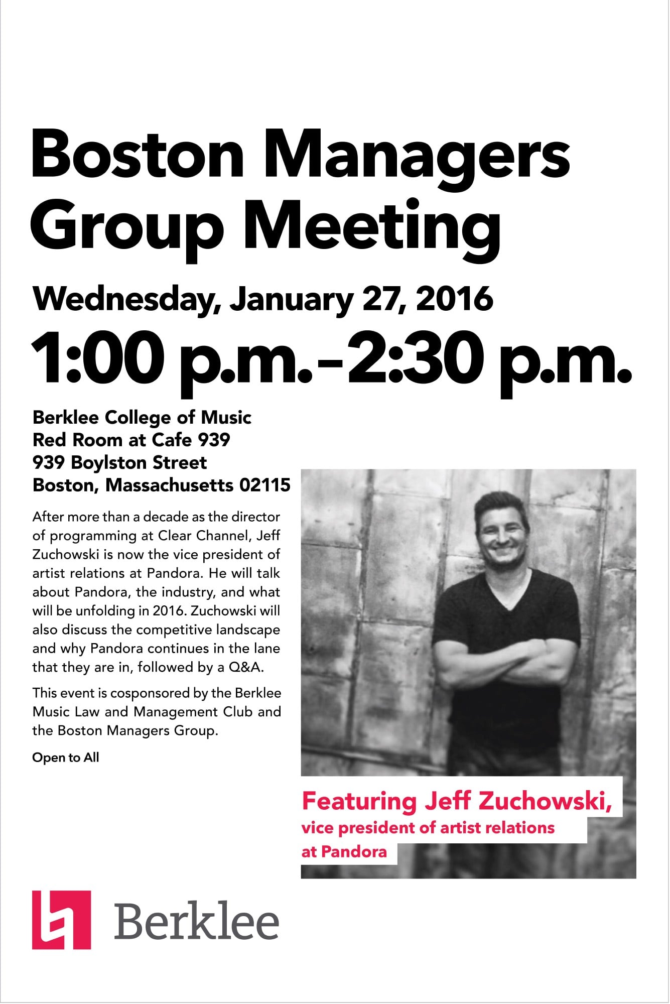
Combining illustrative and photographic concepts helped reuse and recycle the ingredients at Berklee while still maintaining a cohesive print look and feel.


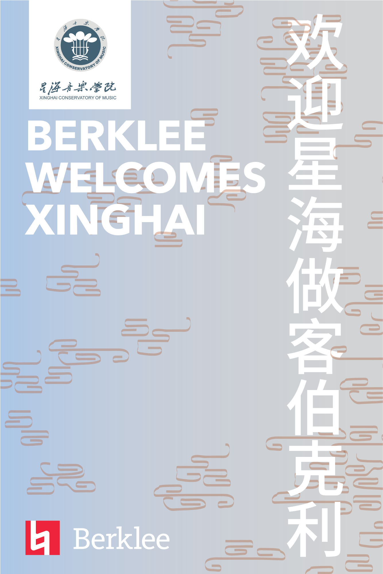
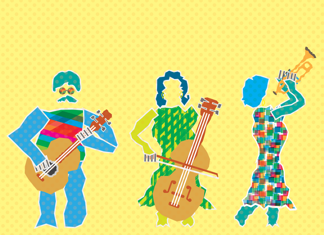
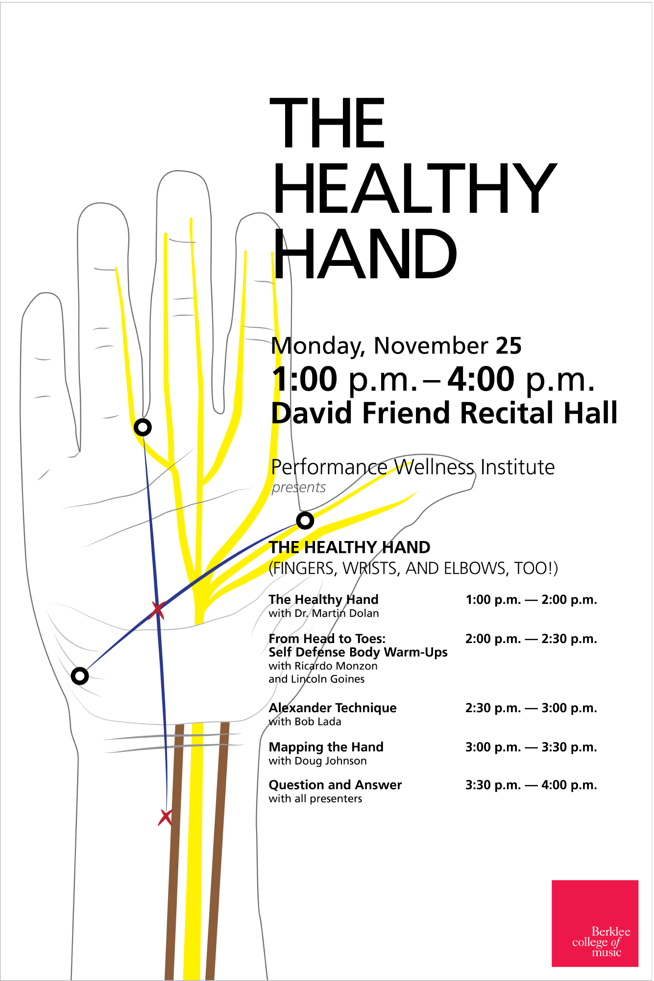
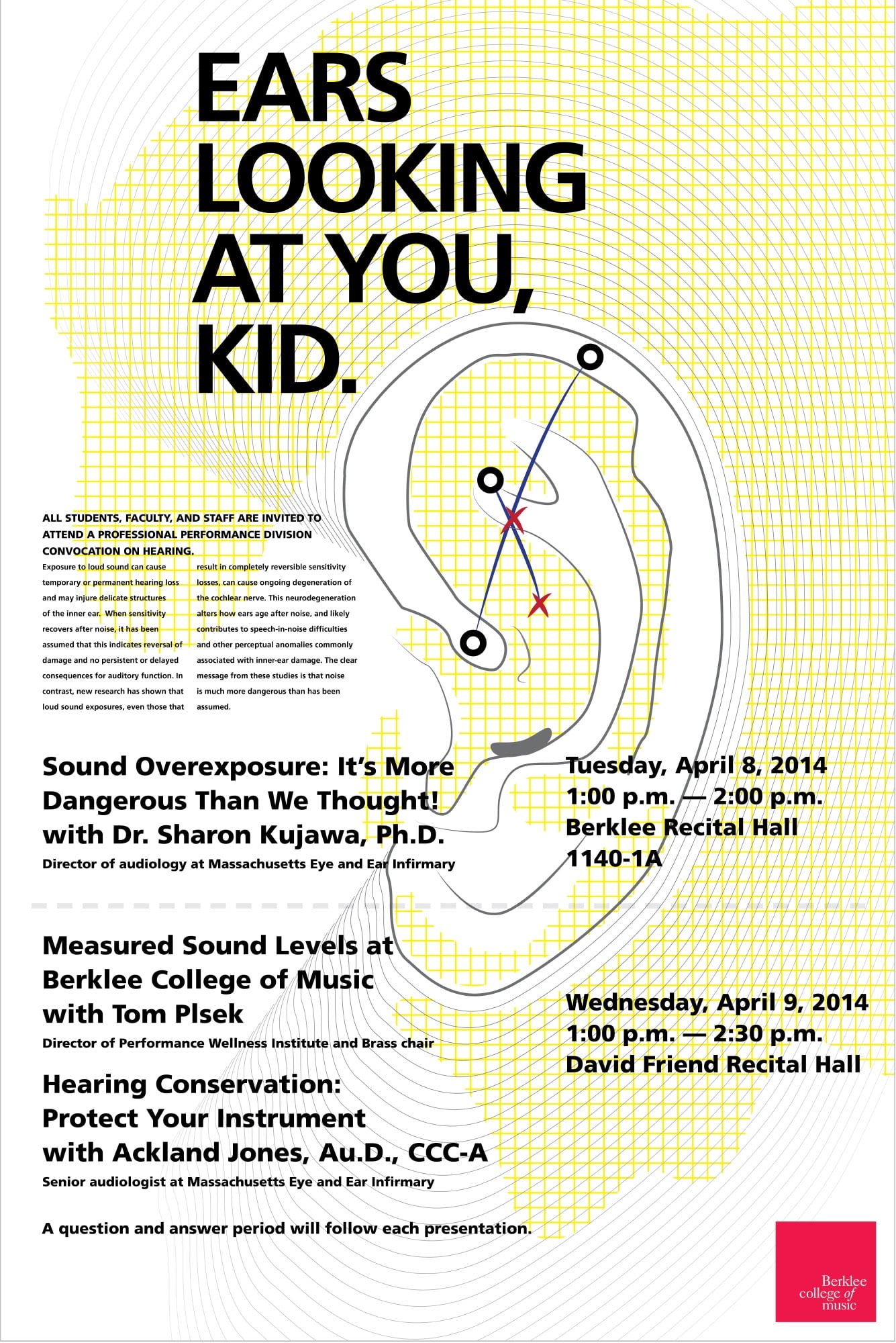
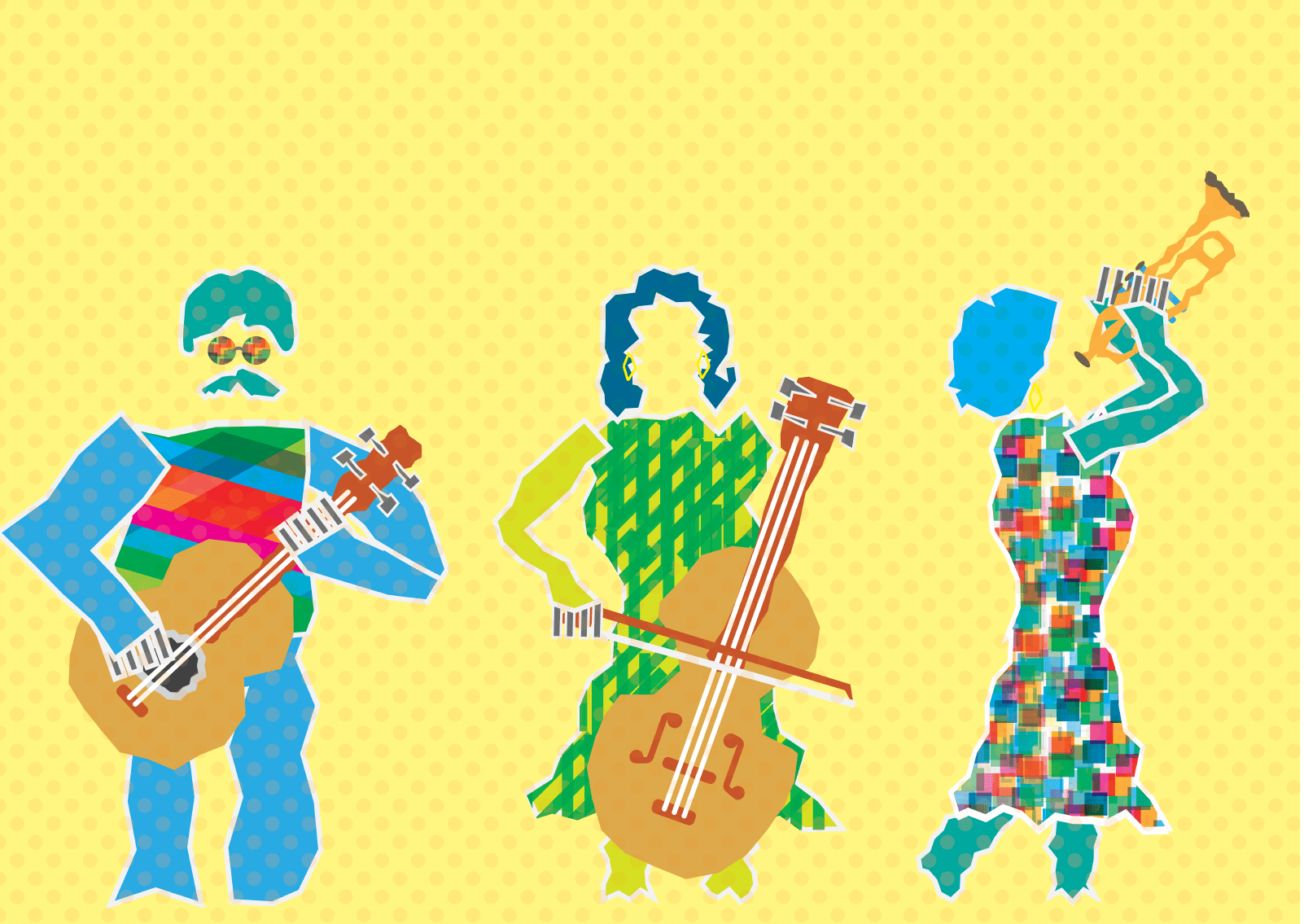
When images were not available I was tasked with crafting illustrations to suit the stakeholders communication intent.
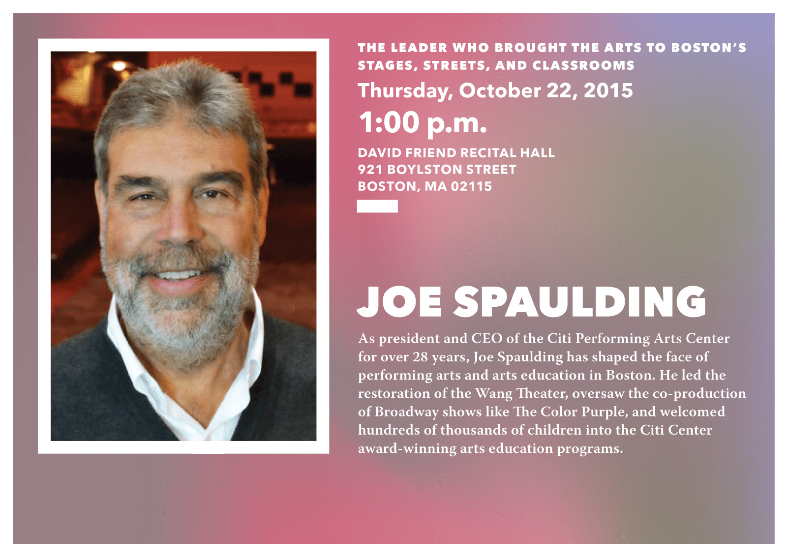
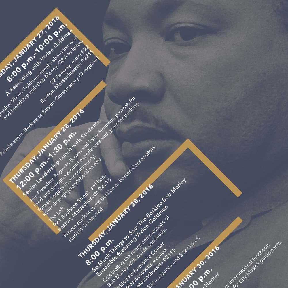
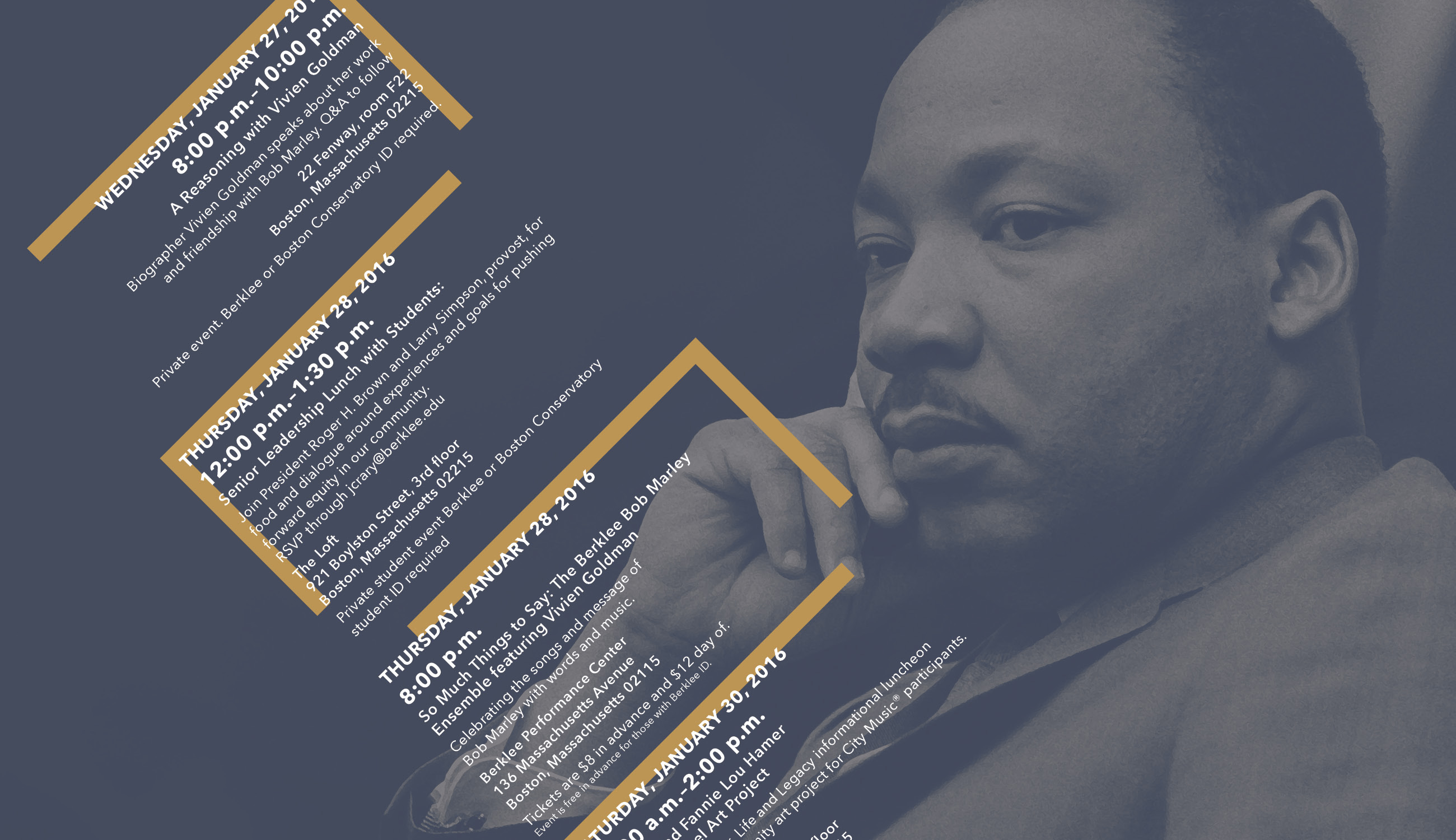
Sometimes fragments of photography became the background for the colorful brand. Cropping and tweaking visuals to suit the situation and build on interesting dynamic photos.

Working for the college as design shepherd, guiding the conversation away from spurious style, color, and how big the logo should be, to instead of one that brings value to design, aligning with the colleges goals, and fulfilling the unique communication needs of the college as a whole.
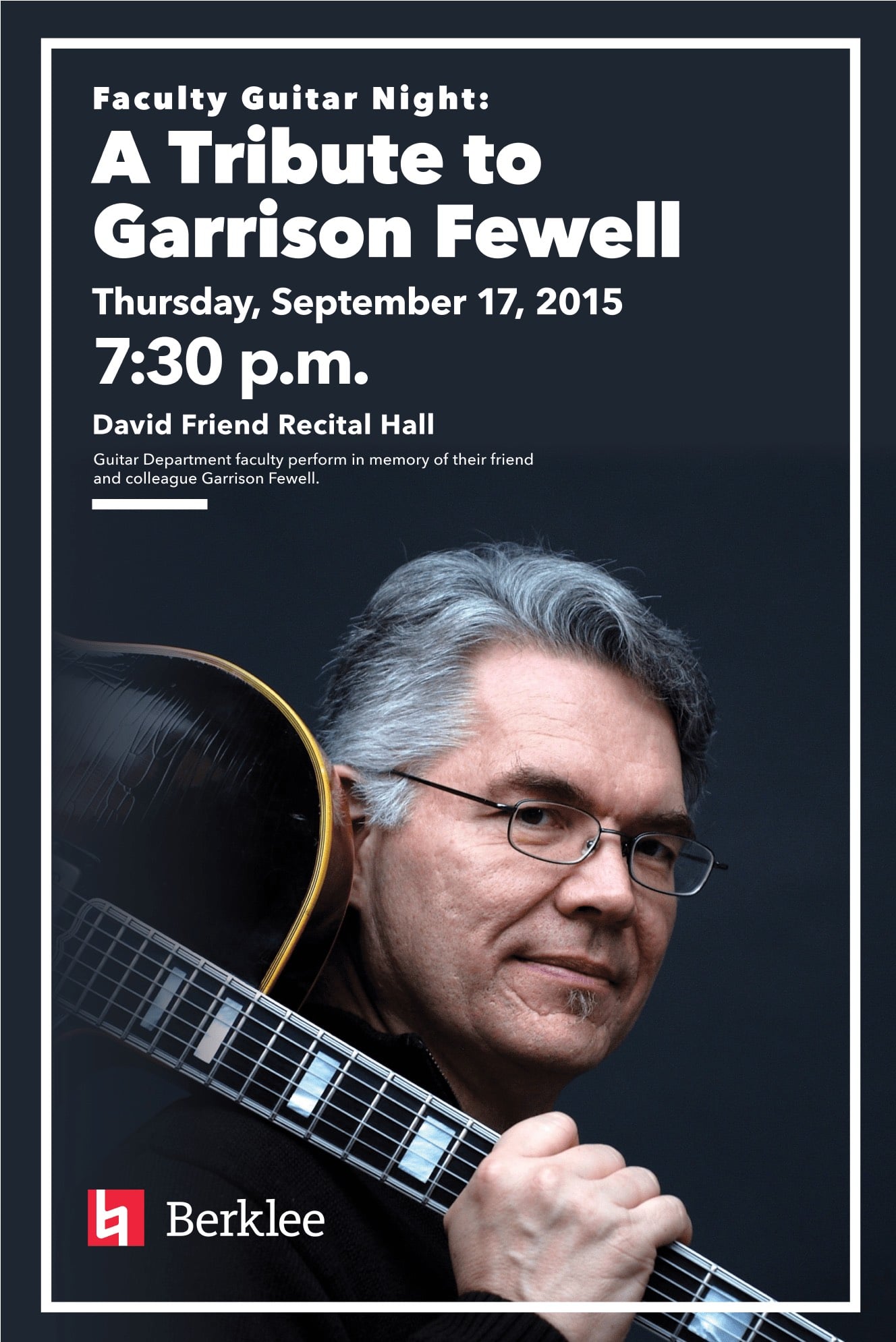
The primary brand stayed conservative in the usage of graphic elements. Mixing elements in a way that photography became the centerpiece — legibility, and clarity over boldness when it demanded.


The Results
Maintaining high graphic standards in all Berklee marketing materials.
Designing bespoke visual solutions for a wide range of Berklee stakeholders.
Refine and innovate Berklee branding and implement in new ways.
Designing and innovating within a fun brand system was a rewarding challenge, and I enjoyed setting the visual tone for Berklee.