Berklee Notification Center
Berklee College of Music gets smart about students and faculty talking to each other. Designing a better way to hear what's happening today on campus.
-
On Behalf Of
- Berklee College of Music
-
Service Provided
Prototyping Research -
Project Date
March 11th, 2021 — March 11th, 2021 -
Deliverables
- Research
- Artifacts
- Wireframe
- Emails
- CSS/HTML

TLDR: Berklee College of Music needed one place to help students, staff, and faculty manage their thousands of college messages, events, and announcements. They wanted it to be seen and heard. Stakeholders and the team selected a centralized dashboard feed. A place where Faculty, staff, and students who attend the college could pick what feeds were relevant to them, without missing a beat of what Berklee needed them to hear.
Berklee gets smart about talking to each other. Designing a better way to hear whats happening today.
Starting to build a in house user experience approach.
Discovering what's happening on campus.
Between 2013 and 2016, I was part of the internal design team at the Berklee College of Music. Of the many projects I was involved with was the revamping of the 'college.edu' website.
One of the constant challenges students encountered at Berklee was keeping track of the 1000+ events happening all year round. Emails, posters, blog posts, and academic notifications flew around as autumn leaves in the wind. Open rate and other user data had shown that few reached students' eyes. Of those that were viewed, students were often bombarded with content they were not interested in (click-thru rates low). Ditto for staff and faculty.
As Berklee’s internal development team redesigned the website, Berklee's leadership pushed for its small integrated design team to rethink how notifications reached Berklee’s community. What resulted from this initiative was a responsive notification center, which pulled from all the different feeds campus-wide for events and announcements, and combined these into a straightforward interface.
The team's goals emerged from the colleges need to drive more relevant content to Berklee’s community members, seamlessly and painlessly. Email or text messages were designed to be managed in one spot. Non-email notifications for each student's academics would also appear in one dashboard. Responsive and accessible, we aimed to cover the whole community in and around Berklee.

What we came up with to start.
Users will be auto-subscribed to at least one feed.
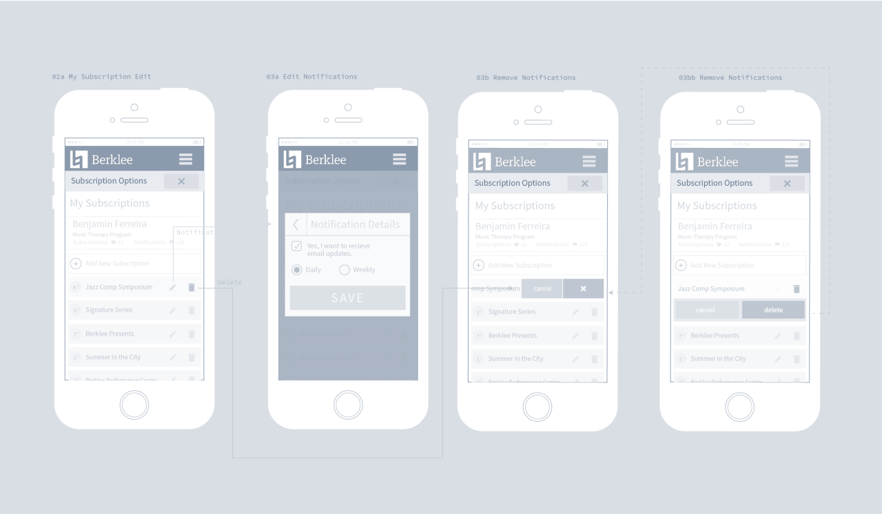
Users should see a list of every feed they subscribe to.
Users should be able to tell which feeds they see on their dashboard only, vs. daily email digest, vs. weekly email digest.
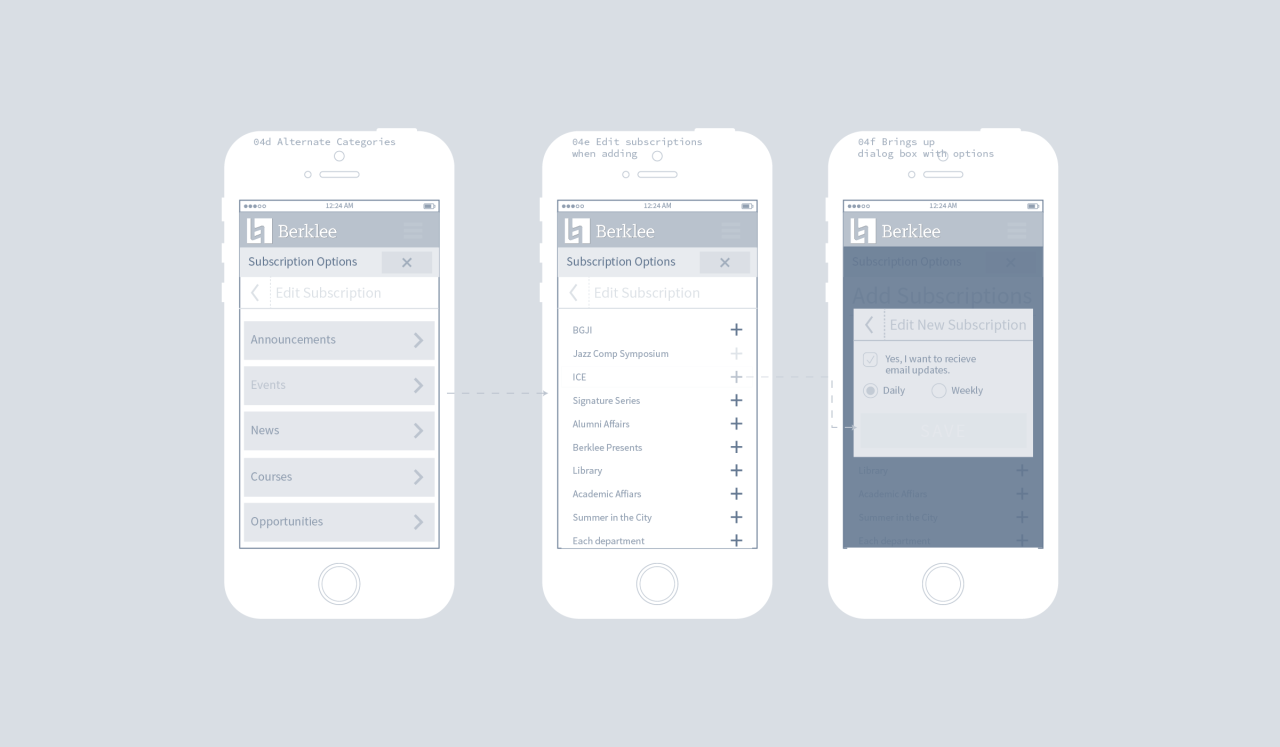
Users add new feeds by skimming categories and then adding the feed’s desired frequency (dashboard, daily, weekly).
Building a solution in house
Creating a space for the many notifications feeds to live became one of our first challenges. Fitting all these items into a mobile environment became a challenge for the development team to put to paper. I was brought on to guide the conversation around how notification center users would view, engage with, and customize their feeds.
Menus that cascade logically and effectively while being no more than four steps deep helped minimize the fatigue of sorting through the content, giving the user context every step of the way and a path to go back to the start of their flow.
I later helped the developers turn disconnected experiences into a functional and usable pattern of design so that a quick pilot program could be stood up.
Discovery
Started with interviewing stakeholders.
The kickoff started with a data-gathering session. Defining the business goals early on, I met with stakeholders to understand the why behind the project.
Research
Researching the problem.
Gathered from faculty and staff existing user stories and user flows to help navigate the correct paths our users should take. Then began to talk to students and means test stakeholder assumptions.
Prototype
Prototype on paper, and a user experience emerges.
Developers and project managers needed a guiding document to begin thinking about how to can customize the Berklee dashboard to fit a user's needs. Started building a concept for the user experience.
Design
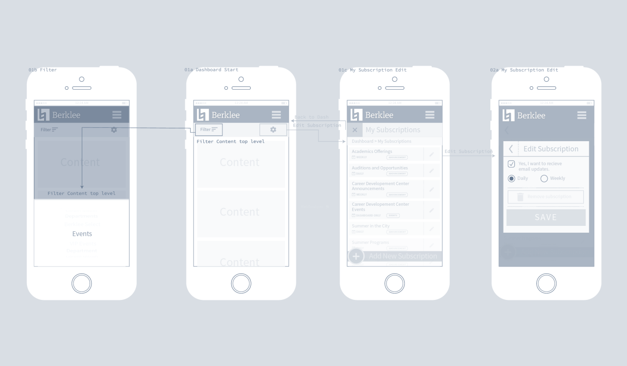
Design wireframes mapping out the user flow.
Satisfied that the research and requirements were met. I began building a system to establish user experience and user interface expectations.
Our Results
The results were a powerful, measured, enjoyable experience in which accuracy, engagement, and usage of Berklee’s internal messaging platforms skyrocketed ↗. Positive responses from all the target audiences helped seal this initiative as one of the pillars of the college's digital experience.
The challenge facing Berklee was how to make sure their students, faculty, and staff received news items, academic notifications, event dates, account information, and safety announcements in a single digital hub. I helped solve that problem.

The challenge facing Berklee was how to make sure their students, faculty, and staff received news items, academic notifications, event dates, account information and safety announcements in a single digital hub.

