MIT InfoProtect Website
“It is in MIT’s interest to protect all types of sensitive data. It is also the community at MIT’s responsibility to safeguard such data.” Easier said than done.
-
On Behalf Of
- MIT
- Information Security and Technology
-
Service Provided
Research Prototyping Design & Craft -
Year Active
March 15th, 2017 — March 15th, 2021 -
Deliverables
- User Research
- Artifacts
- Wireframes
- Prototypes
- User Testing Plan
TLDR: MIT’s security policy changed and it needed a way to get its community onboard. I was charged with creating a design strategy for a multi-phase website and communication campaign. Organizing how MIT’s diverse community would engage with the campaign, how the experience of learning about security would unfold, and the visual and brand language used to drive MIT students, staff, and faculty to learn about their unique security needs, and follow thru with protecting their data and MIT’s data too.
Taming the wild west of data security at MIT.
Building a helpful tool for understanding how and why students, faculty, and staff should protect their data at MIT.
MIT needed to create a security resource for its community to adopt. A tool that educates, guides, sets the standard, and presents clear strategies for protecting sensitive data, both digital and physical. 2 years' worth of research from multiple committees had honed the policy down to a series of classifications. Each classification had tasks associated with it, and the expectation was to have the community follow the policy.
There was just one problem. Who exactly was this community? So what are they required to do? —When the UX team became involved, the direction of the project was focused so much on the what, that the who, how, and when, had fallen to the wayside. In other words, how do we distribute this campaign of policies and tasks to a diverse group of people? How does MIT encourage compliance in following the “rules”? How does this campaign reduce the risk of data security breaches across campus?
More importantly, how do these rules apply differently to each community member at MIT? Remember, I mentioned classifications? Classifications are groupings of tasks that correspond with MIT community member's data sensitivity. Think risk levels like low, medium, or high. Depending on what you do on campus, your risk level changes. So not only was our task to ask the community to follow the rules, but we also were asking them to self identify what risk level applies to them, and follow those rules that correspond.
With no plan on how to proceed, no way of distributing knowledge to the community, and no way to get the community to follow the security rules, the project was stuck in a quagmire.
Context and Challenge
MIT needed to create a security resource for its community to adopt. A tool that educates, guides, sets the standard, and presents clear strategies for protecting sensitive data, both digital and physical. 2 years' worth of research from multiple committees had honed the policy down to a series of classifications. Each classification had tasks associated with it, and the expectation was to have the community follow the policy.
There was just one problem. Who exactly was this community? So what are they required to do? —When the UX team became involved, the direction of the project was focused so much on the what, that the who, how, and when, had fallen to the wayside. In other words, how do we distribute this campaign of policies and tasks to a diverse group of people? How does MIT encourage compliance in following the “rules”? How does this campaign reduce the risk of data security breaches across campus?
More importantly, how do these rules apply differently to each community member at MIT? Remember, I mentioned classifications? Classifications are groupings of tasks that correspond with MIT community member's data sensitivity. Think risk levels like low, medium, or high. Depending on what you do on campus, your risk level changes. So not only was our task to ask the community to follow the rules, but we also were asking them to self identify what risk level applies to them, and follow those rules that correspond.
With no plan on how to proceed, no way of distributing knowledge to the community, and no way to get the community to follow the security rules, the project was stuck in a quagmire.
Looking for a solution
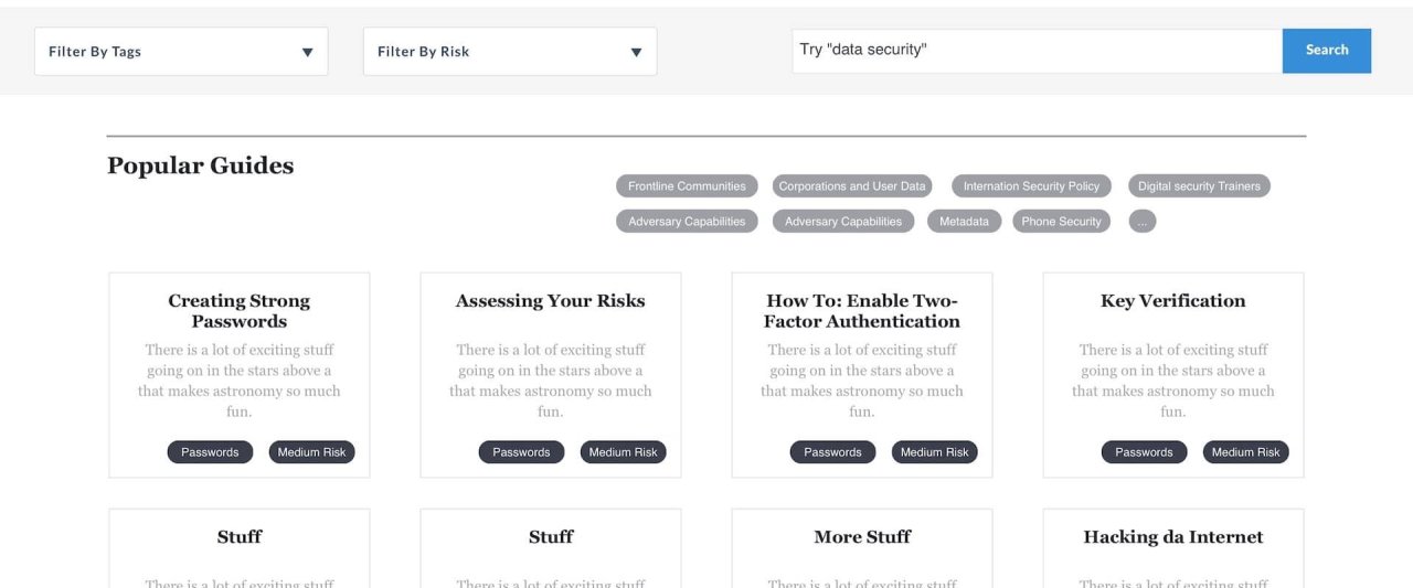
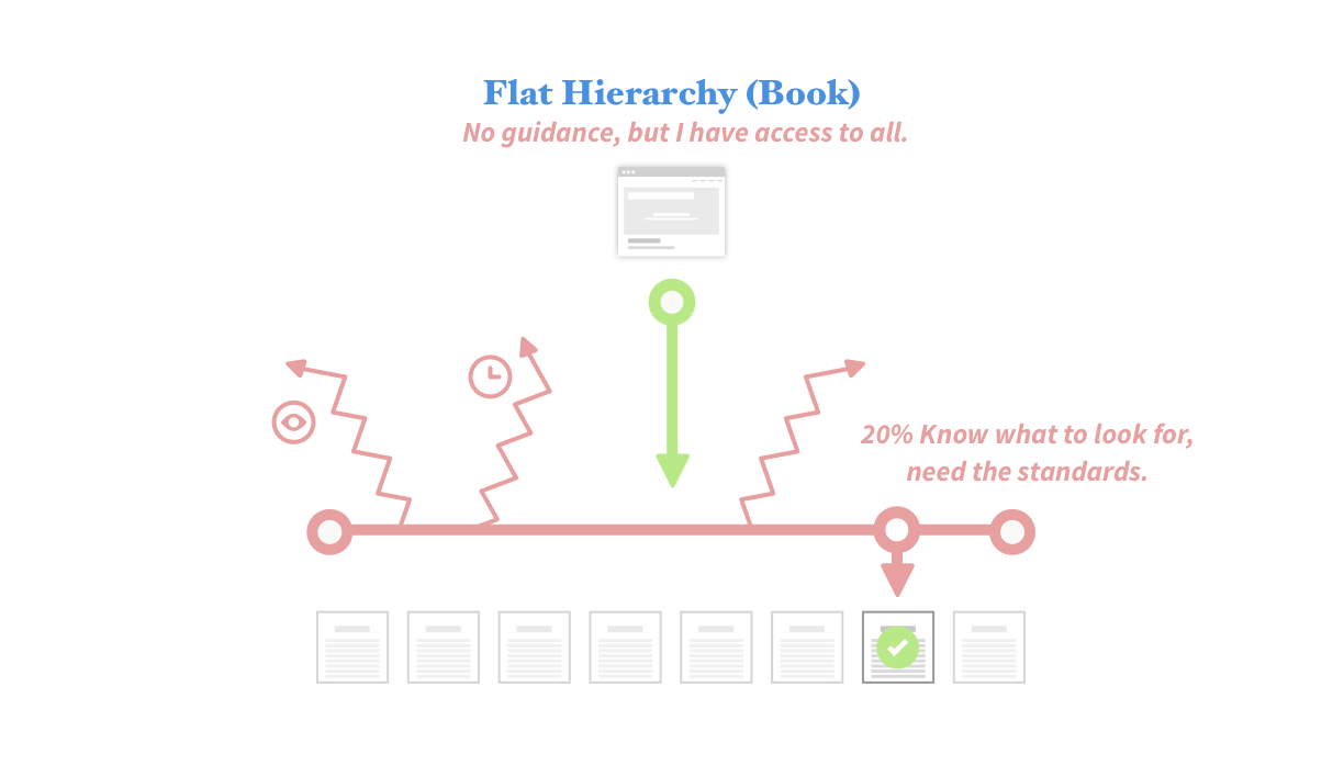
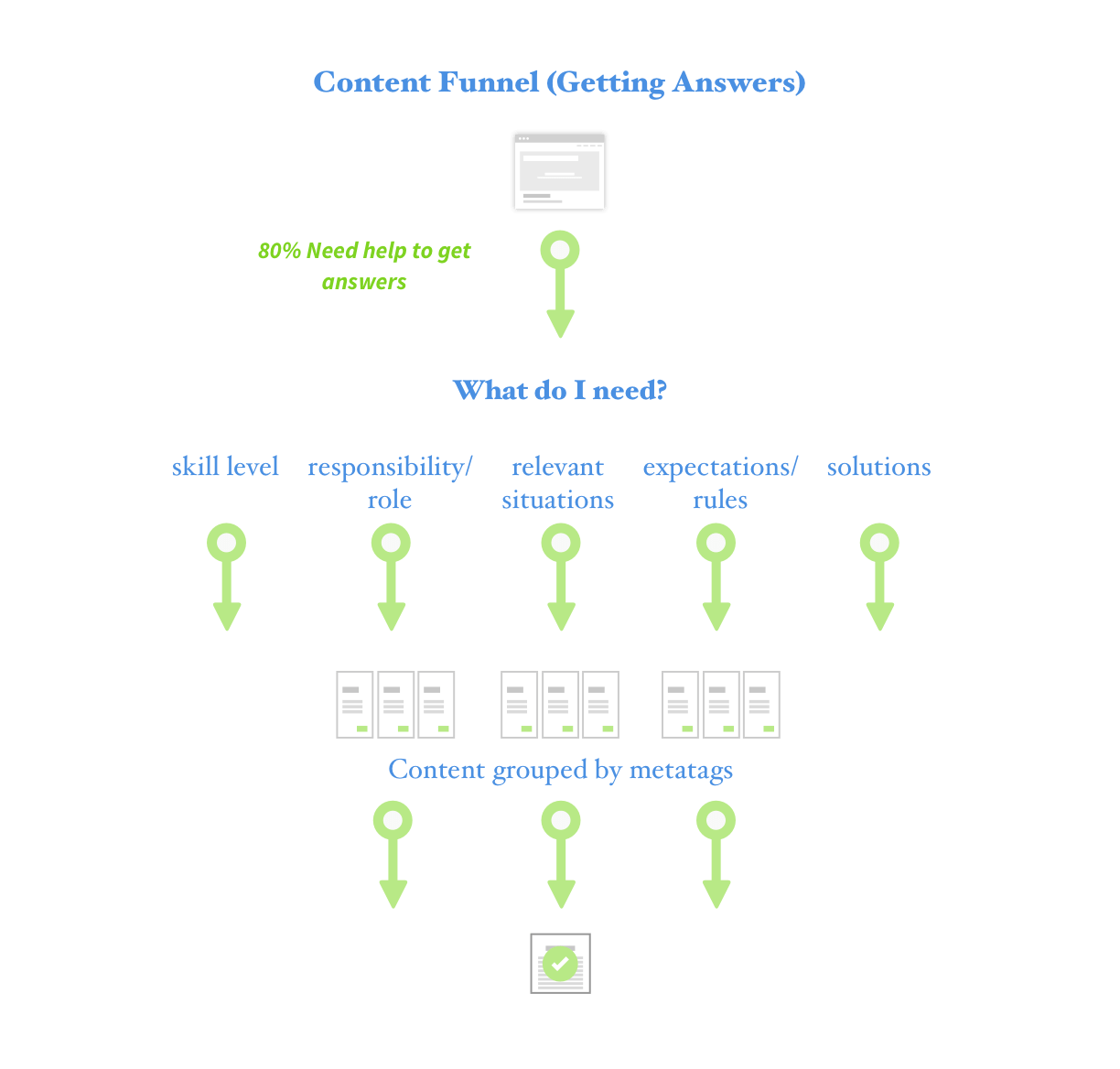
Making sense of the mess, I hypothesized that if the security policy (called controls) had different relevancy depending on who viewed it, then only show them what’s relevant to them. Simple enough. In practice, this means the project lives or dies on whether users can discover, filter, and find the controls applicable to them, based on their own needs and risk classification. Can our team design a tool that helps the community do that?
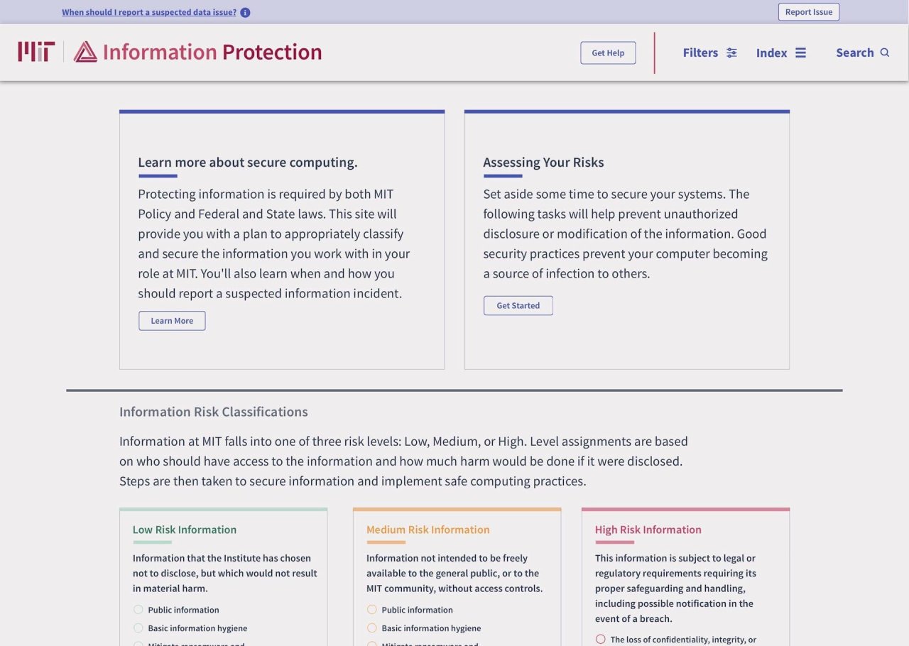
What I developed with the team, was a phased approach to launch this campaign — designing a helpful tool for understanding how and why, I, as a user, should protect data at MIT. InfoProtect took shape as a website. However, the content architecture underneath was the real solution
Leading the team, I tackled the moving parts by splitting the project into a pilot, phase 1, and phase 2 — each solution building on the last. Incrementally improve both the content and its presentation through writing/editing, organization (information architecture), and visual design.
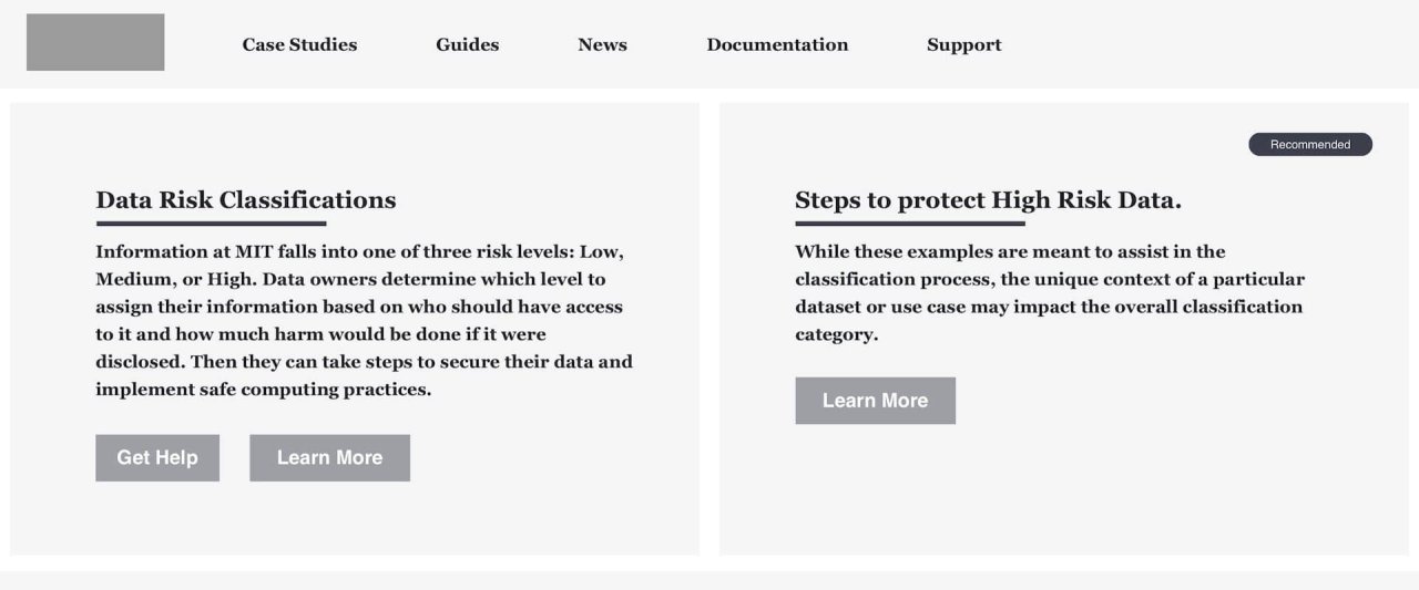
Pilot: Building fast and testing early with small groups to see if we can track a cohort of users learning about and following the security policy. Testing our hypothesis that users could discover what their risk classification is.
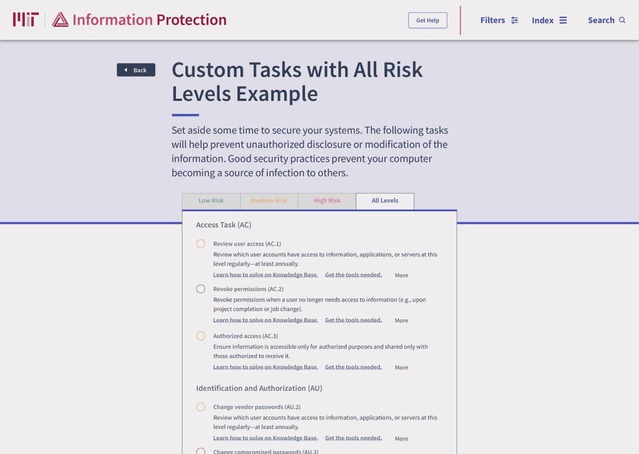
Phase 1: Concentrating on out-of-date policy content while launching MIT valuable resource for compliance. Phase one’s key highlight was a risk level audit tool, so the user can follow the tasks that are relevant to that risk level. In this implementation, users must still know what their risk level is, and match to the correct policy. In phase two, users who don’t know their risk level are guided.
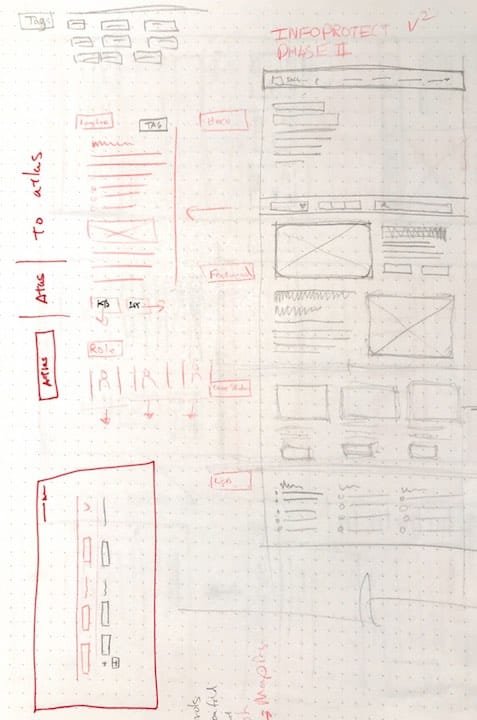
Phase 2: Enhancing the website to provide a guided experience. With the underlying content architecture done, phase two builds an app like experience toward discovering how users can be secure on campus. Allowing the user to be guided, search for specific tasks to complete, or find out more about best practices, all in one MIT IP.
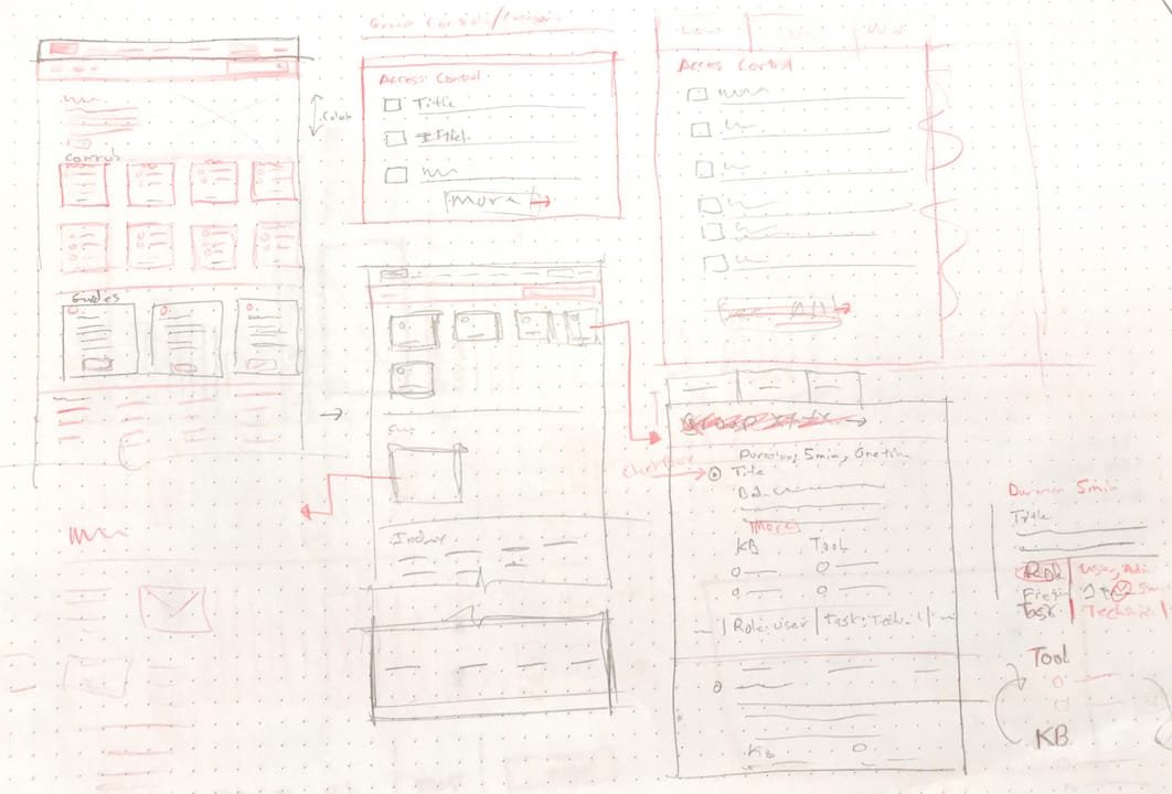
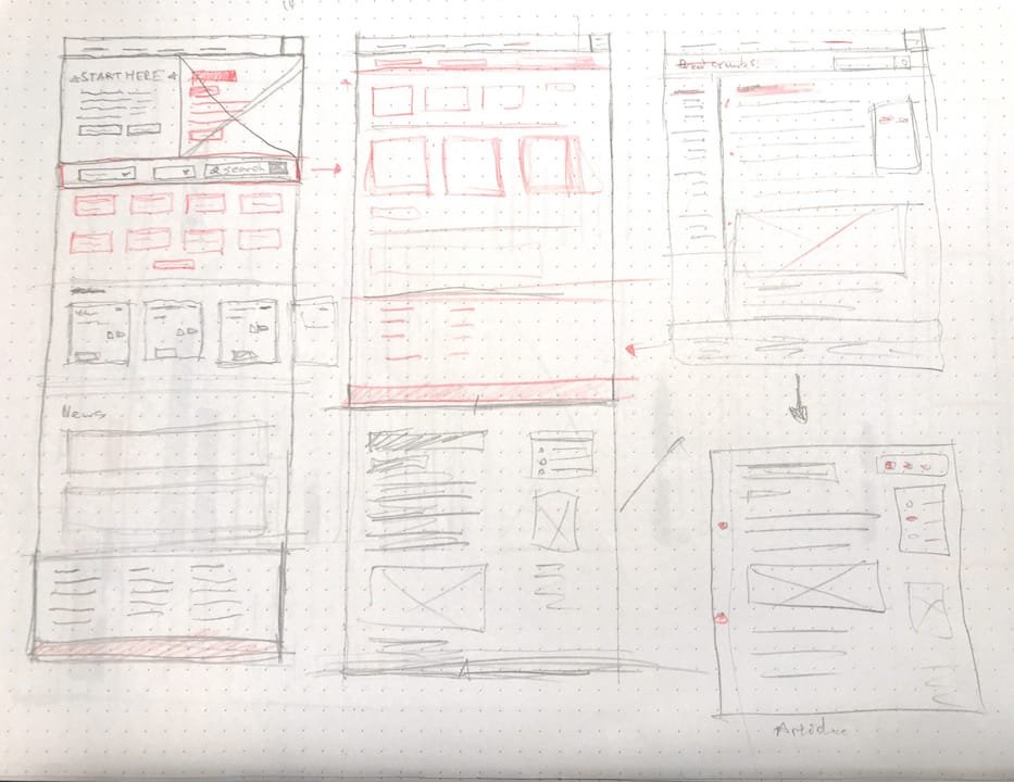
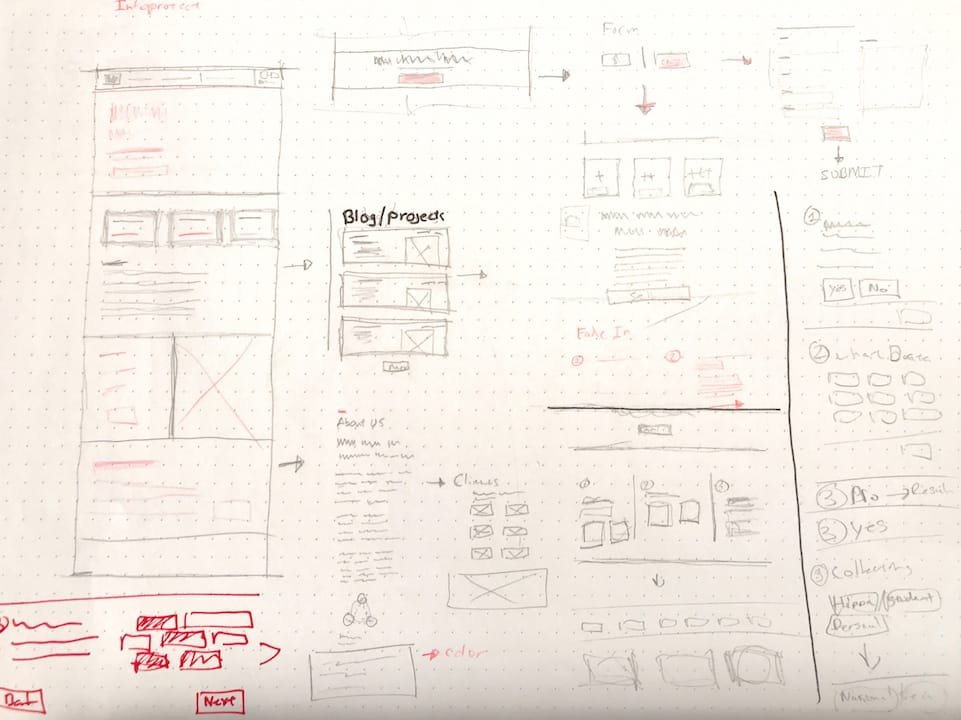
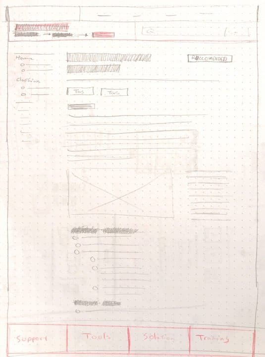
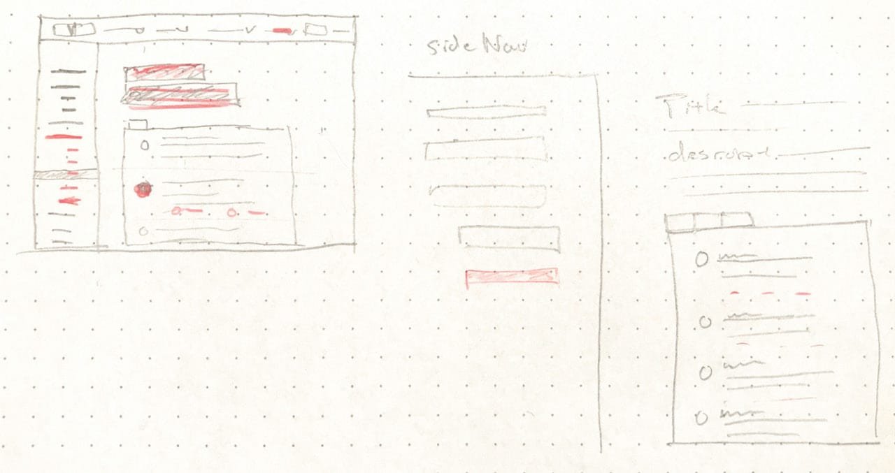
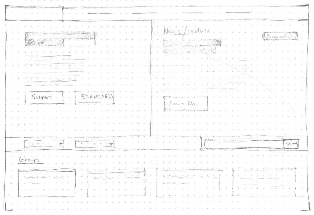
Sketching quickly and talking to stakeholders help us brainstorm how to take our abstract thoughts and turn them into tangible things.
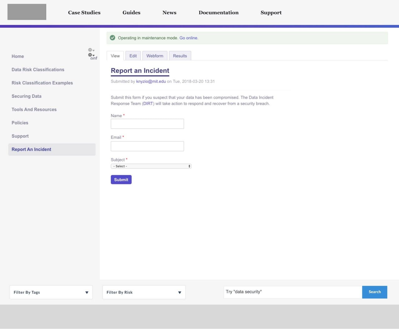
Rapid prototyping in the mid fidelity and high fidelity range was done earlier to get stakeholders and business owners onboard with UX decisions.
Discovery
Started with interviewing stakeholders.
The kickoff started with a data gathering session. Defining the business goals early on, I met with stakeholders to understand the why behind the project.
Organize Information Architecture
Run audits on the content and logic of the content.
Working with the Communications team, I helped organize content, and ways of getting to that content, creating sitemaps and user journeys.
Sketch
With the content structured, focus on connecting the dots.
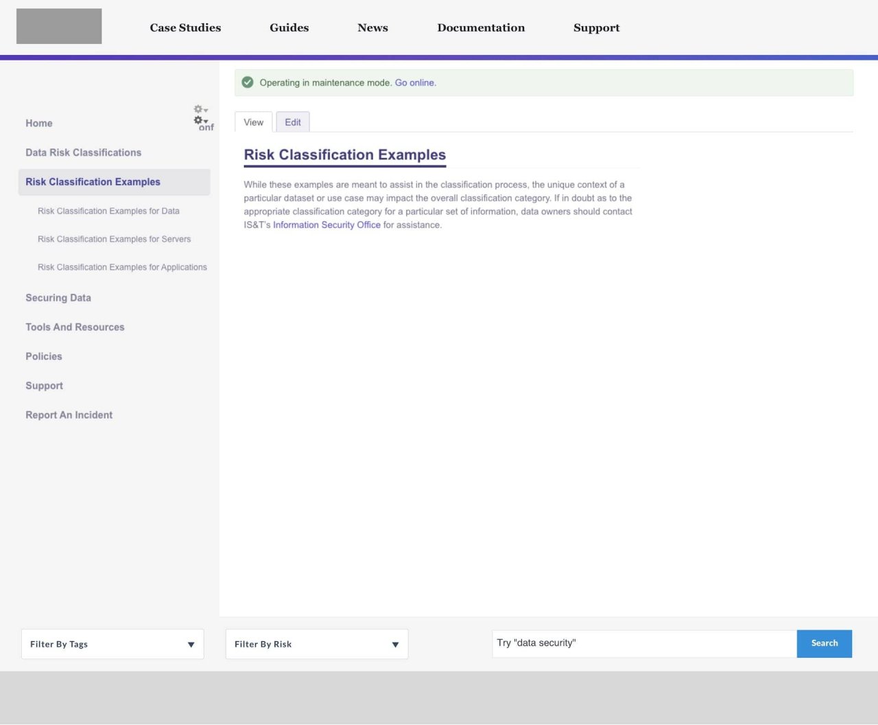
Creating ways for users to discover the controls and content relevant to them by sketching ideas and creating mockups.
Branding
Define what exactly are we try to say to people.
For future campaigns, and setting the visual tone, we sat down with stakeholders and talked positioning.
Prototype
Low-fi to high-fi
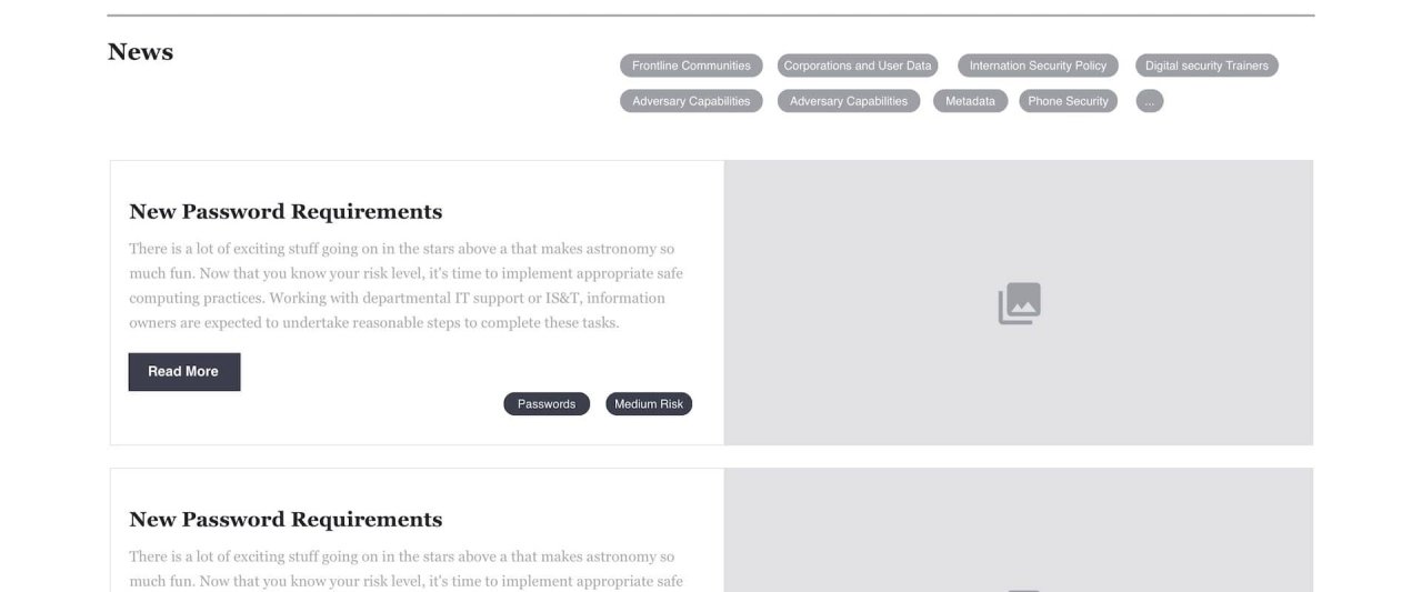
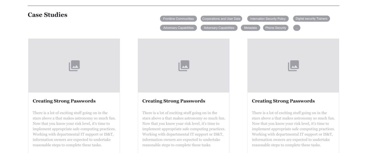
With the user journey mapped, build out the interface that satisfies user needs. Using modern tools, I created interactive prototypes to test with.
Validate
Plan, test, and validate each design decision with users.
I created a pilot testing plan and created many supporting documents to help run user tests to check our assumptions.
Rapid prototyping in the mid fidelity and high fidelity range was done earlier to get stakeholders and business owners onboard with UX decisions.
Sketch ↓
Prototype ↓
Results
The MIT Security team was left with 3 key deliverables including a brand strategy, website strategy, and testing strategy to ensure that they had success with the campaign. Early tests proved positive, and stakeholders and users were pointed in the right direction to solving their security needs.
