Selling Toys, Creating Smiles.
Learning how international product launches are designed, planned, and managed.
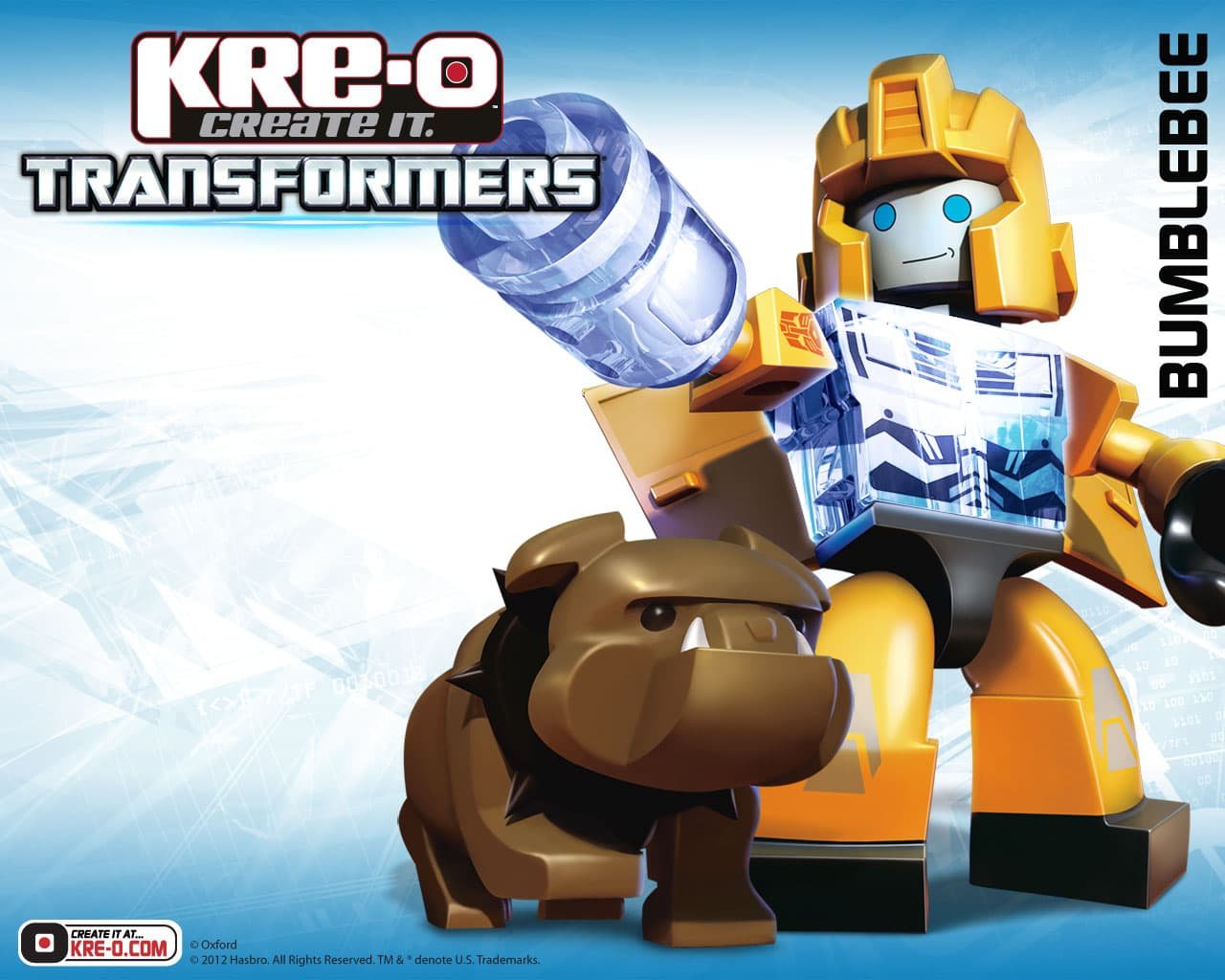
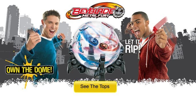
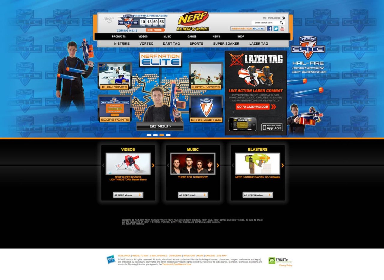
I was fortunate enough to work at Hasbro as digital designer during Hasbro’s internship program. The program had me embed within the boys digital marketing team, a vast department of brand managers, designers, developers, and marketing experts. During my stay, I was able to work on sub brands and products such as Nerf, Transformers, and Bey Blade, while also getting to work on Disney shared I.P. like Star Wars, Marvel, and even got to work on a Rovio Angry Birds tie in.
TLDR: As an intern, I learned more about the complex launch of products than any of my schooling before. Getting paid to learn and experiment with household name brands helping launch my career. For the first time I shipped products, helped produce material for marketing on Hasbro websites and social media, and designed major product landing pages to drive sales to a never before seen product category. Not bad for an intern.
-
Year Active
February 15th, 2012 — March 15th, 2012
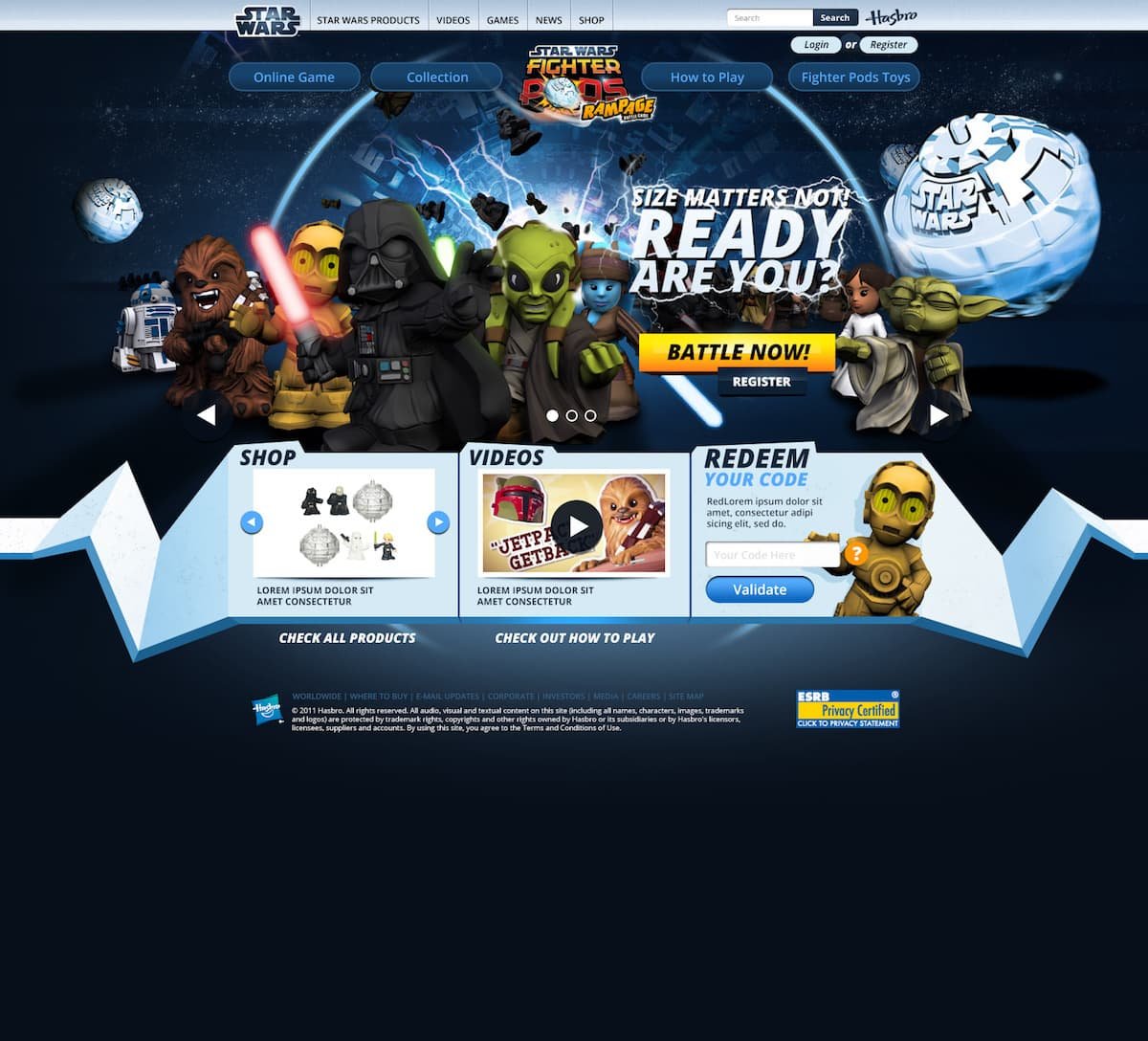
I did not illustrate the characters in the brands below. — I did create their web layout and styled their implementation
Given a bunch of grunt work, my regular tasks were to take existing brand material, packaging, logos, manuals, etc., and create banner images and hero images on Hasbro’s many branded websites. I worked within rigid visual style guides to produce graphics that worked on many pages, driving website traffic to whatever call to action was planned for specific Hasbro landing pages.
While flat design trends were emerging at Microsoft, Apple ,and Google, much of the industry was still crafting Web 2.0 experiences. And boy does my work show that. For the time, it fit the setting that these sites portrayed, brands for boys at Hasbro had “xtreeme” gloss and glitz, over saturated content abounded. But for the target market, Hasbro did their homework, and their audiences responded to these over the top play scapes.
Needless to say, I got good at photoshop.
Some of my early work were products of a marketing first mentality. It worked for the audience.
One major project I worked on was the launch of a brand new website and product. Surprisingly, I was given the brief to do what I felt best solved the challenge. Free reign.
Given the freedom, I recall feeling bit lost at first. Without a clear process to guide me, I began a series of exercises that I now look back on as the start of my formal design process.
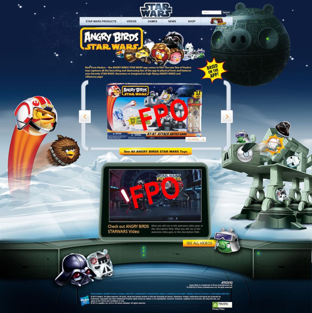
Angry Birds —Star Wars?
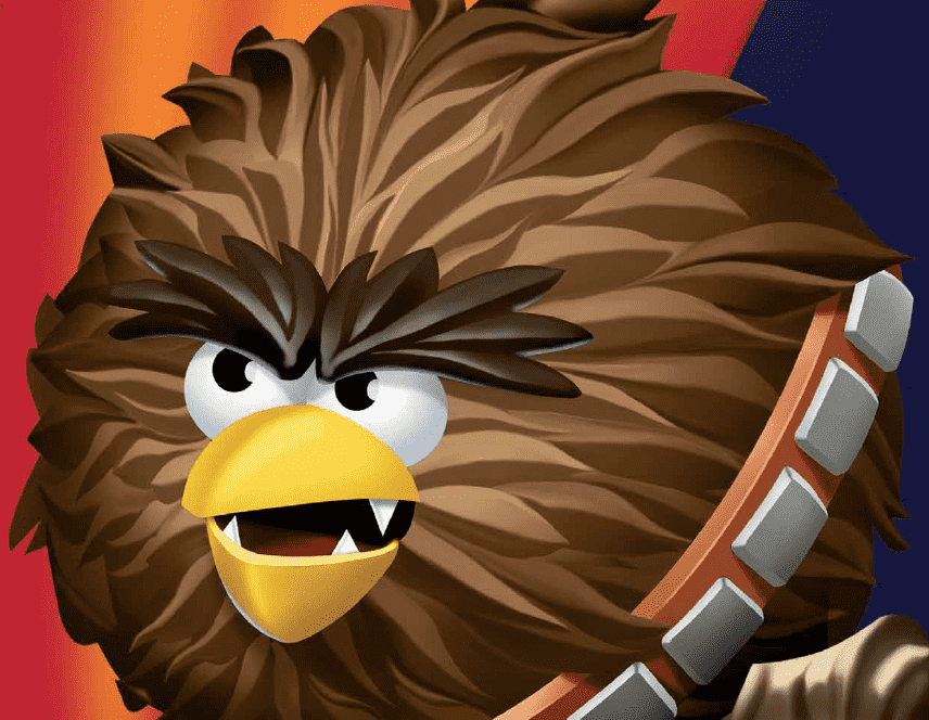
Apparently Angry Birds Star Wars was a thing. Hasbro and Disney had invested heavily in the Rovio I.P., and we're planning a series of major product launches around the fusion of these brands. I had no part to play in the game or product development, but I was tasked with creating a small part of the launch campaign.
Launching products like the AT-AT Attack Battle Game, a Battle of Hoth toy set, with Jenga blocks shaped like an AT-AT walker, alongside Star Wars Bird and Pig characters. It needed a product page.
Some of the brief goals were:
Tell the story of the product, in the context of the game and Star Wars Universe.
It needed space for additional products.
Space for a video.
And a clear call to action while telling a story visually related to the Star Wars Angry Bird universe.
As I recall, the usual process for new product launches was to use the backgrounds and elements from the packaging to produce landing pages. The packaging for the product didn’t have features that lent itself to the needs of a product page. Cross-selling and simple world-building would need something more than duplicating the packaging work.
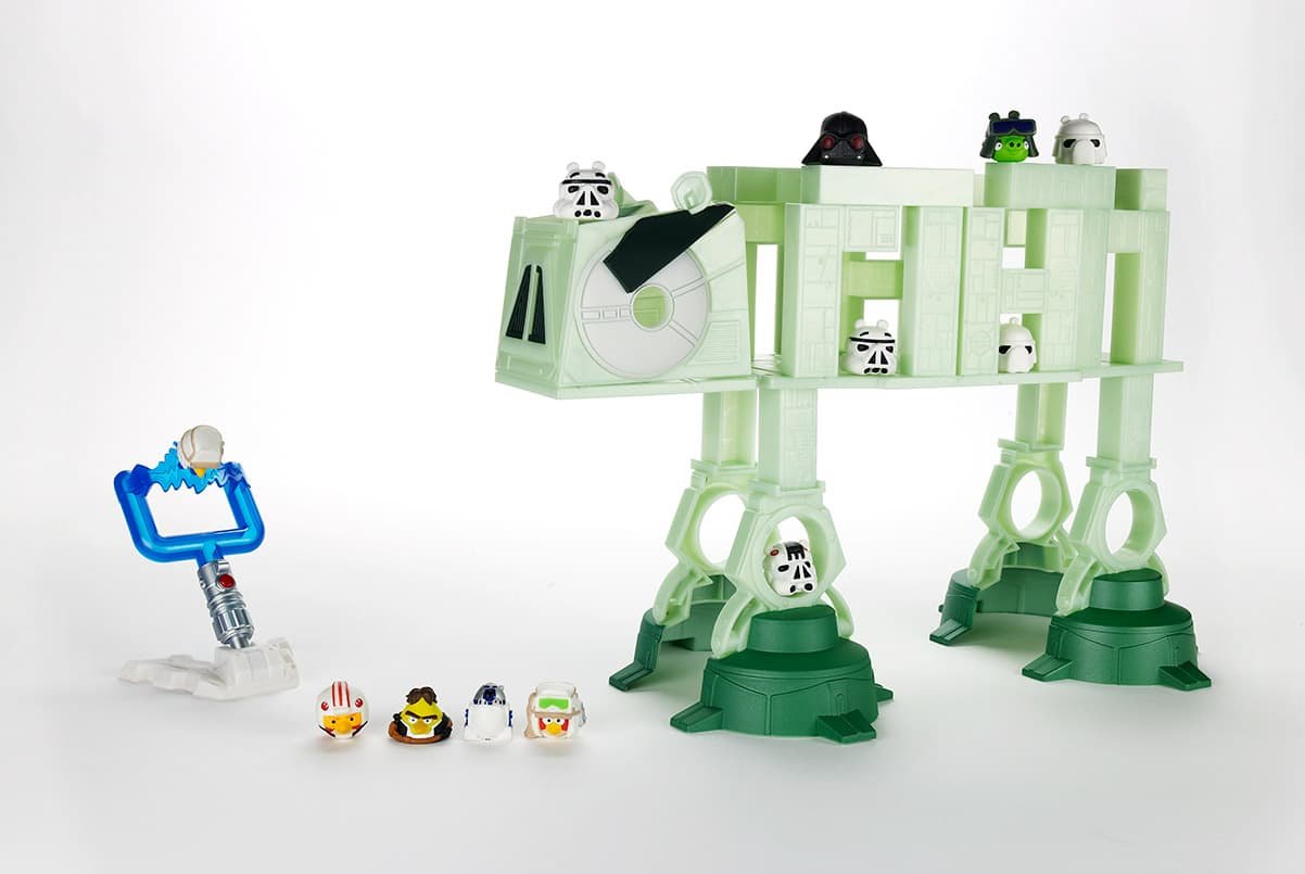
Hasbro already built Star Wars sub-brands for digital products, but their style was unified by the strict Star Wars brand guidelines, and the website for the Rovio tie-in had different marketing goals and site architecture. Copying the same elements would take too long, given our time constraints and budget. Working with my manager to align to the business goals and constraints uncovered, we were able to focus attention on how to best solve the problem.
Solution
What I designed was a uniquely Hasbro, Star Wars Angry Birds landing page with a story to tell. That story echoed in the games lore, and star wars history. It was a blast to produce.
Hasbro wanted to push the product set within the lore. To do so the page would need to not only hint at the type of play, but speak to the Rovio App also launching. The challenge was not to split attention away from either brand but unite it all under one look.
With brief in hand, I started brainstorming about what story the page should tell and what the marketing team needed. First looking at how Hasbro already built sub-branded Star Wars pages, then how the product was position on Rovio’s end. There wasn’t too much to mimic without causing confusion on the intent. The page was for physical products not a game like the other Star Wars examples given.
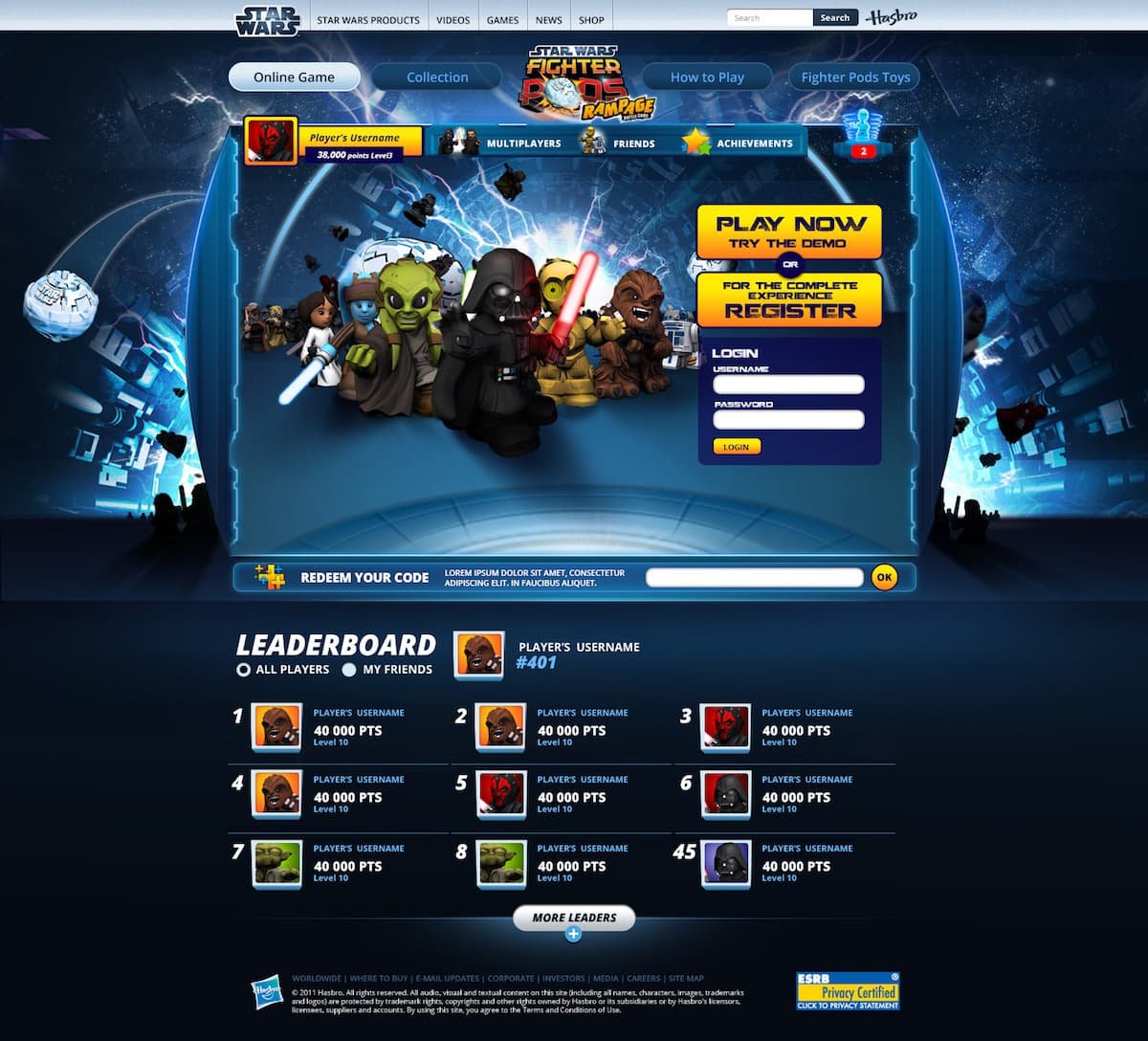
Before starting, I pitched a high fidelity comp to my manager to get buy-in on the page structure. A simple web 2.0 look and feel. This turned out to be a good way to start. I was able to get buy-in on my page layout without doing to much design work. This greatly helped with the producing of the page story.
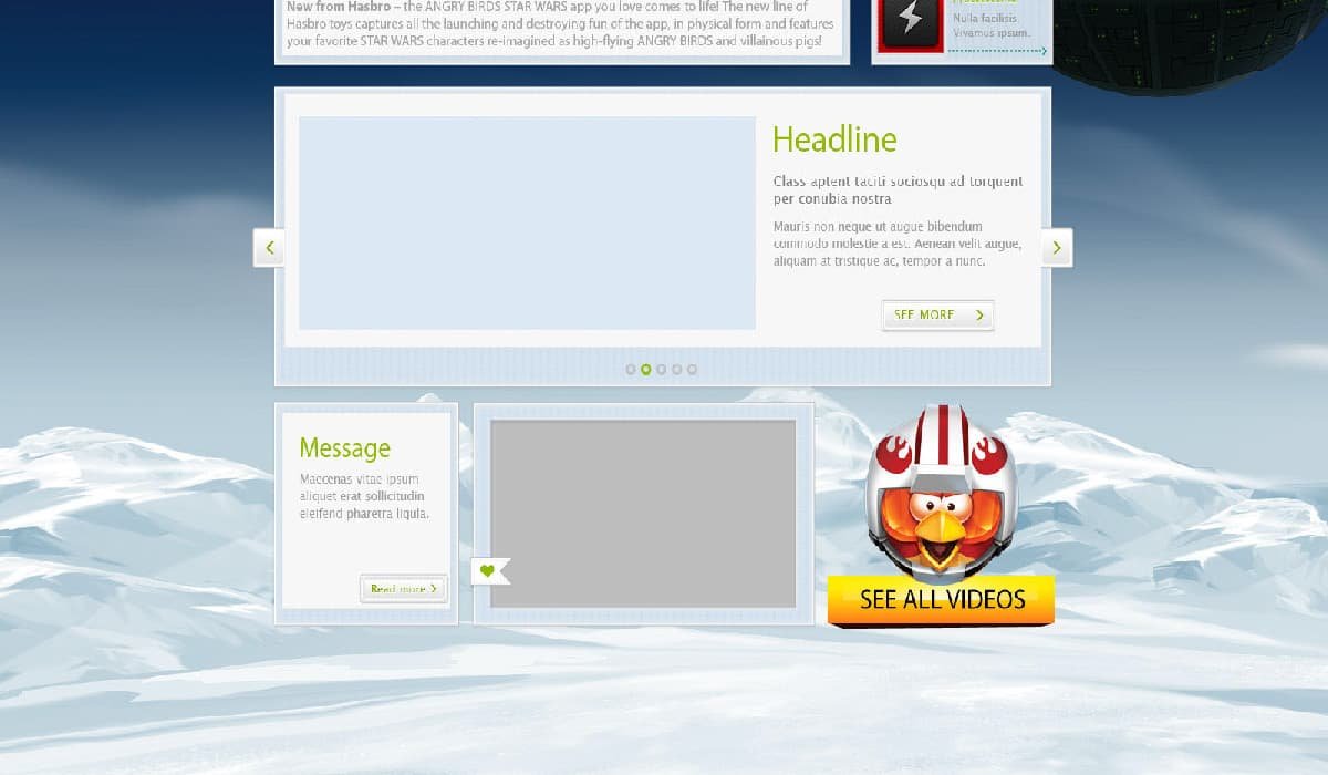
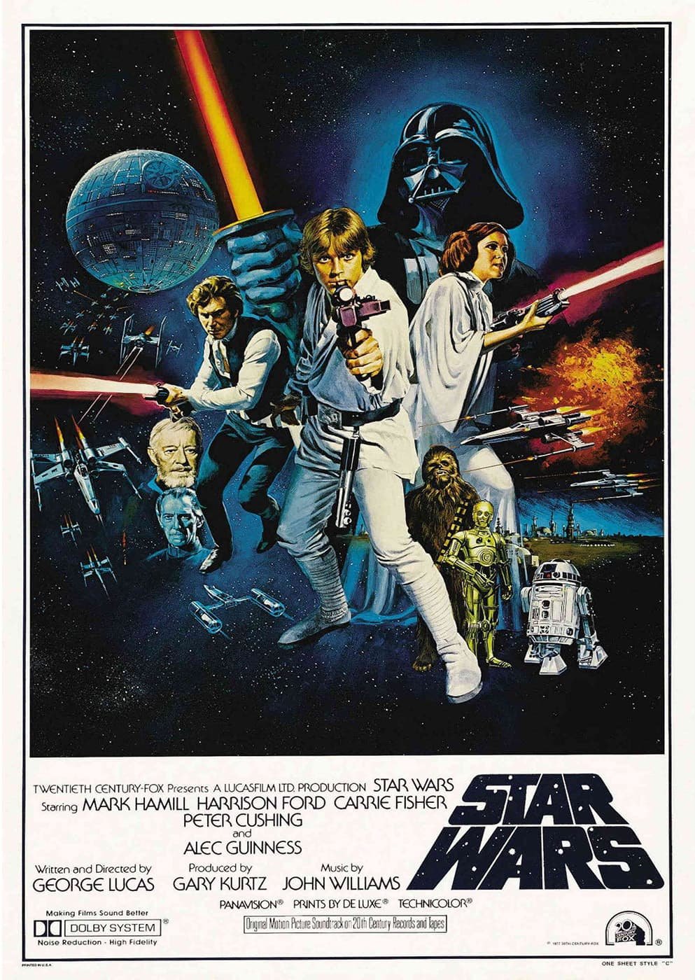
One inspiration I took early on was to look if anyone at Hasbro had mimicked the classic Star Wars poster series.
Surprised it didn’t exist in the portfolio for the Angry Birds version, I decided to mimic the cast of characters as seen in the classic poster from the late 70’s. It worked well, pig star and all.
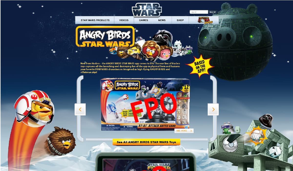
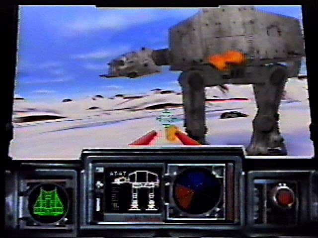
After feeling further exploration of star wars set pieces was needed, I started to recall what elements I enjoyed from the franchise over the years. The most visceral connection I had was the Battle of Hoth, not even the from the movie but from a game called Shadows of the Empire.
This break-thru game included a level where the player is sent to destroy the AT-AT walkers, much like the play set being sold. One view particular, the cockpit view struck me as something I could leverage.
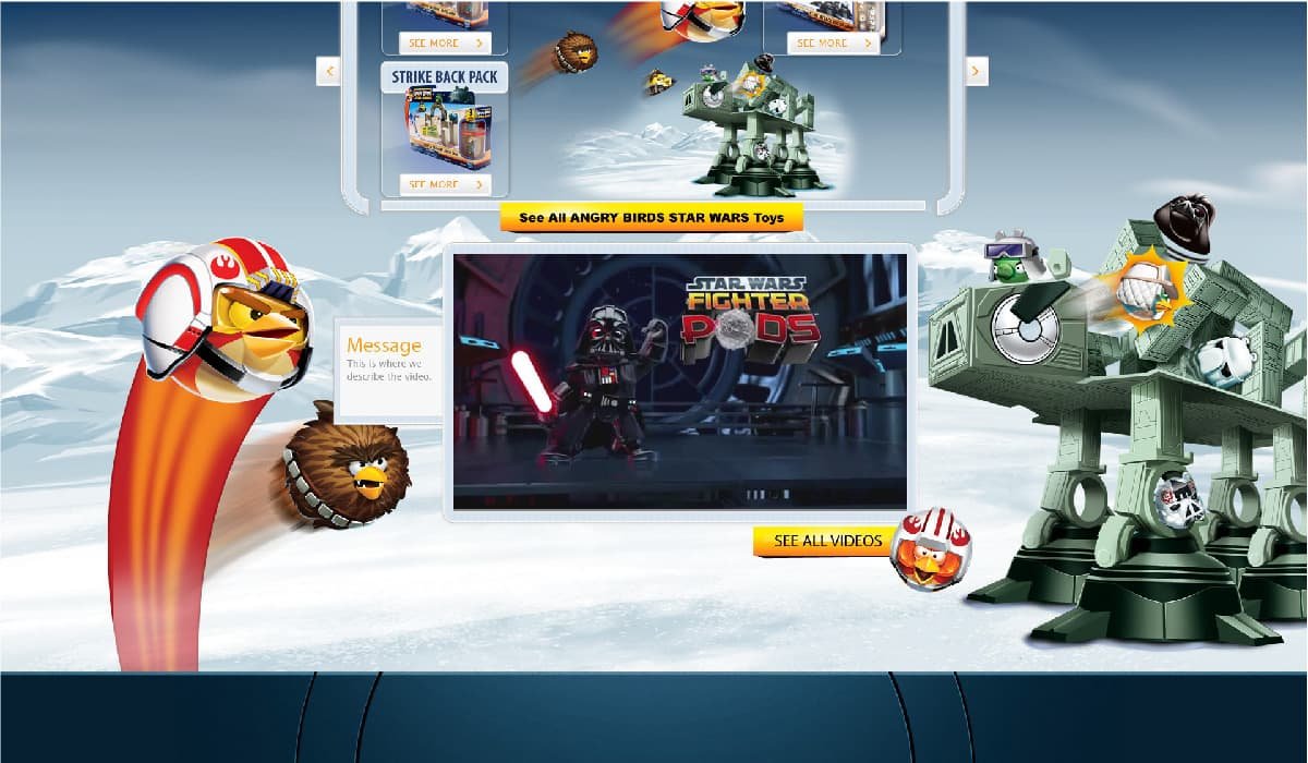
After thinking thru the video section requirement, I took the concept of a cockpit, turned it into a command center, and left the rest to imagination.
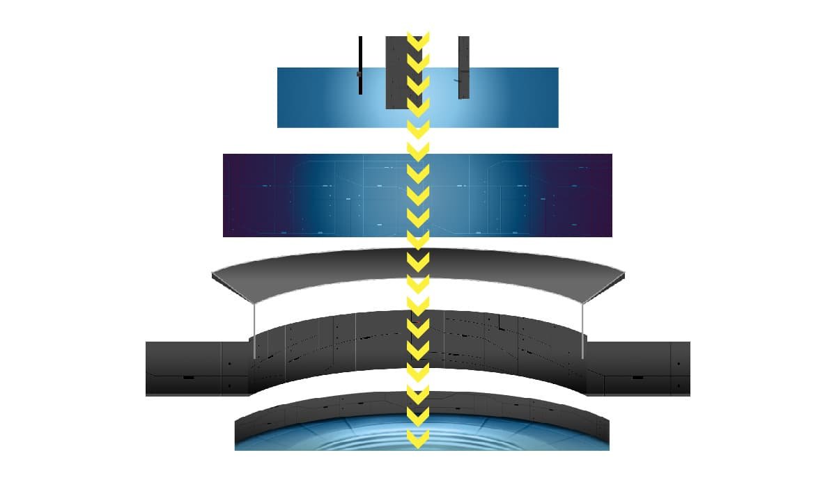
Since the real method of play did not include a vehicle, I thought it best use the metaphor of the cockpit views screen from the Dark Side perspective, not the Rebels. A bottom of the page emerged as a forbidding scene where Darth Pig planned his attack.
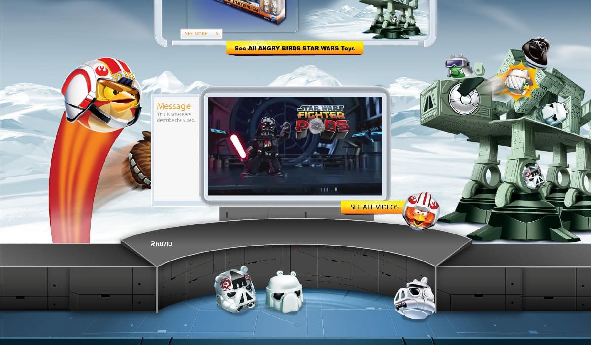
With the setting taking place, I added more of the characters to the background, hinting at the type of play. Using streaks of movement on the bird characters on the left, and showing the conclusion of the play with the bird striking the AT-AT Pig Walker on the right.
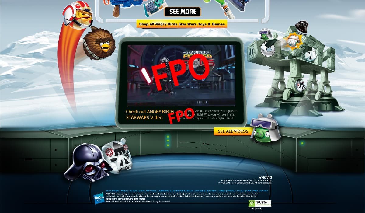
A story told, mimicking the product and game. Repurposing brand assets and telling a story with it helped speed up approval from the many stakeholders needed to launch.
Results
Of all the projects at Hasbro, this one taught me the most. The marketing team loved the concept, and when the brand launched it was used until 2015, when the brand was retired. It was a fun ride.
