Rapid Prototyping in Code
Researching problems, designing solutions, building prototypes. Showcasing how design can be leveraged to bridge the gap between design and tech.
-
On Behalf Of
- FM Global
-
Service Provided
Development Problem Solving Prototyping -
Year Active
March 16th, 2018 — March 16th, 2019 -
Deliverables
- HTML/CSS
- Interactive Prototypes
- Development Patterns
TLDR: In enterprise UX, sometimes the fastest way to prove a concept's efficacy is to build a divergent prototype. As a designer and front-end developer, I helped produce a series of quick concepts, to take static concepts into interactive experiences. Each prototype showcases a specific piece of functionality, and represent the last artifact in a serious of conversations between product leaders, technology owners, and design leads.
Being part of a heist team to deliver interactive prototypes with delivery measured in hours not months.
Context and Challenge
I’m a classically trained designer, and usually, right after research, I generally use the fastest method possible to ideate solutions to uncovered problems. Sketching, writing, whiteboarding, etc., and only after my ideas check out do I move to higher fidelity. But this linear flow is not how projects usually turn out.
Sometimes a project requires a team to build to learn, and when my cross-functional team at FM Global got stuck with flat mockups, we decided we needed to experiment in code.
FM Global hired me as a critical member of their Product Org Transformation. Designers at the company were required to wear many hats, from research to design ops, or being UI designers and developers. All were working to create a better user experience for our operations and clients.
I pioneered a series of code prototypes at the firm, the first time rapid development like this had ever occurred in the modern history of the company. Many where doubtful how useful testing ideas in code would be but sometimes building to learn is more important than perfect handoffs.
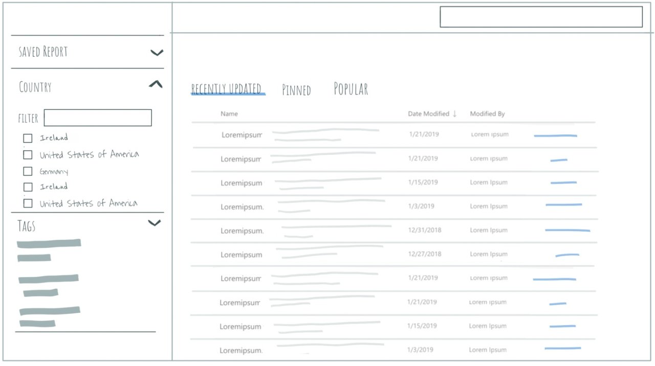
Digitizing Country Sheets at FM Global was an excellent example of communicating value through prototyping. Research had uncovered the need for an "access anywhere" responsive layout on an existing ancient Sharepoint app.
The sole purpose of the tool was to be a document repository for insurance information, sorted and split by country. The rules and regulations found in a “country sheet” could have millions of dollars of liabilities held against the firm. For each “country sheet,” the rules that dictated the decisions that FM Globals underwriters and claims teams made daily were laid out.
Often neglected tools at large companies are left forgotten, even when so crucial to the bottom line. Without having the time to solve the more massive enterprise challenge of knowledge transfer, the design team led by the UX lead Stephen Szermer needed a way to prove, with minimal investment, the Country Sheet app could be made useful and usable.
Solution
The C-Suite needs tangible examples. The product team needed a proof of concept. Tech naysayer needed a coded blueprint, and designers needed a platform to test with users.
What I built became the design and development direction for country sheets.
My rough prototypes aimed for speed of delivery (short time), and just enough style to hint at what could be. Getting the responsive layouts working would help an inexperienced web dev team move fast, and help the UX team have a nice webpage to run user testing with real country sheet data. Doing this was faster than our traditional inVision and Sketch.app workflows.
To help persuade, we set out to build several prototypes to both prove the efficiency gain and the experience gain with this approach. We lined up a new cohort of users to check our assumptions and found, with pleasing results, that our design solved the initial problems with accessing the data anywhere.
Discovery
Getting Context
Talking to our stakeholders to understand what history this experience had. Defining our hypothesis statement and our
Research
Talking to our users
After 3 weeks of user interviews both remote and in person, we had better understanding of the problems users faced today in getting what they needed.
Ideation
Sketching, planning our build
With the problem space better categorized, I began testing the waters with redesigned UI and layout for a new country sheets.
Build
Rapid prototype
Using web standards, I built simple few react + MS Fabric Prototypes and a Vanilla JS HTML and CSS prototype.
Results
By the end of our design phase, the interactive prototypes had helped align three teams on the direction Country Sheets should take, what type of functionality would be needed to meet user expectations, what research we had done to support this direction, and a few code examples for our tech partners to implement in their desired front-ends of choice. All this delivered 4x faster than the average turnaround for user experience research, design, and development.
